Snack Packaging Design: How to Win the Snack Aisle in Three Seconds
Snack packaging has to sell fast. Shoppers scan a wall of bags in a few seconds, often on impulse, so the front needs a strict order: the brand, the snack type, the flavor in a color you can spot from a distance, an appetizing image of the actual product, and one or two benefits that matter to your buyer. Everything else can go on the back.
Most snack brands also sell several flavors, sizes, and formats, so the packaging has to work as one family, with a fixed layout, a clear flavor code, and room for multipacks and variety packs. On top of that, the pack has to protect a fragile, oil- or sugar-rich product from air, moisture, light, and crushing. That part comes down to the format and material.
At SOTDESIGN, a snack line’s packaging starts at $2,500, which pays for the packaging system and the first SKU, and every additional flavor or size is about $800. This guide covers formats, the flavor system, claims and the rules behind them, appetite appeal, slack fill, multipacks, sales channels, and ideas by snack type, and it ends with two of our snack projects.
Snack packaging formats
Format and material are usually your co-packer’s and packaging supplier’s call, but every choice shapes what the design can do.
| Format | Common for | Design notes |
|---|---|---|
| Pillow bag | Chips, crisps, puffs, popcorn | Big front, soft surface; the top third is what shows on a crowded shelf |
| Stand-up pouch | Nuts, trail mix, dried fruit, granola, jerky | Stands on its own, often resealable; works for grocery and online |
| Flow-wrapped bar | Snack bars, protein bars | Tiny surface; flavor and one benefit, the rest on the back or the carton |
| Canister or tube | Stacked chips, nuts, premium snacks | Round surface; the design has to read as the can turns |
| Single-serve bag | Convenience stores, lunchboxes, vending | Small and narrow; brand and flavor only |
| Multipack box | Club stores, grocery, Amazon | Big billboard; show what’s inside and how many |
| Variety pack | Club stores, Amazon, offices | Shows several flavors at once; the system has to hold together |
Snacks are especially sensitive to air and moisture. Chips and nuts go stale or rancid, bars harden, and popcorn loses its crunch. Your supplier will choose the barrier film and the seal. Many chip bags are also flushed with nitrogen, which keeps the product fresh and cushions it in transit. That’s part of why the bag looks fuller than what’s inside it.
Slack fill and the air in the bag
“Half the bag is air” is one of the most common complaints about snacks, and it has a legal side. FDA rules treat empty space in a package you can’t see into as misleading unless it serves a functional purpose (21 CFR 100.100). Those purposes include protecting the contents, the needs of the packing machinery, unavoidable settling during shipping, and a package that can’t practically be made smaller, for example because it needs room for the required label information.
For chips, protective headspace counts as a functional reason. Shoppers still notice the air, and it affects whether they trust you, so a few habits on the pack help.
- Print a clear net weight and use an honest product photo, so people know the real size and amount before they open the bag.
- Get the pack size right. If the bag is much bigger than the product needs, raise that with your supplier before anyone starts on the design.
- Explain the headspace when it helps. A short line such as “bag filled with nitrogen to keep the crisps fresh” (only if it’s true) tells shoppers why the air is there. That works for a functional fill. It won’t cover for a bag that’s simply too big.
Snack brands have also faced lawsuits over slack fill, so it’s worth having your regulatory reviewer look at pack size and fill along with the label.
Build the flavor system first
Many snack brands launch with a handful of flavors and add more as the line grows. If each bag is designed separately, the shelf ends up looking like several brands, so it’s better to start with the system.
Keep the logo position, the layout, the typography, the way the product image sits on the pack, and the back panel structure the same on every bag. What changes from flavor to flavor is usually color, and sometimes an ingredient image or an icon. Color is the fastest signal on a snack shelf. Shoppers often find their usual flavor by color before they read a word, so pick colors that fit the flavor (green for dill or sour cream and chives, red or dark tones for BBQ) and use them the same way everywhere the product appears.
Before you lock the system, write down the next three flavors you might add and check that the color code still works. A palette that’s perfect for four flavors can run out of room at seven. It also helps to test the hardest case: put the longest flavor name, the most claims, and the smallest bag together on one mockup. If that one works, the rest will.
Two brand architectures are common. In a masterbrand look, the brand dominates and the flavors change underneath it. That builds recognition fast and suits young brands. A sub-line structure gives a premium or better-for-you range its own look, which makes sense once the main line is established. Mixing the two too early tends to confuse shoppers.
What goes on the front panel
A snack bag has room for about five elements before the front gets noisy:
- Brand. Big enough to find. It doesn’t have to be the biggest thing on the pack.
- Snack type. “Veggie crisps,” “kettle chips,” “roasted almonds.” Shoppers need to know what it is, and FDA rules require a clear name of the food on the front.
- Flavor. Large, in the flavor color.
- Product image. The snack itself, ideally showing texture.
- One or two benefits. The ones that decide the purchase for your buyer.
The net weight also has to be on the front, and on most packs it goes in the bottom 30% of the panel (very small fronts, 5 square inches or less, are exempt from that placement rule). Put it there from the first sketch so it doesn’t fight with the photo later. We cover the placement and type-size rules in our guide to food label requirements.
Claims that sell, and the rules behind them
Better-for-you claims drive a lot of snack purchases: baked not fried, high protein, no added sugar, gluten-free, vegan, made with real vegetables. They also come with rules.
- Nutrient content claims such as “high protein,” “low fat,” or “good source of fiber” have FDA definitions, and “no added sugar” has its own conditions (21 CFR 101.60). Using any of them also means you need the full Nutrition Facts panel, even if a small business exemption would otherwise apply.
- “Gluten-free,” “no gluten,” “free of gluten,” and “without gluten” all have to meet the same FDA standard, including a limit under 20 parts per million (21 CFR 101.91).
- Words like “vegan,” “keto,” or “clean” don’t have FDA definitions, but they still have to be true and not misleading. Certifications such as Non-GMO Project Verified or a vegan mark come with their own rules from the certifier.
On the pack itself, put all the claims together in one consistent place, such as a row of short badges. Then keep it to the two or three that actually matter. A front with seven badges is just noise to most shoppers.
Appetite appeal and the product image
Snacks are bought on craving, so the product image carries most of the sale.
Show texture: ridges, crumbs, seasoning, a broken piece. People usually see that a snack is crunchy in the photo before they read anything on the pack. The image should also match what’s in the bag, in color and size. If you show the product larger than life, a small “enlarged to show texture” line is common practice and helps avoid disappointed buyers.
Ingredients can signal the flavor, but use them carefully. A potato, a sprig of dill, or a few almonds next to the product is usually enough. Add too many props and you get a still life that hides the snack.
A window is worth considering if you know the trade-offs. It builds trust for nuts, granola, and dried fruit. It also lets in light, which some snacks don’t tolerate well, and it shows broken pieces and crumbs.
Illustration can work too, especially for kids’ snacks, premium lines, and brands with a strong character. It has to look good and still make people hungry.
launching a snack line?
send us your flavors and formats: one system for every bag, fixed estimate in 1–2 business days
get quoteMultipacks, variety packs, and the box around the bags
Many snack brands sell as much through multipacks and display boxes as through single bags, so design the outer pack as part of the system.
- Say what’s inside in numbers, like “6 packs inside” or “12 x 1 oz bags.” Shoppers buying in bulk compare counts and sizes first.
- Show the individual pack on the box, so shoppers recognize it from the single-bag shelf.
- Some large retailers, especially discount and club stores, require or strongly prefer retail-ready boxes that open into a shelf display. The front of the open box turns into a mini billboard, so design it to work both open and closed.
- Variety packs need a clear way to show every flavor at once, such as a row of mini packs, color stripes, or a flavor list. A strong flavor color code makes this much easier.
Design for the channel
- Grocery snack aisle. Several facings of the same flavor color form a block that’s easy to spot. Put the brand and flavor in the top third of the bag, since the lower part is often hidden.
- Convenience stores. Single-serve bags on racks or peg hooks, bought in seconds. Stick to brand and flavor, and leave a clear hang hole area if the bag hangs.
- Club stores. Big multipacks and variety packs, seen from a distance on pallets. Put counts and value front and center.
- Amazon and your website. The pack shows up as a thumbnail. Check that the flavor and snack type are still readable at that size, and plan extra images for the back panel, size, and multipack contents.
- Vending, offices, and lunchboxes. Small single-serve packs where the flavor color does most of the work.
Ideas by type of snack
- Chips and crisps. Flavor color plus a big product photo with visible seasoning. Keep the flavor name large, because that’s how people choose.
- Veggie and better-for-you crisps. Show the real vegetable color of the product and lead with the one benefit that sets you apart, such as baked, not fried.
- Nuts and trail mix. A window or a clear product photo, the roast or seasoning as the flavor, and resealability called out on the pack.
- Bars. The flow wrap is tiny, so it gets the flavor and one benefit, such as protein grams. Leave the brand story to the carton.
- Popcorn. Light, airy imagery and bright flavor colors. Bags are often large and soft, so put the important information high.
- Jerky and meat snacks. Bold, often darker palettes. Most meat and poultry snacks, including beef and turkey jerky, are regulated by USDA’s Food Safety and Inspection Service, not the FDA. That brings its own label rules and approval for special claims, so build the extra time into your schedule.
- Kids’ snacks. Characters and bright color work, but parents are the buyers, so make the benefits and ingredients easy to find.
Common snack packaging mistakes
- Each flavor gets designed on its own. The shelf looks like five brands, and repeat buyers can’t find their flavor.
- The front carries too many claims, and shoppers skim right past the crowded row of badges.
- The product photo oversells. A snack shown bigger, shinier, or more generously seasoned than it really is leads to complaints and lost repeat purchases.
- Brand and flavor sit too low on the bag. On a crowded shelf, the bottom half often isn’t visible.
- There’s no plan for multipacks. If the design only works as a single bag, the club store box becomes an afterthought.
- A claim gets added at the last minute. It can bring the Nutrition Facts requirement with it and force a back panel redesign.
Two snack projects from our work
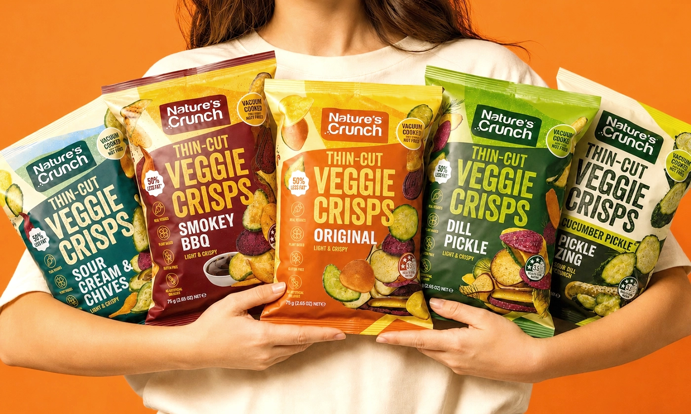
The Nature’s Crunch veggie crisps line came in five flavors: Original, Dill Pickle, Smokey BBQ, Sour Cream & Chives, and Cucumber Pickle Zing. Each pack had to make the product, its flavor, and its main benefits clear in a quick look without seeming crowded, and the five needed to stand out in a busy snack aisle and still look like one family. We handled it with one shared layout and a color code by flavor across all five.
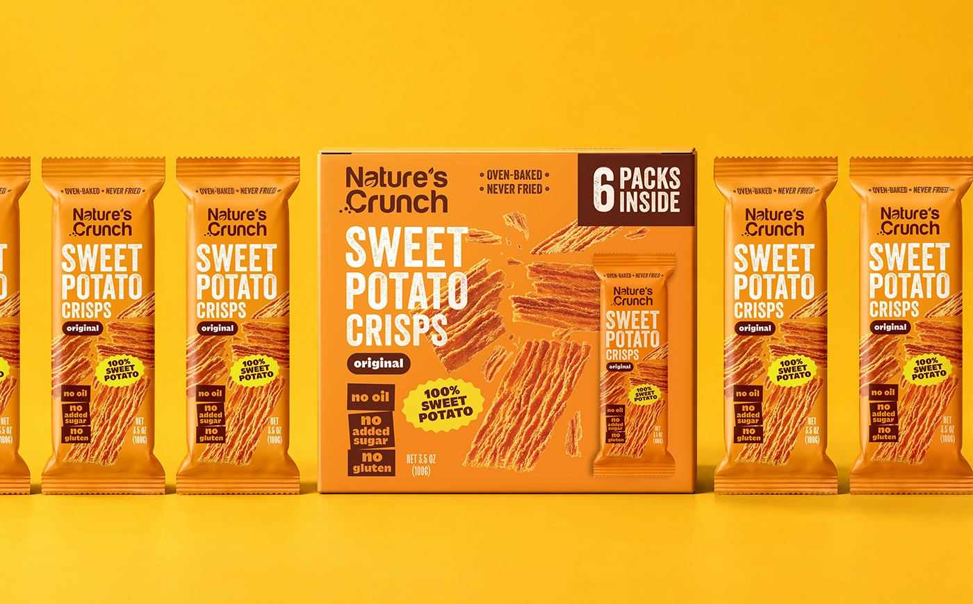
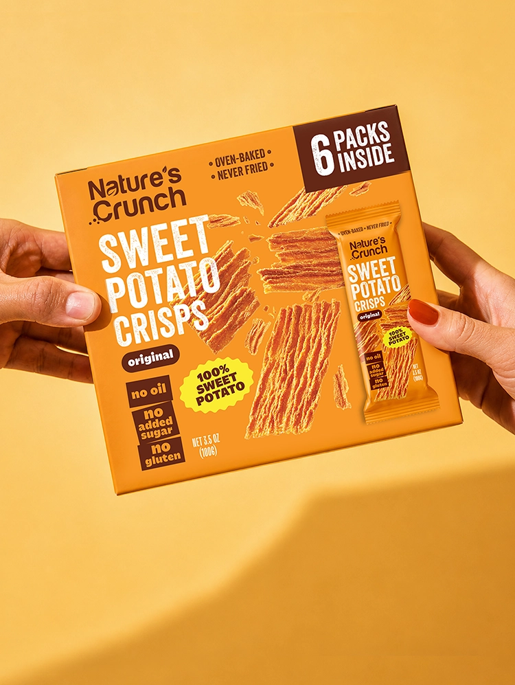
For the same brand’s sweet potato crisps, the brief asked for a bold, modern pack that shoppers could understand within seconds, both as an individual pack and as a retail box of six. The design uses a saturated orange palette tied to the sweet potato and large, high-contrast white type for the product name. The front follows a clear order: logo, product name, flavor, then the main benefits grouped in compact blocks. In the photography, the crisps appear at different sizes, with broken pieces and crumbs for texture. The six-pack box uses the same palette and imagery, plus a high-contrast “6 Packs Inside” panel and an image of the individual pack.
What snack packaging design costs
The price of a snack line mostly depends on how many flavors and sizes you have, whether you need a logo, and how many multipacks or display boxes belong to the system. For the ranges and what moves them, see our guide to how much packaging design costs. If you’re getting ready to talk to designers, our guide on how to write a packaging design brief covers the information they’ll ask for.
Projects through our food packaging design services begin at $2,500, and that covers the system and the first SKU. Each flavor or size you add is about $800, since it adapts a system that already exists, and if you need a logo, that’s about $1,500. For a new snack brand launching with a logo and four flavors, the total is about $6,400 ($1,500 + $2,500 + 3 × $800). A volume discount applies from ten SKUs up, and a ten-SKU packaging line usually lands around $8,000. Every project gets three concepts and three rounds of revisions. Once your brief is in, a fixed estimate follows within 1–2 business days.
Our studio is in Albany, New York, and design is the only thing we do. Across 10+ years of branding and packaging work, we’ve completed 80+ packaging projects for consumer brands, the majority in food and beverage. We don’t handle printing or manufacturing, so the files are set up on your supplier’s dielines and can go to any printer you choose.
ready to design your snack packaging?
flavor systems, multipacks, and claims that fit: design only, any printer
get quoteFAQ
01 What makes good snack packaging design?
It starts with a front that works in about three seconds: the brand, the snack type, the flavor in a recognizable color, an appetizing image of the real product, and one or two benefits. Behind that front you need a system that keeps every flavor and size looking like one family, and a format that keeps the snack fresh and intact.
02 What is the best packaging for snacks?
It depends on the snack. Pillow bags suit chips and popcorn, stand-up pouches suit nuts, trail mix, and granola, flow wrap suits bars, and canisters suit stacked chips. Choose the format and barrier with your packaging supplier based on shelf life and how the product breaks or goes stale.
03 Why are chip bags full of air?
Most chip bags have headspace, often filled with nitrogen, to keep the chips fresh and cushion them from breaking. FDA rules allow empty space that serves a function like protection, but not empty space that’s only there to make the package look bigger.
04 How do you choose colors for snack flavors?
Use colors shoppers already associate with the flavor, like green for dill or sour cream and chives and red or dark tones for BBQ, and keep the code consistent across every size, multipack, and online image. Plan for the flavors you’ll add later so the palette doesn’t run out.
05 What claims can I put on snack packaging?
Nutrient content claims such as “high protein” or “no added sugar” have to meet FDA definitions, and using them requires a Nutrition Facts panel even for small businesses that would otherwise be exempt. “Gluten-free” has its own FDA standard. Undefined claims such as “vegan” still have to be true. Have a regulatory reviewer confirm every claim before the design is final.
06 How many claims should be on the front of a snack bag?
Usually two or three at most. Group them in one place, such as a row of short badges, and keep the rest on the back.
07 How much does snack packaging design cost?
SOTDESIGN prices packaging design from $2,500 for the system and the first SKU. Every flavor or size beyond that adds about $800, and a logo is about $1,500. Most of our packaging projects end up between $2,500 and $8,000.