Packaging Redesign Examples: CPG Rebrands That Worked and Failed
The packaging redesigns that work usually keep what shoppers use to find the brand and fix one clear problem. GoodPop kept its white box and gave the line one consistent brand color; sales rose 40% the following year. Malk made its varieties easier to tell apart and moved its strongest message above the shelf edge; sales rose 56%. The redesigns that fail tend to remove the one cue loyal buyers use to find the product, so they walk past it. Tropicana’s 2009 carton is the best-known example.
For a brand owner, two questions matter more than looks: what problem did the redesign solve, and what did it keep? Each of the main examples below answers both. The results come from retail sales data compared with the year before, so they show what happened after the new pack launched, not proof that the pack alone caused it.
This guide covers the difference between a refresh, a redesign, and a rebrand, eight measured redesigns, two failures, and four redesigns from our studio, with what they have in common. Our redesign projects begin at $2,500, covering the new system and one product.
Refresh, redesign, or rebrand?
People use these words loosely, but they describe very different amounts of change.
| Refresh | Redesign | Rebrand | |
|---|---|---|---|
| What changes | Type, photography, claims, small layout fixes | The whole packaging system: layout, imagery, color use, hierarchy | Positioning, often the name and logo, and the packaging with them |
| What stays | Logo, colors, structure | Logo (often updated), core color, brand name | Sometimes only the product |
| Risk of losing buyers | Low | Medium | High |
| Typical reason | The pack looks dated | The pack doesn’t sell, doesn’t scale, or doesn’t explain the product | The brand itself has to mean something else |
Most of the successful examples below are redesigns that sit close to the refresh end. They changed a lot and still left alone the things shoppers use to recognize the brand. If you’re unsure how far your own project should go, our rebranding checklist walks through the decision.
Redesigns that worked
Designalytics, a firm that measures package design performance, runs the Designalytics Effectiveness Awards for US packaging redesigns, judged on retail sales data and consumer testing. Their published case notes are some of the few public sources that pair a redesign with a sales result. Each of the next three fixed a different problem.
GoodPop: one brand color across the line
GoodPop, a frozen pop brand and the 2022 grand prize winner, grew from a small line into mainstream retailers. Its original packs had a small logo, and the logo’s color changed by variant, so the line didn’t read as one brand on the freezer shelf.
The redesign kept the white box, which shoppers already knew, and added one teal shape behind the wordmark on every flavor. The flavor images moved from stock-style photos in a corner to styled scenes with the pops standing upright and fruit around them. The front carried no more than three claims; the rest, including the mission, moved to the back. The new design launched in early 2021, and in the following year sales rose 40% compared with the year before.
When a line expands, fix the brand color and make the variant color secondary.
Malk: make the varieties easy to shop
Malk, a 2023 winner, sells organic nut and oat milks in a crowded refrigerated case. The old design looked generic, the varieties were hard to tell apart, and the organic status didn’t stand out.
The redesign kept the overall layout close to the original. It added a green band around the bottle neck that reads “organic,” put the variety name (almond, oat) right next to the wordmark, made the “no gums, no oils” message more prominent, and stacked the short ingredient-count message under the brand name, where it stays visible above the shelf edge in most stores. The protein callout came off the front. Sales rose 56% over the same period a year earlier, while the category grew 8%.
In a crowded case the top of the pack does most of the work, so the variety and the reason to buy belong where shelf edges and price tags can’t hide them.
Hot Pockets: speak to the eater and the buyer
Hot Pockets, also a 2023 winner, wanted to appeal to teenage gamers who eat the product while still reassuring the parents who buy it. The packaging hadn’t kept up.
The brand kept the logo’s holding shape but made it white and rounded it to echo the opening of a Hot Pocket. A modern, playful white typeface replaced the old serif. The photography changed from one sandwich to two stacked, shot at an angle that shows more filling and less crust. Sales rose 39% in the six months after launch compared with the same period the year before.
The biggest visible change here was the photo. Showing the filling was meant to work for both audiences at once.
More measured redesigns
The 2025 edition of the awards lists several more CPG redesigns with results. The notes below summarize what each brand changed, as described in the award notes.
| Brand | Category | What changed | Sales after redesign |
|---|---|---|---|
| Laoban | Frozen dumplings | Added food imagery to a quirky, minimal pack | Up 296% |
| Solely | Fruit jerky | A simple, strategic redesign of the line | Up 61% |
| Top Fox | Seed snacks | Stronger flavor and color cues, seeds positioned as a snack | Up 54% |
| Oikos Triple Zero | Yogurt | Clearer communication and a more cohesive line | Up 18% |
| Nuun | Hydration tablets | Color and clearer messages for easier shopping | Up 7.9% |
Two cautions about any list like this. First, these are year-over-year sales changes, and other things may have changed at the same time. GoodPop, for example, was also expanding into conventional retail. Second, award lists show the winners. Many redesigns produce no measurable change, and some lose sales. The patterns are still useful, because the same moves appear again and again.
is your packaging holding you back?
send us photos of your current packs: we’ll tell you what to keep and what to change, fixed estimate in 1-2 business days
get quoteRedesigns that failed
Tropicana, 2009: losing the orange with the straw
In 2009 Tropicana replaced its carton, including the orange with a straw in it, with a minimal design showing a glass of juice. Loyal buyers couldn’t find it, and some said it looked like a store brand. Sales fell sharply within about two months, and the company went back to the old design. Our article on the Tropicana redesign goes through what happened and what to learn from it.
Coca-Cola, 2011: white cans that looked like Diet Coke
For the 2011 holiday season, Coca-Cola released white cans with polar bears to support a conservation campaign. Some shoppers confused them with silver Diet Coke cans, and some said the drink tasted different. Within weeks the company moved the campaign to red cans, earlier than planned.
In both cases, the brand took away the one visual cue that shoppers relied on: Tropicana’s orange and straw, Coca-Cola’s red. Nothing else on the pack could make up for it.
Four redesigns from our work
Brandage: from generic cartoons to one illustrated system
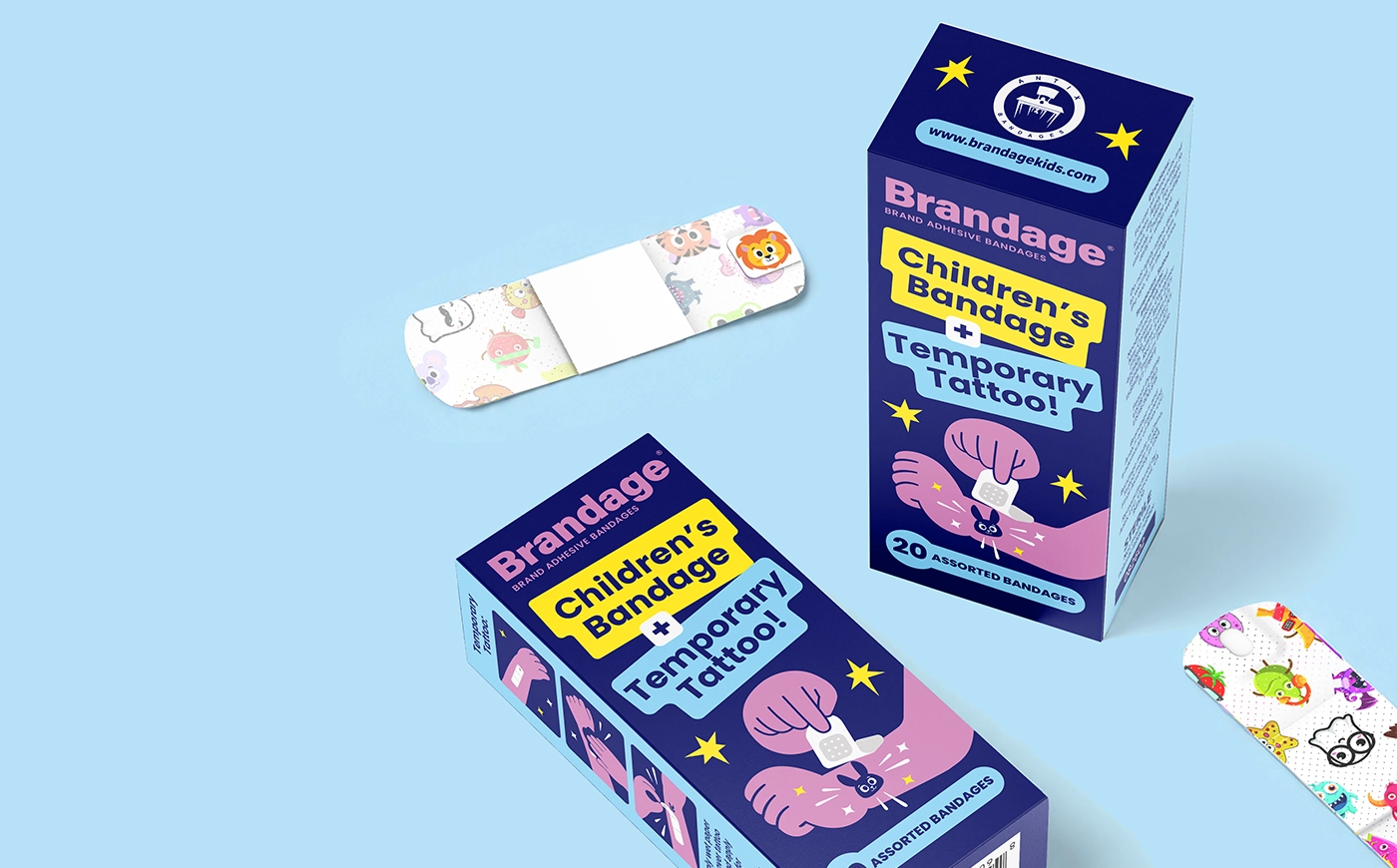
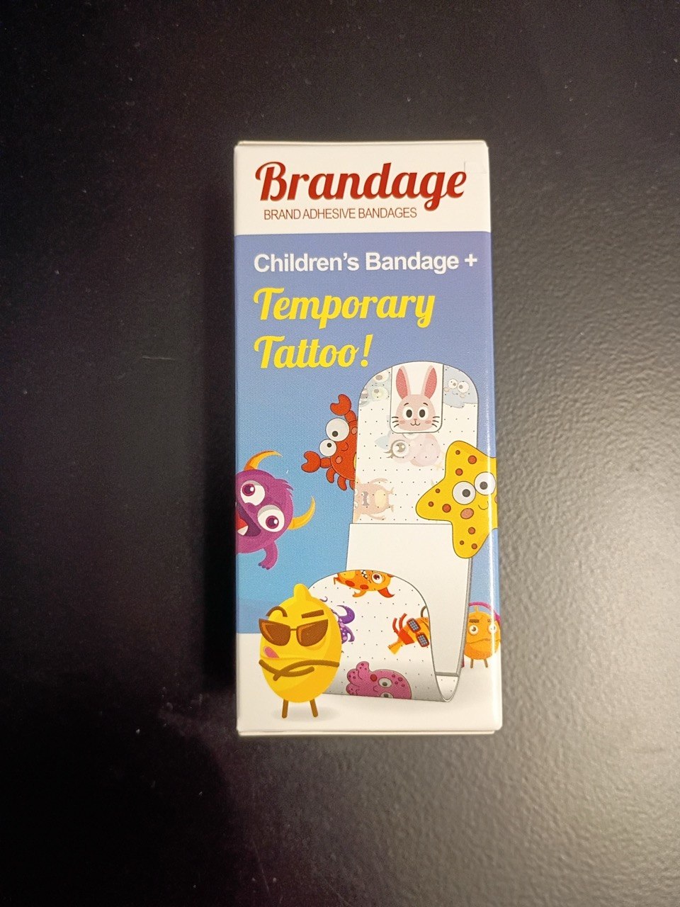
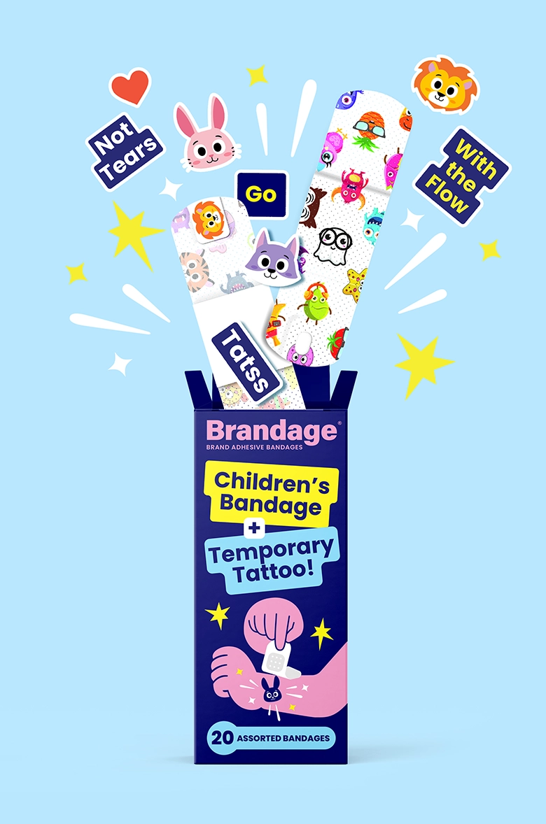
Brandage sells children’s adhesive bandages that come with temporary tattoos. The earlier box had a white top band with a red script logo, a light-blue gradient, and a mix of cartoon characters in different drawing styles around a picture of the bandage. The product idea was there, but the box looked like many other kids’ products, and the count of bandages wasn’t on the front.
The redesign keeps the Brandage name at the top and puts the two main messages, “Children’s Bandage” and “Temporary Tattoo,” in high-contrast color blocks so the idea reads at a glance. A deep navy background gives the box a calm, medical feel for parents, while yellow, pink, and light-blue accents and one consistent illustration style keep it fun for kids. The quantity, 20 assorted bandages, sits on its own at the bottom of the front, and the animal characters continue onto the bandages and tattoos inside, so the box and the product look like one family. The side panels show illustrated steps for applying the tattoos.
ZEBRA: a varnish line that looked dated
ZEBRA makes wood coatings and varnishes. The old packaging no longer looked modern next to competitors, didn’t work well across SKUs, and didn’t explain each product’s benefits.
We kept the ZEBRA logo and improved it with higher contrast and better placement, so it became the fixed anchor of the line. Each product now shows a material texture that tells you what it’s for, such as stone, wood, a boat, or parquet. Bold sans-serif type and a simple icon layout make the main benefits easy to read, and every version has a four-part benefits block for gloss, durability, drying time, and similar points. A black-and-white label structure ties the SKUs together and still lets each one stand apart.

Prix: one identity for six scents
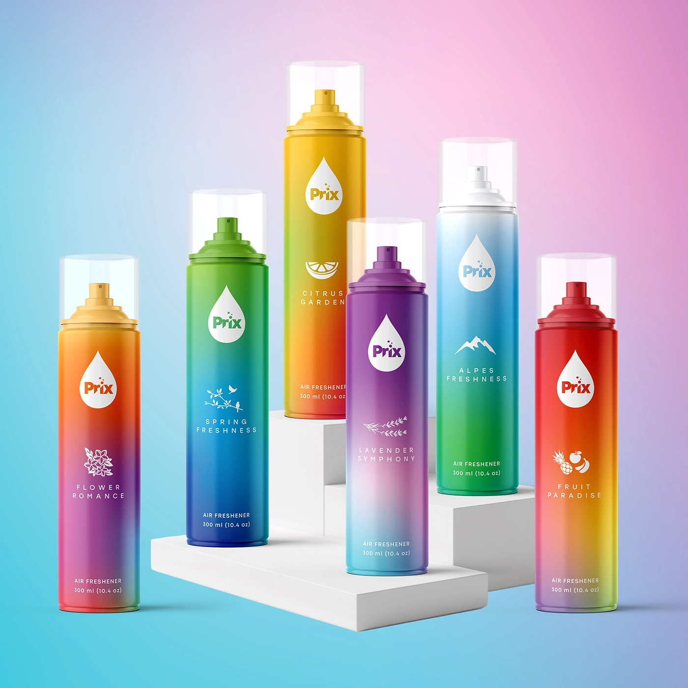
Prix sells aerosol air fresheners. Before the rebrand, the packaging had no consistent identity, so shoppers had trouble telling the brand apart and finding a scent.
We designed a new logo, a clean sans-serif inside a droplet shape, and made it the visual anchor on every can and size. Each of the six scents got its own color gradient and a small symbol: Citrus Garden in yellow-orange with a citrus slice, Lavender Symphony in purple-blue with a lavender sprig, Flower Romance, Spring Freshness, Fruit Paradise, and Alpes Freshness each with their own pairing. The color lets shoppers find a scent before reading the name.
Stepnoy: a dairy line organized by color
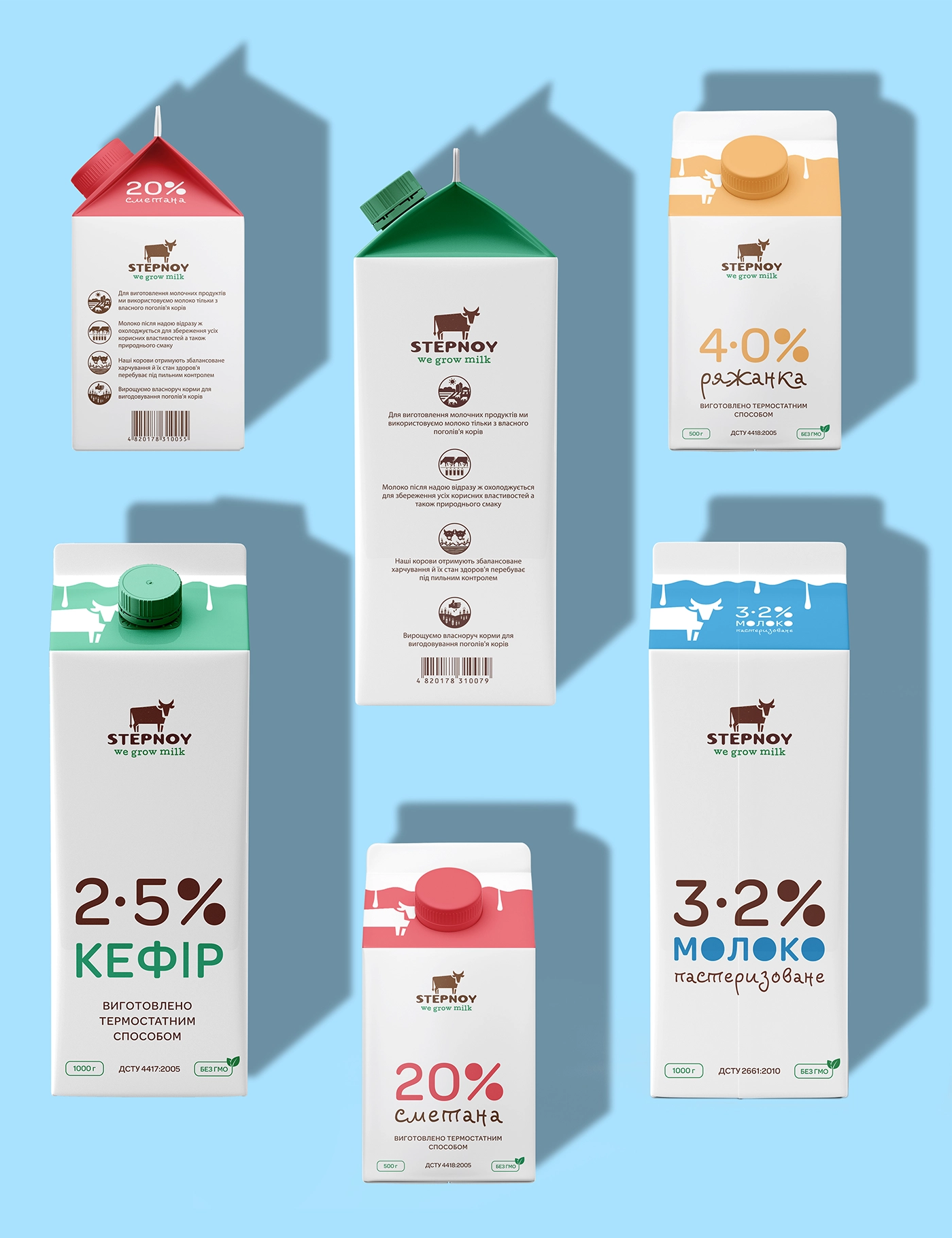
Stepnoy makes a full range of dairy products: milk, kefir, sour cream, yogurt, baked milk, and more. The brand’s idea is honesty and simplicity, so the system uses white as the base for the whole line. The challenge was to tell shoppers instantly what each product is and how much fat it has, and to stay recognizable when packs are stacked in small, cramped spaces.
The answer was color by product type: blues for milk, greens for kefir, pinks and reds for yogurt and sour cream, beige to orange for baked milk, with the shade getting deeper as the fat content rises. Brown type on white keeps everything readable. After the new packaging launched, the client reported a 34% increase in sales.
What successful redesigns have in common
Most of them keep at least one recognition asset. GoodPop kept its white box and Hot Pockets kept the logo shape, so regular buyers still had something familiar to look for. Prix is the exception among our examples: it had no consistent identity worth keeping, so a new one was the point.
Most of the changes are about shopping, not style. In the majority of these cases, the main change made the variety, the flavor, or the product type easier to find.
They often show the product better, as Hot Pockets did with its filling and Laoban with its dumplings.
They cut the front down to fewer claims and one main message, with the rest moved to the back.
And they work as a system, so new flavors or sizes can follow without a new design. Failures tend to break the first of these: they take away what shoppers used to find the brand.
How to plan your own packaging redesign
Start with the problem, in one sentence. “Shoppers can’t tell our flavors apart.” “We look like a store brand next to the new competitors.” “The pack doesn’t explain what the product is.” A clear problem tells the designer what to change and what to protect.
Then list your recognition assets: the logo shape, the color, the structure of the front, any character or icon. Decide which ones stay. Make that list part of the brief, together with photos of your shelf and your top competitors. The rest of what to include is in our packaging design brief guide.
Before you print, test. Put the new pack next to the old one and your competitors at real size and ask buyers of your product to find it. If you have the budget, a simple online preference test against the old design is worth running. Plan the rollout too: many brands add a small “new look” flag for a few months so loyal buyers know it’s the same product, and retailers need advance notice when the pack changes.
What a packaging redesign costs
A refresh that keeps the system and updates details costs less than a full redesign, and a rebrand with a new name and logo costs more. For the full price ranges, read what packaging design costs.
With our packaging design services, a redesigned system plus the first product costs from $2,500, and every further SKU in the line is about $800. Redesigning a six-SKU line comes to about $6,500 ($2,500 + 5 × $800). If the logo is redesigned too, add about $1,500. From ten SKUs there is a volume discount, so a ten-SKU line comes to about $8,000. A redesign includes three concepts and three rounds of revisions, and we’ll send you a fixed estimate within 1-2 business days after we see your current packs.
SOTDESIGN is a branding and packaging studio in Albany, New York. We’ve designed 80+ packaging projects over 10+ years for consumer brands across the US. We do design only, so your files are set up on the dielines your supplier provides, ready for whichever printer you pick.
ready to redesign your packaging?
keep what your buyers know, fix what gets in their way: design only, any printer
get quoteFAQ
01 What is a packaging redesign?
A packaging redesign changes the whole packaging system of an existing product: layout, imagery, color use, typography, and the order of information. Unlike a full rebrand, it usually keeps the brand name and at least some of the visual cues shoppers already know.
02 Do packaging redesigns increase sales?
They can. Measured examples include GoodPop (sales up 40%), Malk (up 56%), and Hot Pockets (up 39%) compared with the year before. But results depend on what the redesign fixed and what it kept, and redesigns that remove familiar cues can lose sales, as Tropicana’s did.
03 What is the difference between a refresh and a redesign?
A refresh updates details such as type, photography, and claims while keeping the layout, logo, and colors. A redesign rebuilds the packaging system, often with an updated logo and new imagery, while keeping the brand’s core recognition assets.
04 Why did the Tropicana redesign fail?
The 2009 carton removed the orange with a straw and the familiar layout, so regular buyers couldn’t find the product and some saw it as a generic store brand. Sales dropped within about two months, and Tropicana returned to the previous design.
05 Should you tell customers about new packaging?
Usually yes. A small “new look, same recipe” flag on the front for a few months helps loyal buyers recognize the product. Tell retailers in advance as well, so they can update shelf tags and planograms.
06 How much does a packaging redesign cost?
At SOTDESIGN, a redesign begins at $2,500, which covers the system and one product; each further SKU adds roughly $800. A six-SKU line is about $6,500, and a logo redesign adds about $1,500.