Brand Extension Examples: CPG Brands That Stretched Right (and Wrong)
A brand extension is when a company puts an existing brand name on a product in a new category: a coffee chain selling ice cream, a baking soda brand selling toothpaste, a tire company publishing a restaurant guide. The examples below come from consumer goods, because that is where extensions live or die fastest. A new product gets a few seconds on a shelf, and the pack either makes the connection to the parent brand obvious or it doesn’t.
We’ve sorted 16 examples into three groups: the ones that worked, the ones that failed, and the ones that are still argued about. For each one there is a short note on what the packaging had to do, because that is the part a founder can actually control. If you’re trying to decide whether your new product is an extension at all, start with our guide to line extension vs brand extension: a new flavor or size is a line extension and a much smaller job.
What makes a brand extension work
Four things show up in almost every success on this list:
- A believable link. The new product uses something the brand is already known for: an ingredient, a flavor, a skill, a feeling.
- A category that wants the brand. Shoppers in the new aisle should be glad to see the name there. If the name puzzles them, the aisle is wrong.
- A pack that borrows the right assets. Logo, color, and a signature element travel; the format follows the new category’s rules.
- A product that holds up on its own. The brand gets the first purchase. The product has to earn the second.
The failures usually miss the first point, and no amount of packaging fixes that.
Brand extensions that worked
Dove: from a bar of soap to a full bathroom shelf
Dove started in 1957 as a single beauty bar with a moisturizing claim. Starting in the 1990s Unilever carried the name into body wash, deodorant, and hair care, and in 2010 into a men’s line, Dove Men+Care. The link was the same every time: mildness and moisture. The packaging kept the dove silhouette and the soft white-and-blue palette on every format, so a shopper who trusted the bar recognized the shampoo without reading the label. The men’s line changed the palette to gray and darker blue but kept the bird, which is the textbook way to extend to a new audience without losing the parent.
Arm & Hammer: one ingredient, many aisles
Arm & Hammer is the example marketing classes use most, and for good reason. From baking soda the brand went into detergent, toothpaste, deodorant, and litter, and buyers accepted each move because the ingredient already stood for odor control and cleaning in their minds. The red arm-and-hammer roundel on its yellow field is the glue. It sits in the same place on a toothpaste tube and a litter box, and the words “baking soda” appear on nearly every pack as the reason to believe.
Tostitos: the chip brand that sells the dip
Frito-Lay took Tostitos, a tortilla chip, into jarred salsa and queso in the 1990s. This is the companion-product kind of extension: the two products are used together, so the shelf placement and the purchase are natural. Salsa jars sit in a different aisle from chips, with different formats and labeling rules, so the jar had to look like salsa first and Tostitos second. The brand carried over through the logo and its red-and-yellow colors, and the store often solved the rest by stacking the jars next to the chips.
Reese’s: from candy to the cereal aisle
Reese’s Puffs, launched by General Mills in 1994 under license from Hershey, is a candy brand living in a cereal box. The link is the flavor, peanut butter and chocolate, and the box leans on it hard: the orange Reese’s color, the logo, and a bowl shot that looks like the cup. The pack is a cereal pack in every other way, with the panel, the nutrition facts, and the family-size format the category expects. That balance is the lesson. The cereal shopper needs a cereal box; the Reese’s fan needs to spot the orange from across the aisle.
Starbucks: bottled coffee and the grocery freezer
Starbucks took its name from the cafe into the grocery store in stages: bottled Frappuccino through a partnership with PepsiCo formed in 1994 (the bottles reached stores in 1996), ice cream with Dreyer’s in 1996, and from 1998 packaged whole-bean and ground coffee sold in supermarkets. Each move borrowed the green siren and the cafe cues, and each one sat in a category with its own rules: a chilled bottle, a pint, a coffee bag. What made the extension credible was that the brand already meant “coffee done a certain way.” The packaging job was to make a grocery product feel like the cup from the counter.
Oreo: the cookie that became a cereal
Oreo O’s, a Post cereal introduced in 1998, turned a cookie into breakfast. Oreo’s assets are unusually strong, the black-and-white cookie, the blue background, the embossed pattern, and the cereal box used all of them. It worked because the product looked and tasted like the cookie, which is the point of a flavor-led extension. Oreo later did the same with ice cream, milkshakes, and dozens of partnerships, and the rule held: keep the cookie visible, let the host category decide the format.
Michelin: tires and a restaurant guide
Not a food example, but one of the oldest extensions most people have heard of. Michelin published its first guide in 1900 to encourage motoring in France, and therefore tire sales. Over a century later the guide is a brand of its own, and the link between a tire company and fine dining feels strange only if you forget the original logic. The lesson for a small brand is that a link can be indirect, as long as it is real and the extension does its job well.
Hershey’s: from bar to syrup to baking shelf
Hershey’s chocolate syrup dates to the 1920s; the brand already sold cocoa, and later added baking chips and chocolate milk. This is the “same ingredient, new use” route, and the packaging makes it easy to follow: the Hershey’s wordmark and its brown field, consistent across a bar, a syrup bottle, and a bag of chips. For a food founder this is the most common type of extension to copy, because the new product is often made from the same thing you already make well.
Brand extensions that failed
Colgate Kitchen Entrees
The frozen lasagna in the viral photos was never sold; Colgate’s real test, in 1964, involved dried “Colgate Kitchen” entrees in one test market, withdrawn quickly. We covered the story in our line extension vs brand extension guide, and the packaging note is simple: a toothpaste wordmark on a dinner box makes people think of toothpaste. No typography fixes that association.
Harley-Davidson cologne
In the 1990s Harley-Davidson licensed its name onto a wide spread of products, including cologne and perfume. Riders and fans did not want to smell like the brand, and the fragrance line is now a standard example of stretching too far. The packaging was conventional for a fragrance, which was part of the problem: a bottle on a store counter had nothing of the motorcycle in it beyond the logo. When the only connection is a name, the pack is doing all the work, and a logo alone cannot carry a category jump this wide.
Cosmopolitan yogurt
In 1999 the magazine’s publisher put the Cosmopolitan name on a line of yogurts sold in the UK, through a joint venture with the dairy company MD Foods. It was pulled within about two years. The thinking was that the magazine’s readers bought yogurt; the problem was that the magazine had nothing to say about food, and a magazine-style pot in a dairy case did not read as a yogurt anyone trusted. Buyers in a chilled aisle look for cues of freshness and taste, and a media brand offers neither.
Frito-Lay Lemonade
Frito-Lay is often cited for a short-lived lemonade, on the logic that salty snacks make people thirsty. The link was literal but the wrong way around: the name made shoppers think of chips, which is not what you want on a cold drink. It disappeared quickly. The lesson is that an association can be strong and still unhelpful, and that the parent’s packaging cues, in this case a snack logo, can actively hurt in a beverage cooler.
Life Savers soda
In the 1980s Life Savers put its name on a line of fruit-flavored sodas. Taste tests reportedly went well, but the product did not sell. People knew exactly what Life Savers tasted like, and that is what they expected from a can: candy in liquid form, which is not what most people want to drink. A strong flavor identity is an asset in confectionery and a trap in a category that wants refreshment.
Zippo perfume
Zippo launched a fragrance line in 2010, with bottles shaped like the lighter. The packaging was clever and the link was purely visual. The brand means durability and fire, and neither of those is a reason to buy a perfume. Clever structure is not the same as a believable reason, and a flip-top bottle on a fragrance counter spoke to collectors more than to perfume buyers.
The ones that are still argued about
Cheetos Mac ‘n Cheese
Frito-Lay launched Cheetos-flavored boxed macaroni and cheese in 2020, first at Walmart, then wider. The link is the cheese dust everyone knows, and the box uses the orange and the Chester Cheetah mascot straight from the bag. It launched to a lot of attention and still sits in the pasta aisle, but critics point out that it is up against Kraft and Annie’s in a category they own, and that novelty-led extensions often fade. Either way it is a clean example of how to design the pack: borrow the color and the character, follow the box format of the host category exactly.
Tide Dry Cleaners (now Tide Cleaners)
Procter & Gamble put the Tide name on a franchised dry cleaning chain, which is a service extension instead of a product. The orange bullseye on a storefront is instantly recognizable, and the link, clean clothes, is obvious. Whether a detergent brand belongs in retail services is the part that is still debated, and after more than fifteen years it is still a chain of a few hundred stores. It shows that a brand can be strong enough to carry almost anywhere and still not be the right owner of a category.
Types of brand extensions in one list
Most examples above fall into one of these:
- Same ingredient or recipe, new form (Hershey’s syrup, Arm & Hammer): the easiest to make credible, because the reason to believe is on the label.
- Companion product (Tostitos salsa, a pasta brand’s sauce): bought together, often shelved together, low risk.
- Same flavor, new category (Reese’s Puffs, Oreo O’s, Cheetos Mac ‘n Cheese): works when the flavor is the brand.
- Same benefit, new category (Dove): the promise travels even when the product is different.
- Same occasion (Starbucks at home): the brand follows the moment from one channel to another.
- License and merchandise (Harley-Davidson, Cosmopolitan, Zippo): the name is licensed out and someone else makes the product, and this is where most of the famous failures sit.
How to test an extension before you design anything
Packaging is the last step, and an expensive one if the idea itself is wrong. Before you brief a designer, answer these in writing:
- Say the link in one sentence. “Our granola brand is launching a nut butter because our buyers already trust our nuts.” If the sentence needs a paragraph, the link is weak.
- Walk the new aisle. Stand in front of the shelf where the product will sit. Note the formats, the price points, and the colors already there. Your pack will have to belong here first.
- Ask ten current customers. Not whether they like the idea, but whether they would pick your brand over the one they buy now in that category, and why.
- Check what you can’t reuse. The dieline, the required label panels, and often the claims will be different. Budget for a new structure instead of an adapted one.
- Decide what happens if it fails. A failed extension can dent the parent brand. Dove’s risk was small because each new product fit; Harley’s was bigger because the fragrance contradicted the brand.
If the idea passes, write it into a proper packaging design brief so the designer knows which assets must travel and which category rules now apply.
What travels on the pack, and what doesn’t
Across the successful examples, the same assets move from parent to extension:
- the logo or wordmark, in its usual place;
- one signature color (Reese’s orange, Tide orange, Starbucks green);
- a signature element: a mascot, a pattern, a product shot that looks like the original.
What changes is the format and the information architecture, because those belong to the new category. A cereal box has a front panel, a side panel, and a nutrition facts panel in expected places; a jar of salsa has a round label with a claim, a flavor, and a heat level. The extension borrows identity and obeys format.
taking your brand into a new category?
send us the parent packaging and the new product: we’ll show how the identity carries over · fixed estimate in 1-2 business days
get quoteRange systems from our work
Our own projects are usually line extensions and range systems, which is where most small brands actually live, with the occasional step into a neighboring category. They show the same rule: a fixed brand block, a flexible zone for what changes.
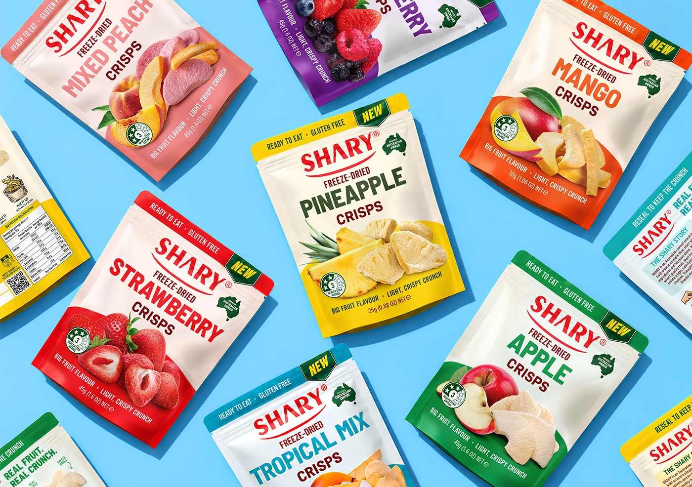
The SHARY freeze-dried fruit crisps redesign is the clearest case of that rule at work. Seven flavors, from strawberry and mango to a tropical mix, share one white pack with a larger SHARY logo and the same photographic idea, fresh fruit next to the freeze-dried pieces, while color-coded top and bottom panels do all the separating: red for strawberry, yellow for pineapple, purple for mixed berry, and so on. The brief was a refresh that kept the recognition the brand already had, and the result is a range that an eighth or ninth flavor can join without a new design. If SHARY ever stepped into a neighboring category, say a fruit powder or a snack bar, that color logic and the fruit-plus-crisp photography are the assets that would travel.
For Fishtime, a frozen fish and seafood brand with more than twenty products, we built one concept around a lighthouse, fjords, and calm water, and let product names and images separate the SKUs. The system was designed to absorb new products without a redesign, which is what a range needs if the company later moves into a neighboring category like ready meals.

Nature’s Crunch started with five flavors of mixed veggie crisps in stand-up pouches. The sweet potato crisps that followed added a new product and a new format, a pouch plus a six-count carton, and the brand block and photography style carried over so the two products read as one family on the shelf.
Chocolate Mouth uses seasonal and themed boxes, which is the small-brand version of an extension: the same chocolate, a new occasion, a new structure. The logo and the hand-drawn style stay put while the illustration changes, so the holiday box is clearly the same maker.

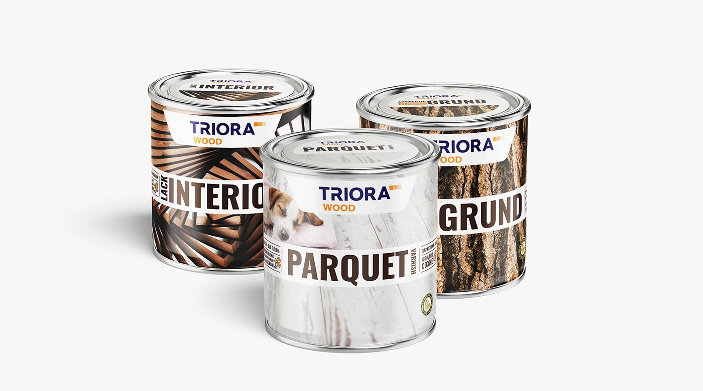
TRIORA WOOD is outside food: premium coatings with several subcategories on one shelf, next to the company’s other trademarks. Photographs of the actual materials, a disciplined type scale, and icon infographics give each subcategory its own look inside one system, which is exactly the problem a brand faces when it extends into a sibling category.
What extension packaging costs to design
Through our packaging design services, a product entering a new category usually needs its own packaging system: $2,500 covers the first SKU, and each further variant adds about $800. If the extension stays inside an existing system, the work is closer to adding a SKU. Our packaging design cost guide breaks the ranges down by format and scope. A logo or brand refresh that comes with the extension is a separate line.
SOTDESIGN is a packaging and branding studio based in Albany, New York. We have designed 80+ packaging projects for consumer brands over 10+ years, and we work only on design: your files go to any printer or manufacturer you choose. If you are planning an extension of your own, SOTDESIGN works as a packaging design agency for food and beverage brands and maps the whole range before anything goes to print.
have a product that needs the family look?
brief us on the parent brand and the new category · design only, files for any printer · estimate in 1-2 business days
get quoteFAQ
01 What is a brand extension?
A brand extension uses an existing brand name on a product in a different category. Dove moving from bar soap into shampoo is a brand extension. A new flavor of the same product is a line extension.
02 What is the most successful brand extension?
Arm & Hammer and Dove are the cases cited most often, because they stretched across many categories over decades with the same believable link each time. Reese’s Puffs and Tostitos salsa are strong examples inside food.
03 Why do brand extensions fail?
Usually because the link between the brand and the new category is missing or points the wrong way, as with Frito-Lay Lemonade or Colgate’s food test. A brand that stands for one taste or one job struggles when the new product asks people to forget that.
04 Does a brand extension need new packaging?
Yes. The new category has its own formats, label rules, and shelf conventions, so the structure is usually new. What carries over is the identity: logo, color, and a signature element.
05 How much does packaging for a brand extension cost?
At SOTDESIGN a new packaging system starts at $2,500 for the first SKU, with each added variant around $800. The exact number depends on format and how much of the parent system can be reused.
06 How is a brand extension different from a line extension?
A line extension adds a variant inside the same category: flavor, size, format. A brand extension moves into a new category. Our separate guide compares the two in detail.