
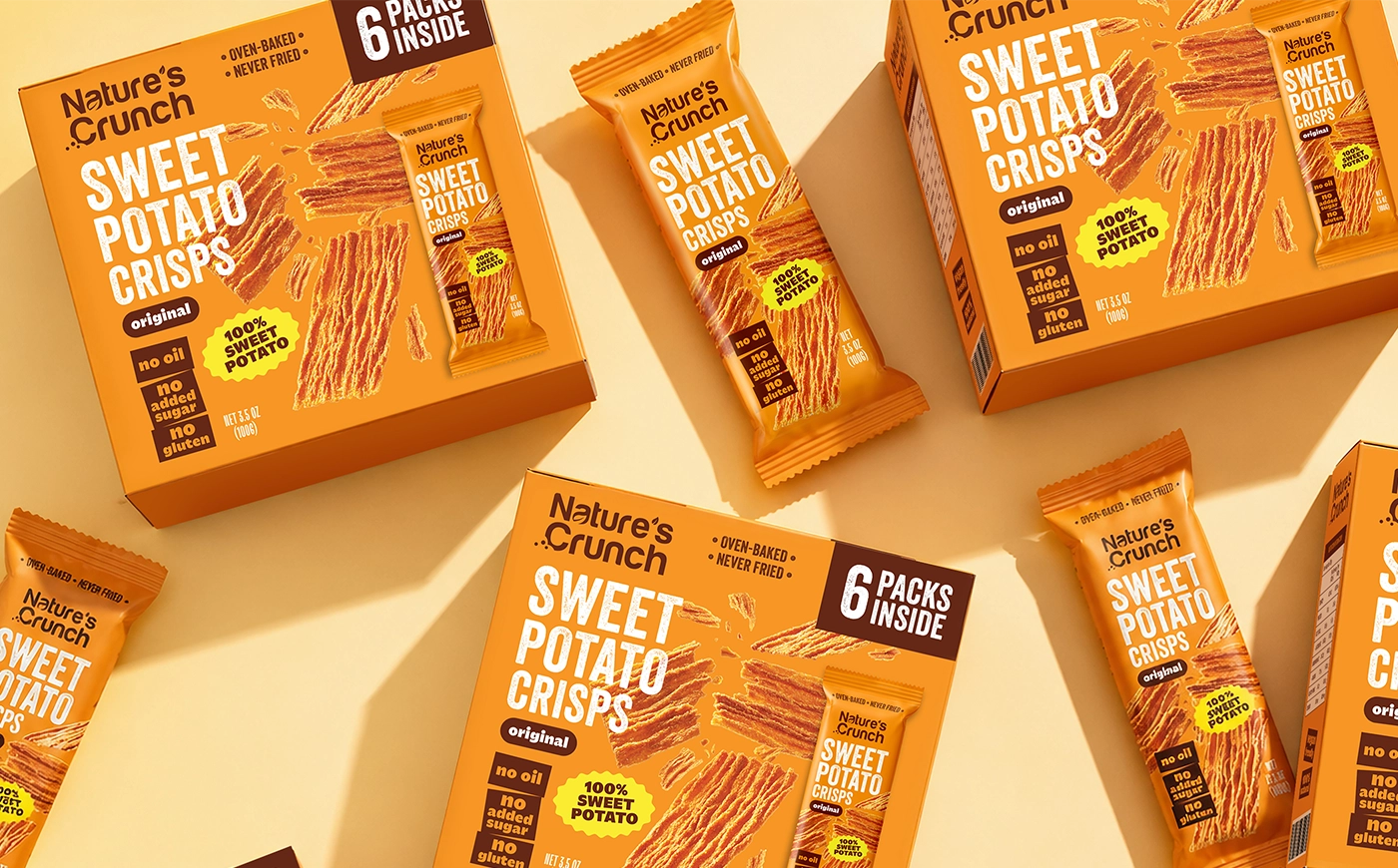
Sweet Potato Crisps Packaging Design
concept
Nature’s Crunch Sweet Potato Crisps are a simple, naturally colourful snack made from 100% sweet potato. The packaging concept uses a bold orange palette, oversized typography and appetising product photography to communicate the product clearly and create a strong, energetic presence on the shelf.
challenge
The goal was to create a bold and modern package that customers could understand within seconds. The design needed to make the product name immediately visible, highlight the main benefits and show the crispy texture of the snack. It also had to work consistently across two different formats: an individual pack and a retail box containing six packs.
solution
We created a clear packaging system built around a saturated orange colour, high-contrast typography and dynamic images of the sweet potato crisps. The design makes the product easy to recognise while giving it a warm, appetising and memorable identity. The same visual language was adapted to the six-pack box, creating a consistent presentation across both packaging formats.
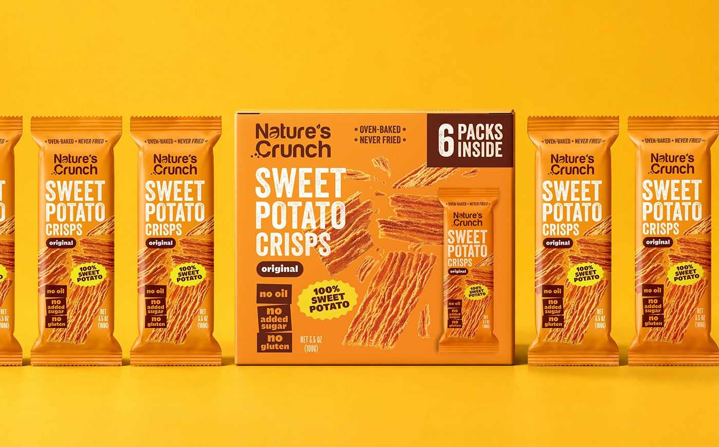
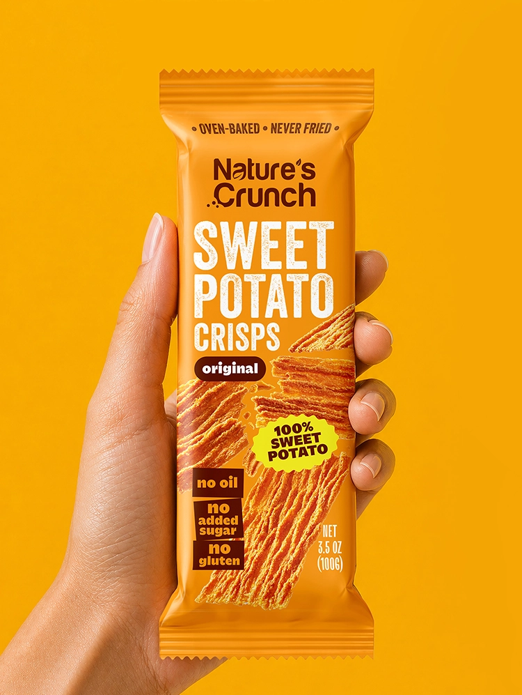
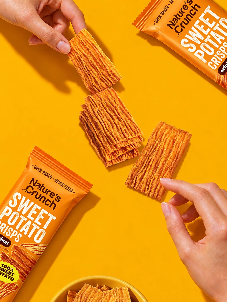
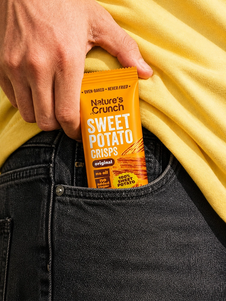
Snack packaging has only a few seconds to attract attention. We created a clear front-of-pack hierarchy that guides the eye from the Nature’s Crunch logo to the product name, Original flavour and key product benefits. The narrow vertical format of the individual pack is used efficiently. The large product name occupies the centre of the design, while the claims and product information are grouped into compact, high-contrast blocks. The main messages—including “Oven-Baked,” “Never Fried,” “100% Sweet Potato,” “No Oil,” “No Added Sugar” and “No Gluten”—are easy to find without making the packaging feel overloaded. Product photography plays a central role in the design. The crisps are shown in different sizes and positions, with broken pieces and crumbs adding movement and energy. The detailed texture of the product makes the crisps look light, crunchy and appetising. By allowing the product images to move around and partially overlap the typography, the composition feels more dynamic while keeping the information clear. This visual approach helps customers understand the product’s texture and imagine the eating experience before opening the pack.
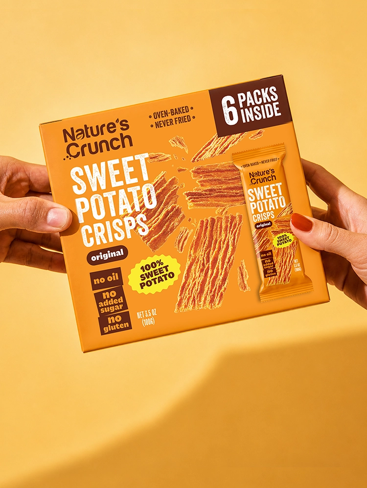
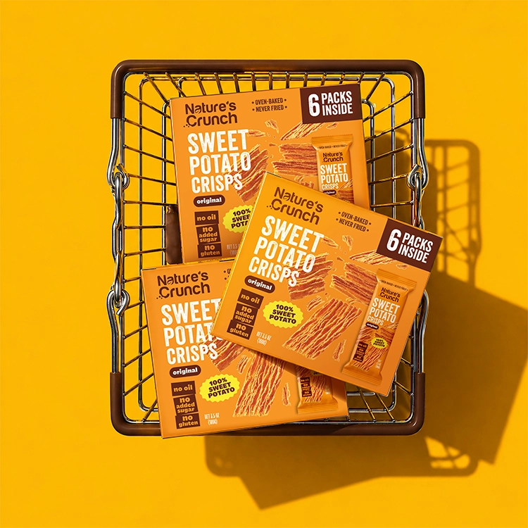
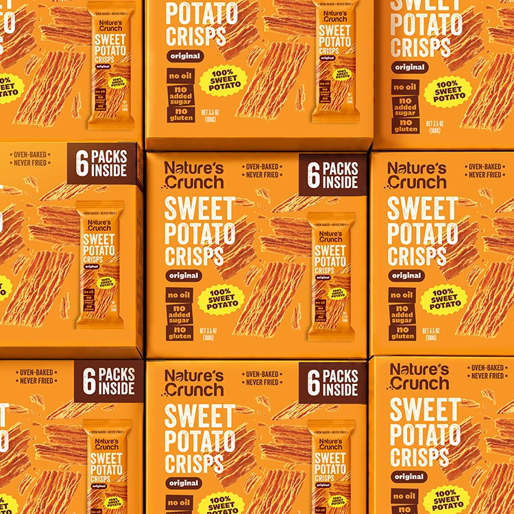
In addition to the individual package, we developed a retail box containing six packs. The box continues the same orange palette, bold typography and product-focused imagery, making both formats immediately recognisable as part of the same brand. A high-contrast “6 Packs Inside” panel makes the quantity easy to understand, while an image of the individual pack clearly shows what customers will find inside the box. The wider surface of the carton allowed us to create a more expansive product composition while preserving the same hierarchy and visual character as the individual packaging
project overview
The final design gives Nature’s Crunch Sweet Potato Crisps a bold and memorable shelf presence. The bright orange colour creates instant product recognition, large typography communicates the product quickly, and dynamic photography highlights its crispy texture.
The result is a clear and flexible packaging system that works consistently across the individual pack and six-pack retail box while making the product look simple, modern and appetising.
relevant services
- packaging design
- label design
- beverage design
- food packaging design