
Mixed Veggie Crisps Packaging Design
concept
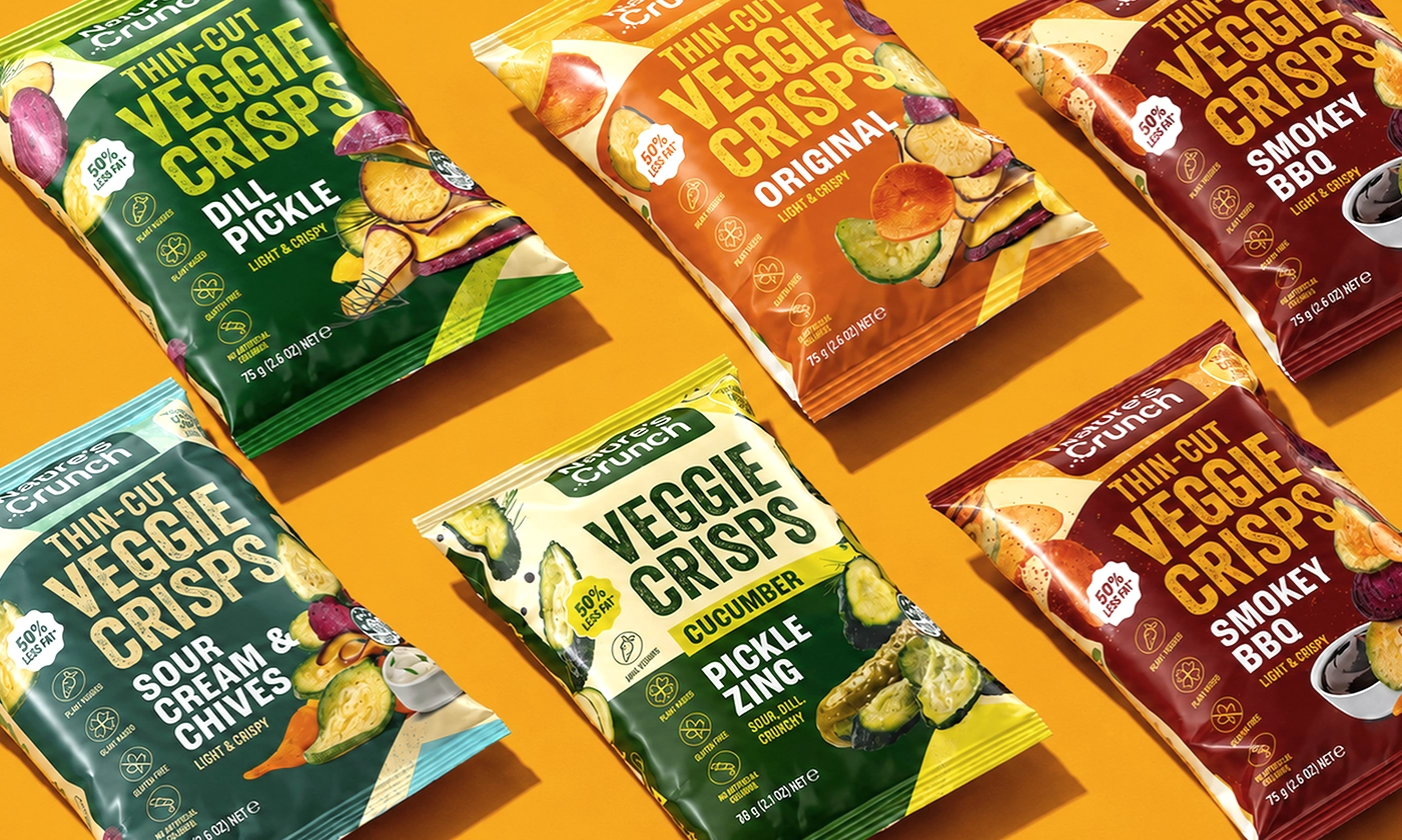
Nature’s Crunch is a range of light and crispy vegetable snacks created for modern, flavour-driven consumers. The packaging concept combines bold typography, vibrant colours and appetising product photography to make the crisps easy to notice, understand and choose at first glance.
challenge
The goal was to create a strong packaging system for five SKUs that would stand out in the busy snack aisle while keeping the range visually consistent. Each flavour needed its own clear identity, and the packaging had to communicate the product type, flavour and key benefits quickly without making the design feel crowded., challenge
solution
We created a bold and flexible packaging system based on strong flavour colour-coding, a clear information hierarchy and dynamic product compositions. Each SKU has its own colour palette while sharing the same layout, typography and visual structure. The result is a bright, modern range that feels connected as a family and is easy to recognise on shelf., solution
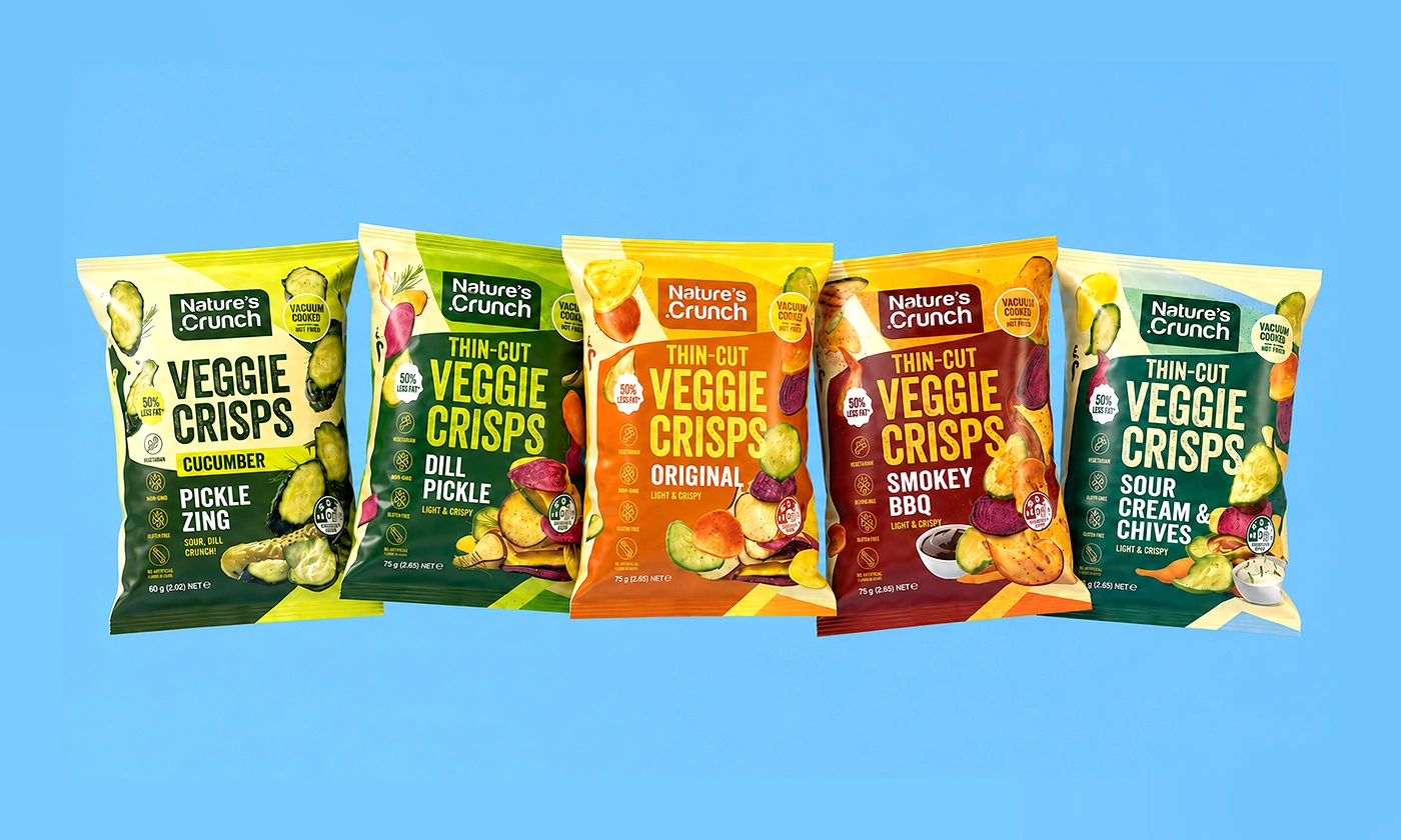
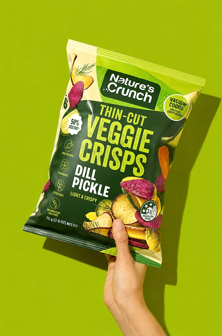
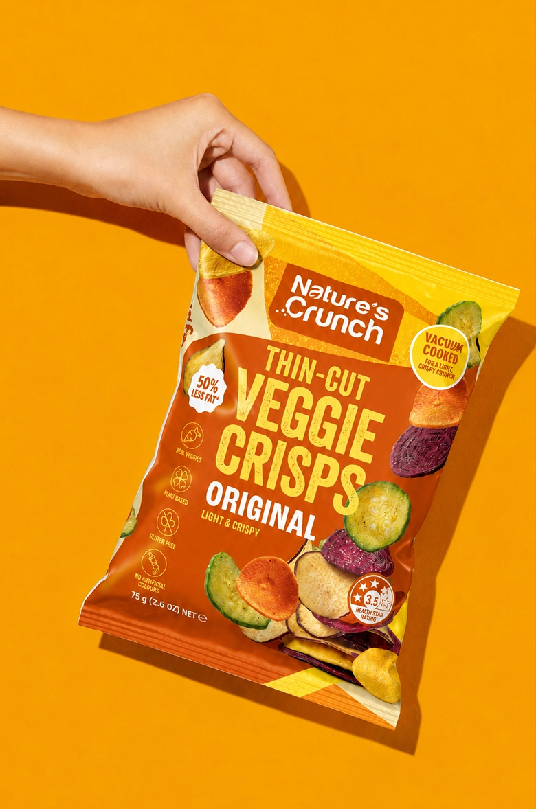
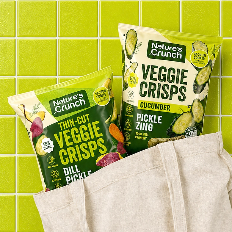
The collection includes five distinctive SKUs: Original, Dill Pickle, Smokey BBQ, Sour Cream & Chives and Cucumber Pickle Zing. One of the main challenges was to give each variety its own personality while keeping the complete range visually consistent. The packaging needed to achieve: strong shelf impact, clear flavour differentiation, easy-to-read product information, appetising product presentation, a flexible system that could be extended to future flavours. Each SKU has its own colour identity inspired by its flavour. Warm orange supports Original, deep red gives Smokey BBQ a rich and smoky character, vibrant green makes Dill Pickle feel fresh and tangy, cool blue-green distinguishes Sour Cream & Chives, and bright lime helps Cucumber Pickle Zing feel especially crisp and refreshing. Although every pack is different, the repeated structure, typography and graphic elements connect all five products into one recognisable brand family.
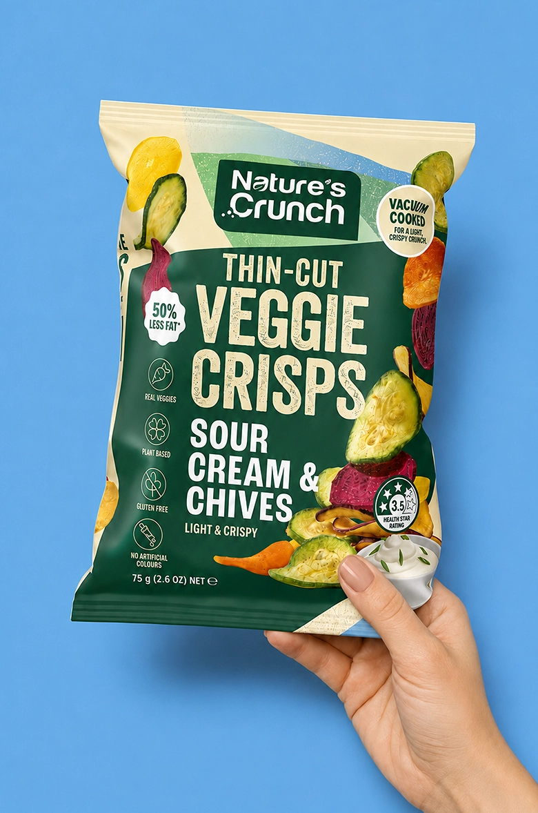
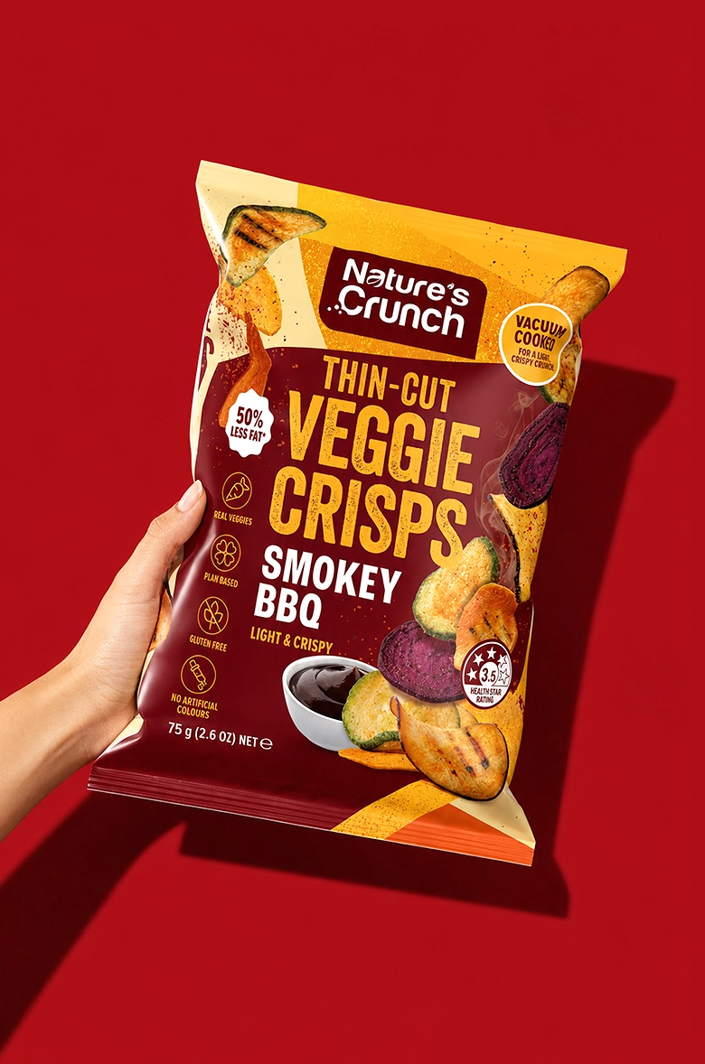
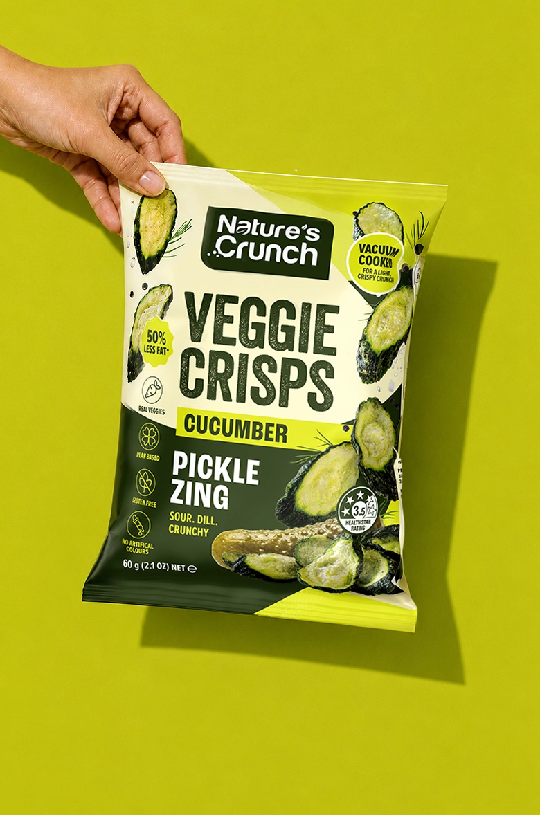
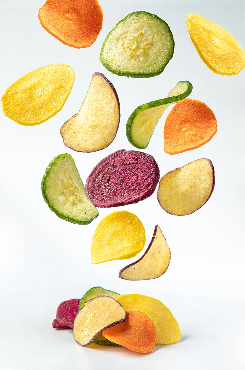
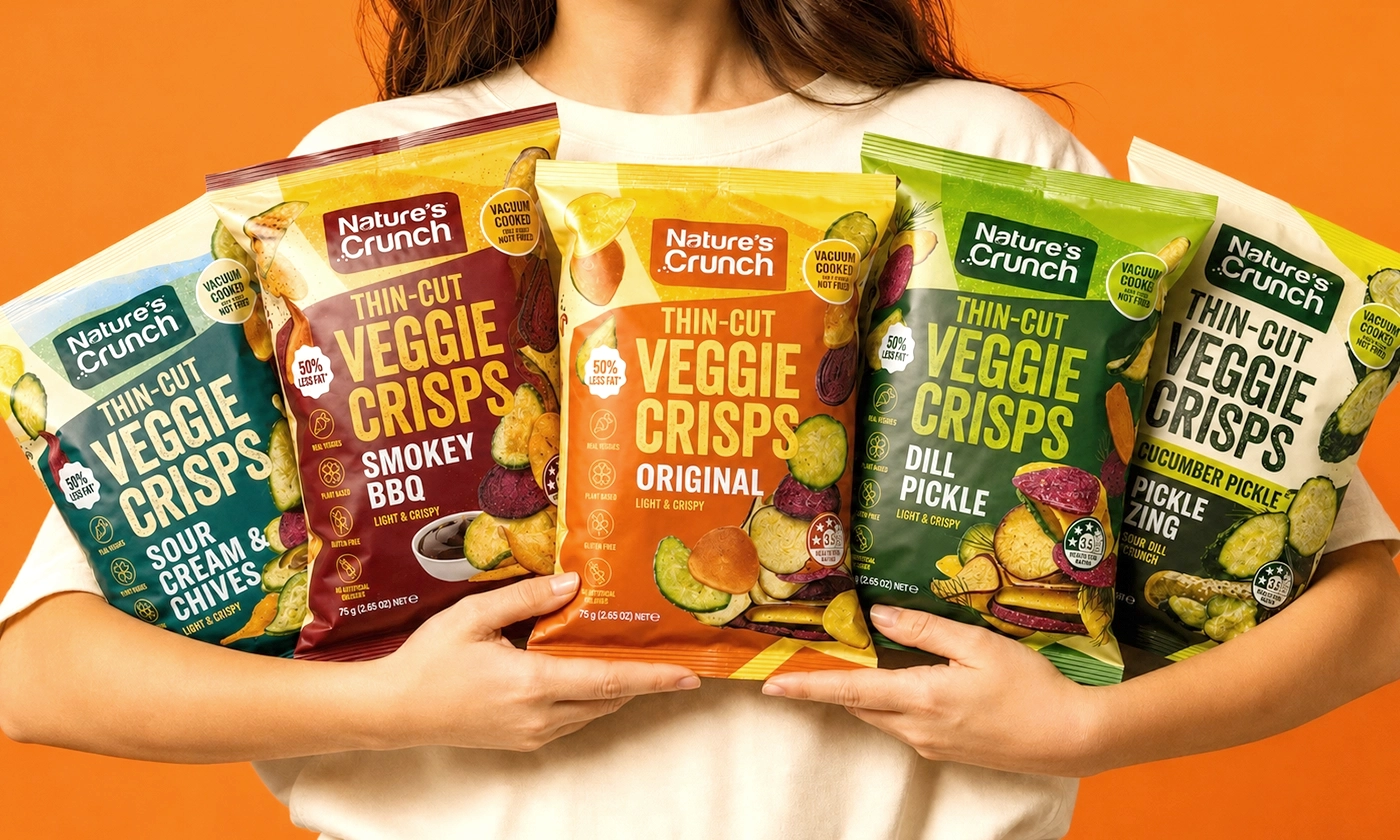
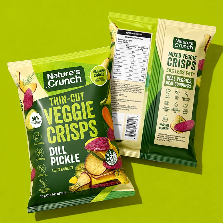
Snack packaging has only a few seconds to attract attention. We created a strong front-of-pack hierarchy that leads the eye from the Nature’s Crunch logo to the product name, flavour and key benefits. The large “Veggie Crisps” title creates visibility from a distance, while high-contrast flavour names help customers quickly find their preferred option. Bright colour blocks make the range easy to navigate and create a strong visual rhythm when several packs are displayed together. Dynamic compositions of vegetables, individual crisps and flavour ingredients bring movement and appetite appeal to the design. The product visuals highlight the colour, texture and crunch of the snacks, helping customers imagine the experience before opening the bag. The packaging needed to communicate several important product benefits while remaining easy to read. We organised the claims into a simple system of icons and badges that supports the main design without competing with the product name. The back of the pack continues the same visual language, combining product information, nutrition details and brand messaging within a clean and consistent layout.
project overview
The final Nature’s Crunch range feels bright, modern and full of flavour. Bold typography gives the packaging strong shelf presence, colour-coding makes the five SKUs easy to navigate, and dynamic product photography highlights the light and crispy texture of the snacks.
The result is a clear and memorable packaging system that positions Nature’s Crunch as a modern international snack brand and gives customers the information they need at first glance.
relevant services
- packaging design
- label design
- beverage design
- food packaging design