
Freeze-Dried Fruit Crisps Packaging Redesign
concept
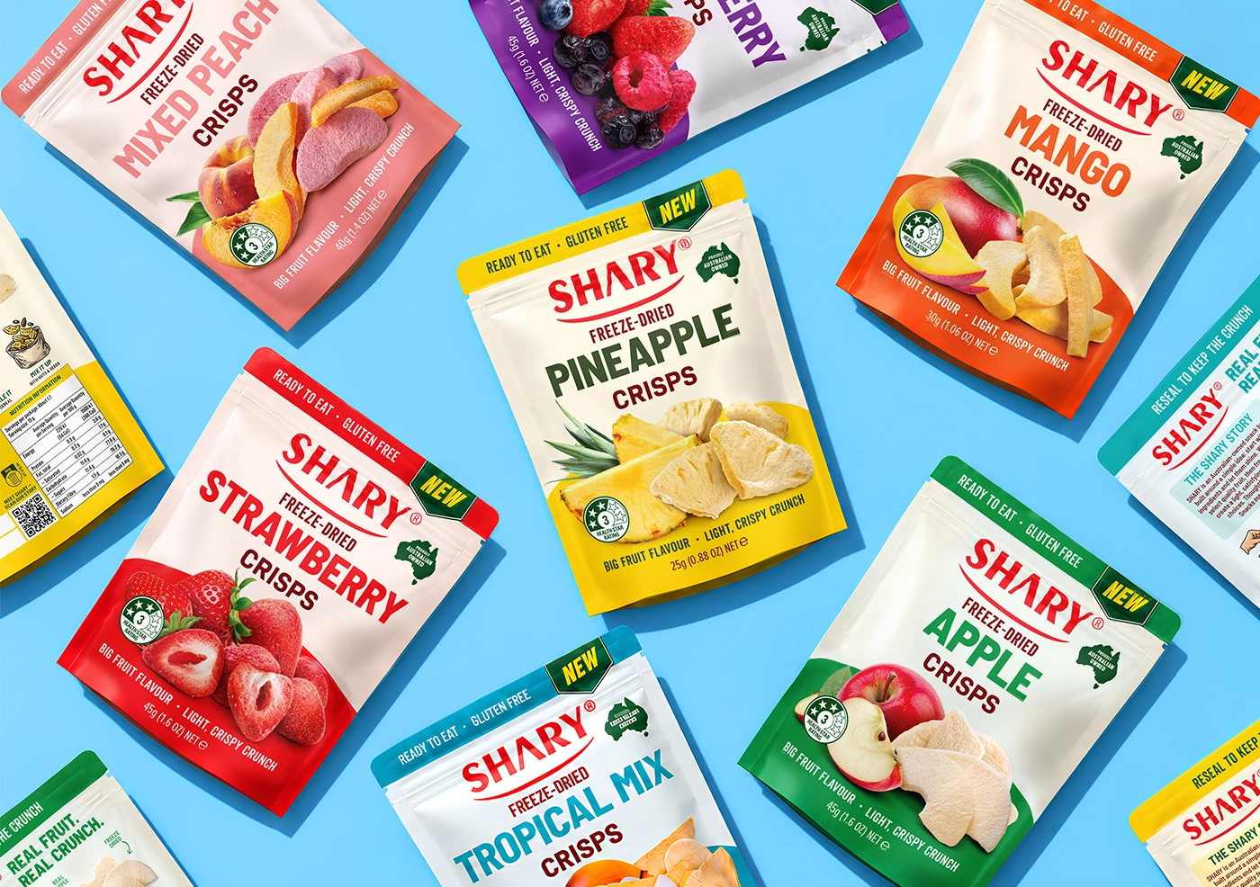
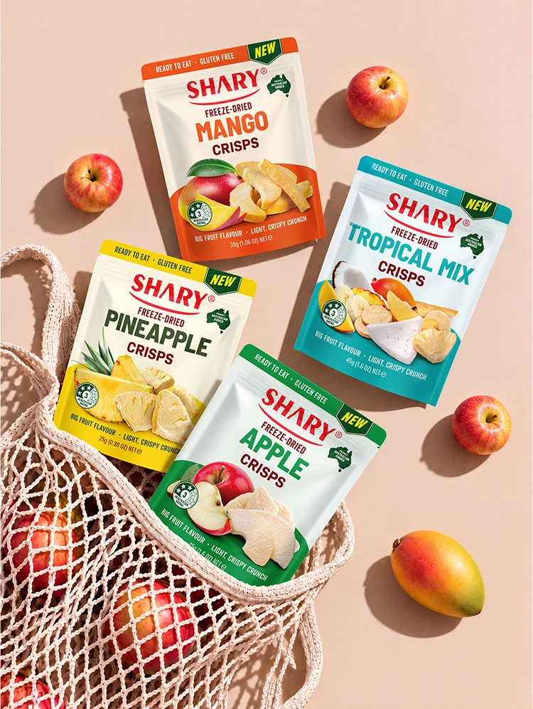
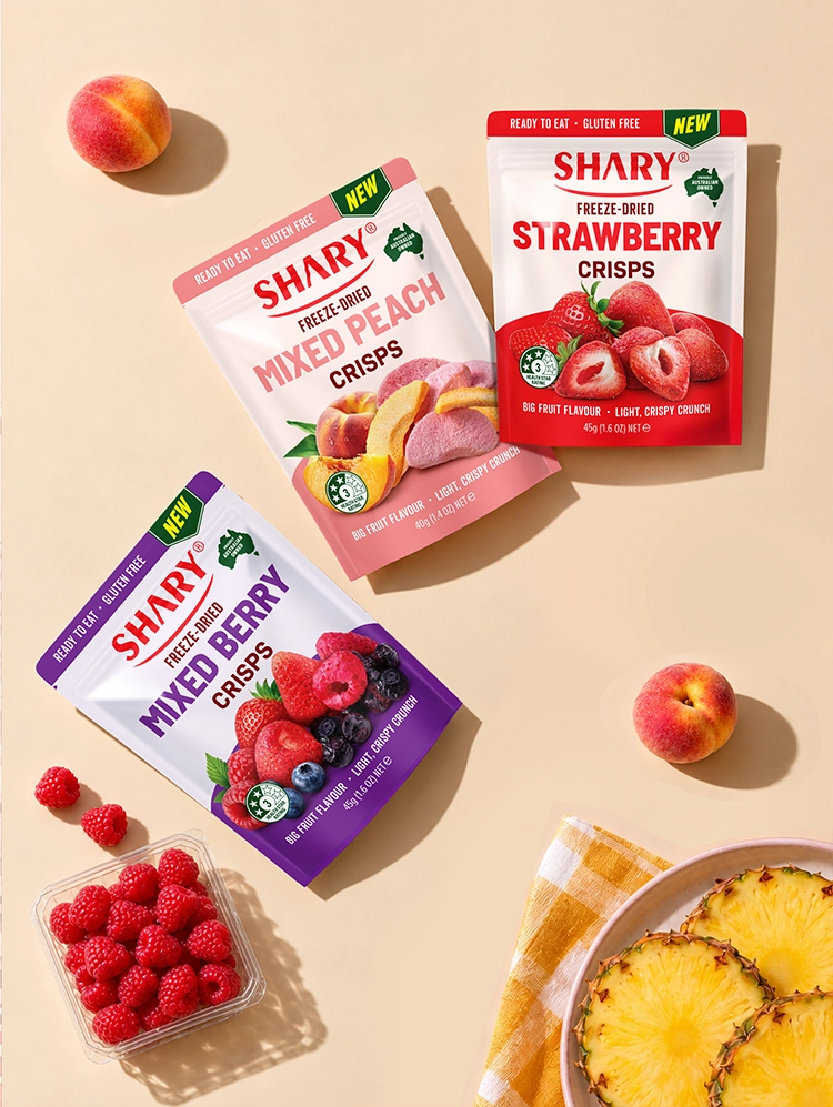
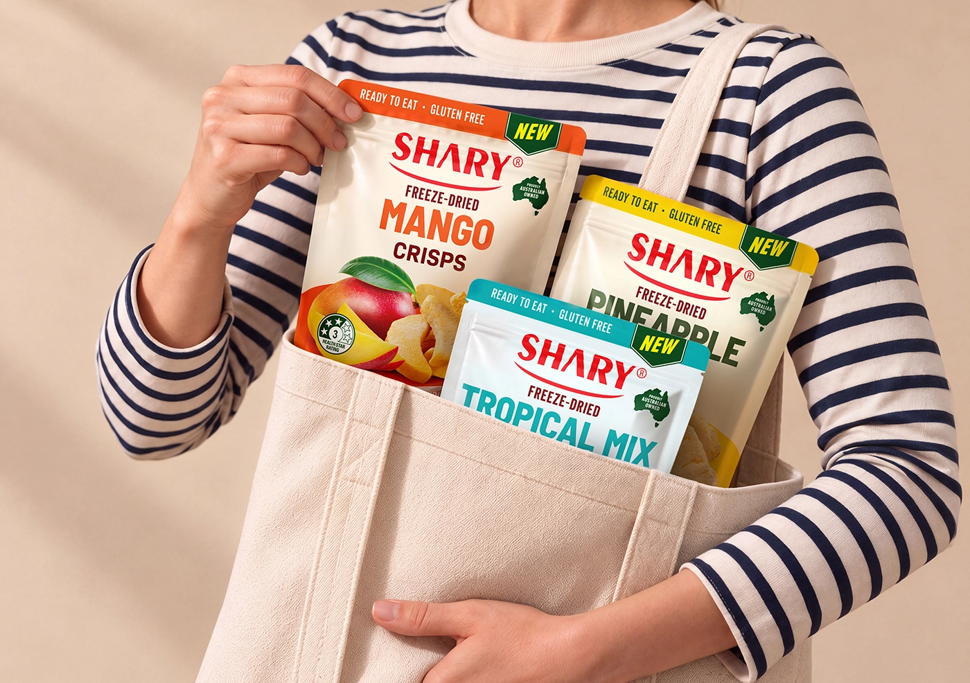
SHARY Freeze-Dried Fruit Crisps are a colourful range of light, crunchy snacks made from real fruit. The redesign combines bold flavour colours, clear typography and appetising photography to make all seven products easy to recognise and choose. A consistent visual system connects the range, while colour coding gives each flavour its own distinctive identity.
challenge
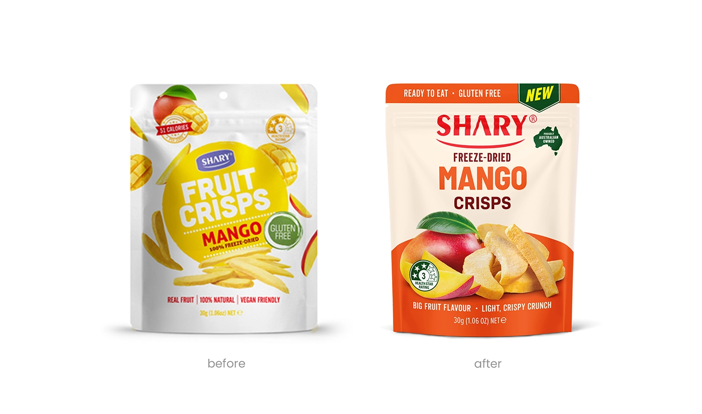
The goal was to refresh the existing SHARY packaging while preserving its established brand recognition. Each pack needed to communicate the brand, freeze-dried format, flavour and crispy texture within seconds. At the same time, the seven varieties had to look distinctive individually, work together as one connected range and remain easy to navigate on a busy retail shelf.
solution
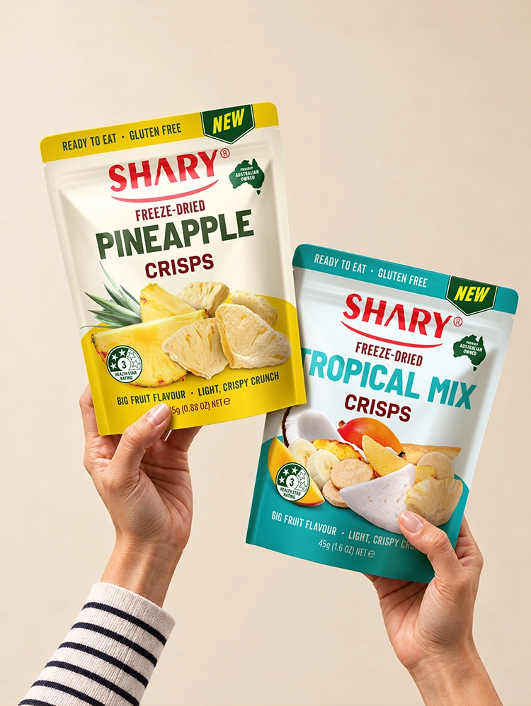
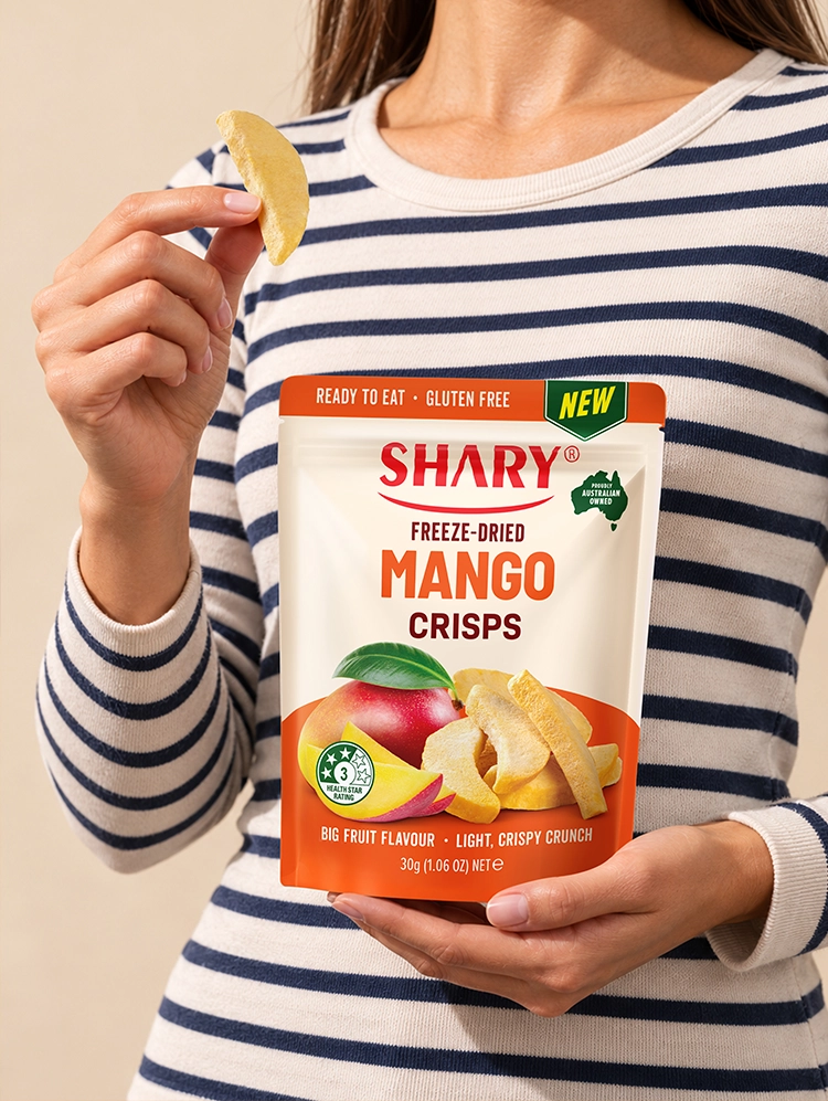
We created a clean packaging system built around a larger SHARY logo, prominent flavour names and colour-coded panels. Fresh fruit is paired with freeze-dried pieces to communicate both the ingredients and the light, crunchy texture. A clear front-of-pack hierarchy organises the main product information and supporting messages, keeping every pack easy to understand without making the design feel overloaded.
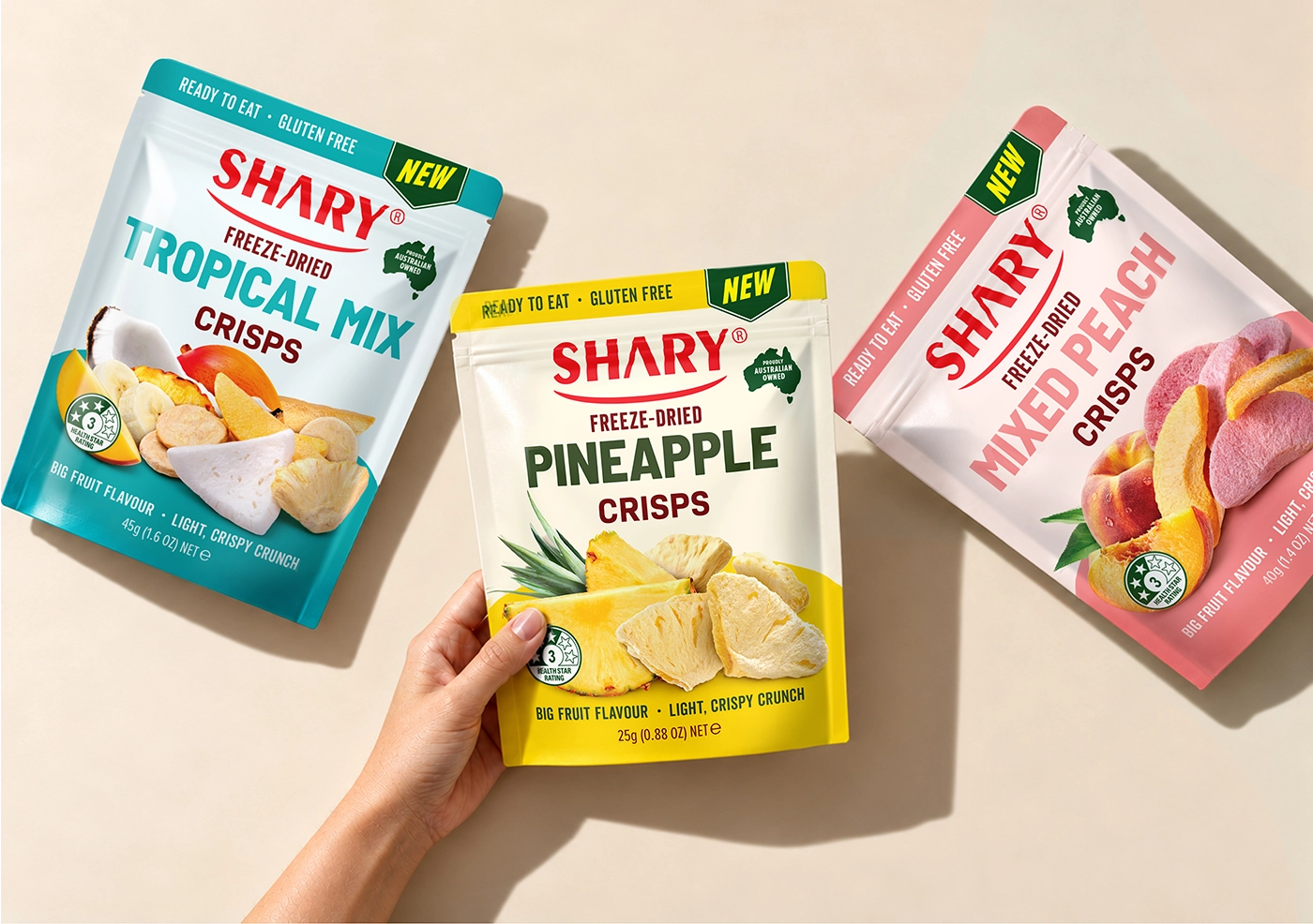
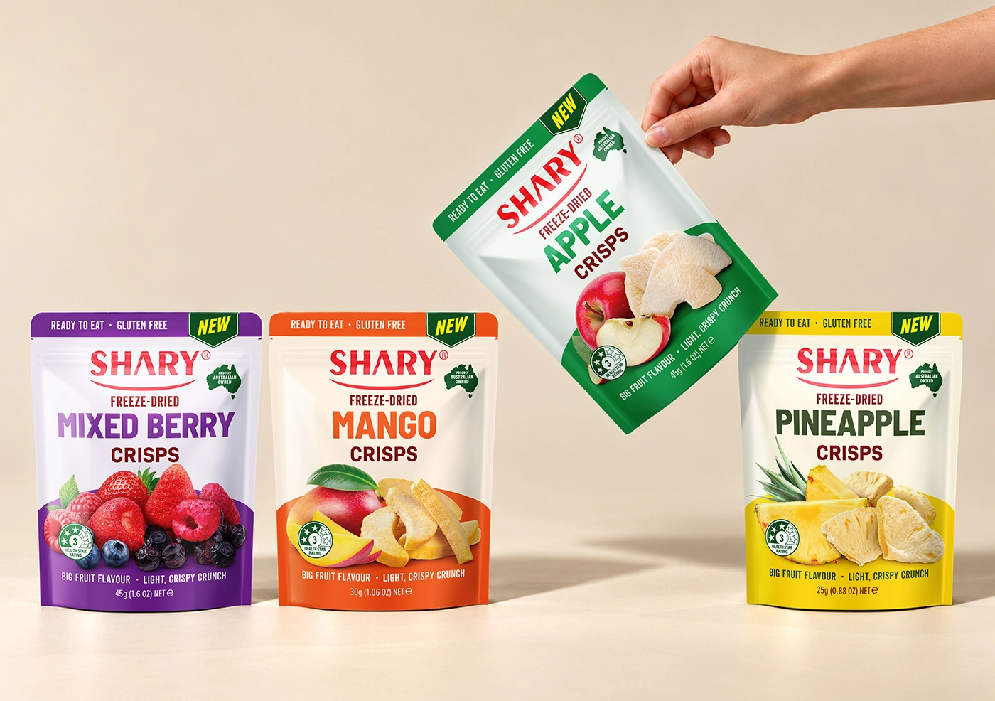
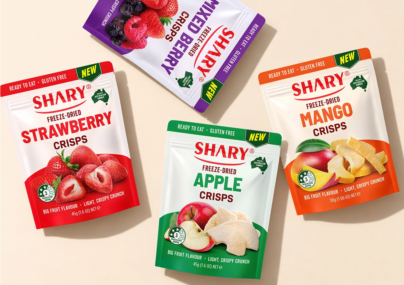
The front of each pack is designed for quick recognition on a busy retail shelf. The enlarged SHARY logo strengthens brand visibility, while the prominent flavour name makes each variety easy to identify from a distance. Strong colour blocks give the range energy and help customers distinguish between products at a glance. The photography plays an important role in communicating the product experience. Fresh fruit establishes flavour and natural appeal, while the freeze-dried pieces show the actual shape, colour and crispy texture of the snack. The images extend into the coloured area, creating depth and movement without compromising clarity.
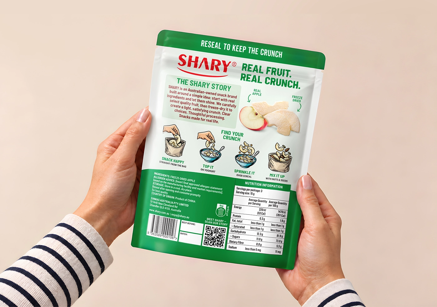
The back of the pack continues the same clear and approachable visual language. The message “Real Fruit. Real Crunch.” and a concise SHARY story reinforce the product proposition. Simple illustrated serving ideas show that the crisps can be enjoyed straight from the bag, added to yoghurt, sprinkled over cereal or mixed with nuts and seeds.
Project overview
The completed redesign brings seven SHARY products together as one cohesive and flexible packaging range. Strong typography provides a clear reading hierarchy, vivid colour coding makes flavour selection easier, and appetite-led photography communicates both the fruit ingredients and the crispy texture.
The result is a bright, modern and recognisable packaging system that preserves the existing SHARY identity while giving the range stronger shelf presence and a clearer reason to choose the product.
relevant services
- packaging design
- label design
- beverage design
- food packaging design