Packaging Design Case Study: Nature’s Crunch Sweet Potato Crisps
This case study walks through one packaging project from brief to print files: Nature’s Crunch Sweet Potato Crisps, a snack made from 100% sweet potato from an Australian brand whose veggie crisps range is also our work. The brief covered two formats, a single pouch and a retail carton that holds six pouches, and we designed both. Three decisions carry the pack. The color comes from the ingredient: a saturated orange that no other element on the front competes with. The product name is set in large white type. And the photography shows the crisps whole, broken, and as crumbs, so a shopper sees the texture before opening anything. In October 2026 Packaging of the World ran the project in its Food / Snacks section, and World Brand Design Society published it as well. Below we go through the brief, what sits where on the front of the pouch, how the same system was adapted to the carton, what the client received, and what a brand owner can take from the case when choosing a designer for a snack line.
The brief: one flavor, two formats, six claims
Nature’s Crunch makes vegetable snacks. Their veggie crisps range, five flavors in one system, is also our work, so the brand had a logo, a tone, and a way of using photography on its packs. The new product was sweet potato crisps in one flavor, Original.
The brief was short. The pack had to be bold and modern, and a shopper had to understand what the product was within a few seconds. The product name had to be visible first. Six claims had to be on the front: “Oven-Baked,” “Never Fried,” “100% Sweet Potato,” “No Oil,” “No Added Sugar,” and “No Gluten.” The texture of the crisps had to be visible. The same design had to work on a narrow vertical pouch and on a carton holding six of them, because the product sells both ways.
That last point is the one brand owners most often leave out of a brief. A pouch and a carton have different proportions, different print processes (flexible film versus folding carton) and different jobs on the shelf: the pouch sells one snack, the carton sells a week of snacks. Designing the pouch first and “stretching” it onto the box later often produces a box that looks like a blown-up bag. We planned both from day one. If you are writing a brief for your own product, our packaging design brief template has a line for pack format and sizes; list every format you plan to sell in there, even the ones that come later.
Starting from the ingredient
Many snack brands own a shade and put it on every SKU; others color-code by flavor, as the Nature’s Crunch veggie crisps do. The sweet potato crisps had one ingredient in the pack and a product name that said so. Sweet potato is orange. Using that orange as the whole background did two things at once: it told the shopper what was inside before they read a word, and it gave the pack a color field with no competition from a brand palette that was never built for this product.
We used several shades rather than one flat fill. The lighter oranges sit behind the photography and the name; the deeper, redder orange carries the edges and the claim blocks. White type on that field gives the strongest contrast available without going to black. Dark brown and yellow are the two accent colors on the pack, and they are reserved for the supporting information: the flavor and the claim blocks. Two accents is a deliberate limit. A third would have started to compete with the crisps themselves.
Front of pack: what reads first, second, and third
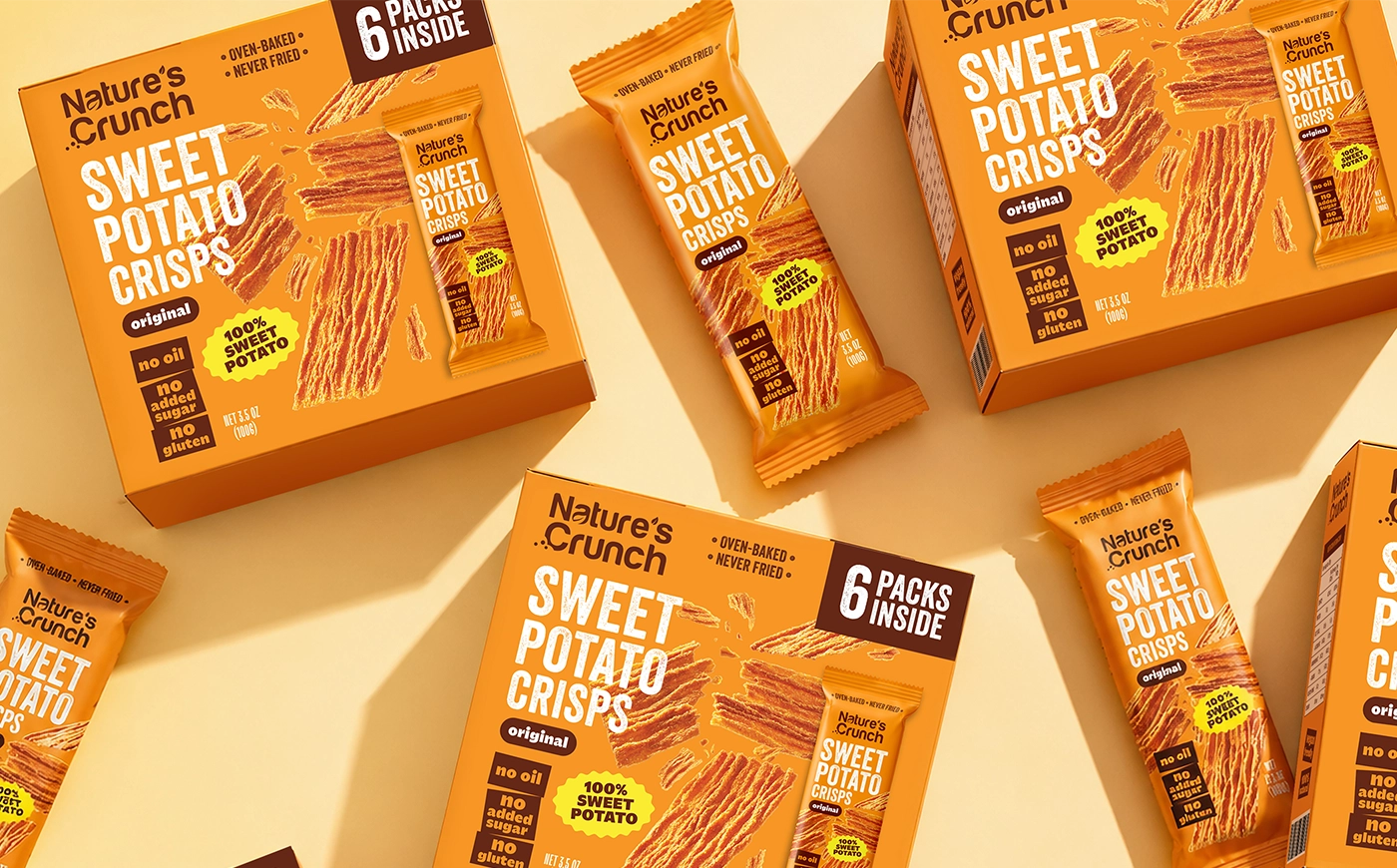
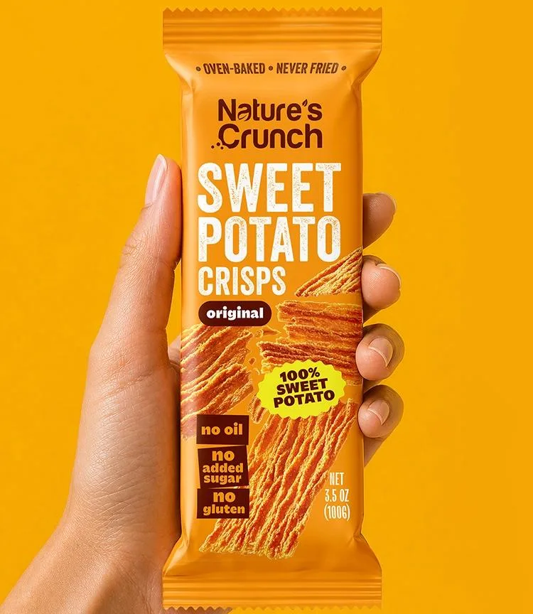
The pouch is tall and narrow, so the front works as a column. From the top: the Nature’s Crunch logo, then “Sweet Potato Crisps” as the largest element, then “Original,” then the six claims in compact high-contrast blocks: two along the top edge, the sweet potato badge beside the name, and three stacked near the bottom. The crisps photography runs behind and around the type. Nothing else competes on the front.
The order matters more than any single element. A shopper in the chip aisle decides in a few seconds. The name is the thing they need first, so it takes the center of the pack and the largest white type. The brand logo sits above it, smaller, because for a young brand the product promise sells before the brand name does. “Original” is there for the day a second flavor arrives; it reserves the slot.
The six claims were the hardest part of the front. Six short phrases scattered across a pack become noise. Six phrases set in the same style, aligned in blocks, become one readable unit. We set them in compact blocks using the two accent colors, dark brown and yellow, against the orange, so they read as a group: a shopper who cares about “No Added Sugar” finds it in the block, and a shopper who does not is not interrupted by it. Nothing on the front had to be dropped to make room, and the pack does not look crowded. That balance was the brief’s hardest requirement, and the claim blocks are where it was won or lost.
One note for a US launch, since the product sells in Australia and this article is read in the US: two of the six claims have FDA conditions on an American label. “No Gluten” is one of the terms FDA treats the same as “gluten-free” under 21 CFR 101.91(b)(2), so the food has to meet the gluten-free definition in 101.91(a)(3): no ingredient from a gluten-containing grain that leaves 20 parts per million or more of gluten, and any unavoidable gluten below 20 ppm. “No Added Sugar” has five conditions under 21 CFR 101.60(c)(2): no sugars or sugar-substituting ingredients added in processing, no ingredients that carry added sugars (jam, concentrated fruit juice), no process that raises the sugar content, a label statement that the food is not “low calorie” unless it qualifies, and one that is easy to miss: the food it replaces has to normally contain added sugars, which a plain crisp may not satisfy. That last point needs a regulatory check before a US launch. Our guide to food label requirements explains how claims like these change what the rest of the label must show. The design does not change; the wording and the substantiation do.
Showing the crunch on the front
A sweet potato crisp is thin, with an uneven edge and a slightly bubbled surface. That texture is the product’s main sensory promise, and a flat illustration cannot carry it. So the front uses product photography, and we used it in a specific way: crisps at different sizes and angles, whole pieces next to broken halves, and crumbs scattered toward the edges of the pack.
The pieces overlap the typography at a few points. That was a choice. On a static mock-up that reads as a small risk to legibility. On a real pack it is the opposite: the overlap pulls the crisps forward, off the orange, and gives the composition movement. We kept every letter of the product name clear; only the margins of the photography touch the type. The crumbs do a second job as well. They hint at the sound, the thing a crisp shopper is really buying, which no claim block can say directly.
launching a snack? get the pack designed
pouch, carton, or both · design only · fixed estimate in 1-2 business days
get quoteThe six-pack carton
The carton holds six pouches and often sells on a different shelf from the single pack. It had to be recognized instantly as the same product and, at the same time, it had to say “six” without a shopper hunting for the number.
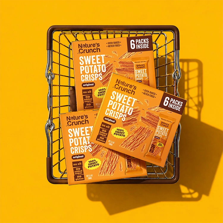
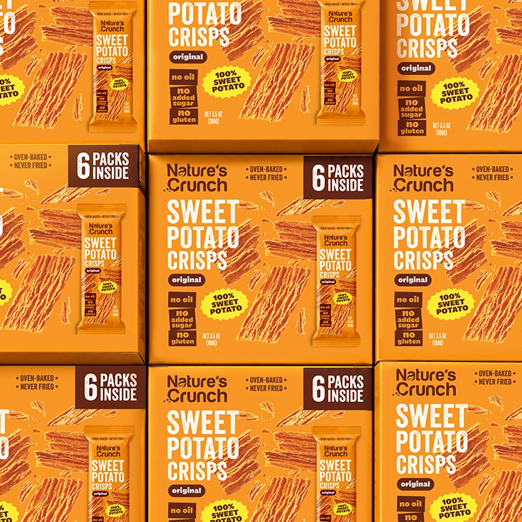
The carton keeps the same orange field, the same white product name, and the same photography. Its wider face gave us room the pouch did not have, so the crisps composition on the carton is larger and more spread out, with more whole pieces and more space between them. Two elements exist only on the carton. A high-contrast “6 Packs Inside” panel states the count. And an image of the single pouch appears on the face, so a shopper sees what is inside the box before opening it; that picture also links the two formats in memory, because a shopper who has bought the pouch recognizes it on the carton.
The hierarchy stayed the same across both: logo, name, flavor, claims. That is what makes a multipack read as a family instead of a second brand. For a line that will grow, this is also what a second flavor or a larger pouch inherits later. If you want the mechanics of how a carton is built from a flat sheet, our dieline guide explains the folding carton and the pouch layouts side by side.
What we handed over
The deliverable was the artwork for the two formats, prepared for print: the pouch and the folding carton, each on its own dieline, with the type, the claim blocks, and the photography in place. We do not print. The files went to the client’s printer.
Two details from the handover are worth repeating on any snack project. First, small type on a pouch should be checked at print size before sign-off: flexible film can soften fine type more than carton board does. Second, the carton and the pouch share one set of design elements, so a later change to a claim or a flavor name is made once and carried to both formats.
Where the project went after delivery
Packaging of the World published the project on 12 October 2026 in its Food / Snacks section, listed under cardboard and foil as the packaging materials. World Brand Design Society published it as well. Both are curated galleries. Editors choose what goes up. We mention this because a publication is one of the few outside signals a client can check on a design project, and because both are places where designers and brand teams look at what is current in a category.
We do not have sales data from the client to report, and we will not invent it. What we can say is what the design was built to do, and what a shopper can see on the pack: the product, the texture, the six claims, and the count on the carton, in that order.
Chips packaging design: four decisions that carry over
Most of what we did here applies to any crisp, chip, or baked snack pack. Four decisions in particular, each of which we would make again on a pouch for a different brand, a different vegetable, or a different price point.
Take the color from the ingredient when the ingredient is the point. A single-ingredient snack has a built-in color story. A pack that uses it tells the shopper what the product is before the name is read. If the brand already owns a strong color, use it for the brand elements and let the ingredient color carry the product field.
Group the claims. Three, five, or six short claims on a front are common for a better-for-you snack. Set them in one style, in one place, in a block the eye can take in at once. Scattered claims cost the pack its calm, and a calm pack reads faster.
Photograph texture. Thin, airy, bubbled, or crunchy is the promise, and only a photograph shows it. Include broken pieces and crumbs; a perfect stack of identical crisps looks like a render.
Design the multipack with the single pack. The carton needs the count, a picture of the unit inside, and the same hierarchy as the pouch. It should not need a second design project.
The same ideas, applied across other snack formats, are in our snack packaging design guide, which covers bags, pouches, and multipacks across snack categories.
What a project like this costs and how long it takes
A packaging design project at SOTDESIGN starts at $2,500. That price covers the packaging system and the first product in it: for this project, the pouch design with its hierarchy, color, type, and photography layout. A second format on the same product, such as the six-pack carton, and each further flavor are added to the estimate. The usual range of our packaging projects is $2,500 to $8,000, and the position inside that range depends on the number of formats and SKUs. Our article on packaging design cost breaks the price down line by line.
Most projects take 2 to 3 weeks. That runs from kickoff to final approval. For a larger line, the timeline is set in the estimate. The step that often adds time is the photography: if the client has no product shots, the shoot or the retouching has to be scheduled before the layout can be finished.
How to read a packaging design case study when you are hiring
A brand owner choosing a designer reads case studies to answer one question: will this agency solve my problem? A few things to look for in any case, including this one.
Is there a brief? A case that shows only the final pack tells you what the designer likes. A case that states the client’s requirements and shows how each one was met tells you how the designer works. On this project the six claims, the two formats, and the name-first hierarchy were all in the brief, and each is visible on the pack.
Does the hierarchy hold at a distance? Look at the hero image small, at the size of a thumbnail. If you can still read the product name and tell what the product is, the pack will work on a shelf. If you can only see a nice composition, it will not.
Is there a second format? A single beautiful pouch proves less than a pouch and a carton that belong together. Multipacks, cases, and a second flavor are where a system is tested.
What was delivered? Print-ready artwork on the printer’s dieline is a different deliverable from a mock-up. Ask which one the case shows.
Did anyone outside the agency and the client look at it? A gallery publication is a small, checkable signal. So is a retailer listing. Sales figures are stronger, but most clients do not share them, and a case without them is not a weaker case; it is an honest one.
ready to design your snack packaging?
pouch, carton, or a full line · design only · fixed estimate in 1-2 business days
get quoteSOTDESIGN is a branding and packaging design agency working with food, beverage, and CPG brands across the US. The sweet potato crisps project is one of the 80+ packaging projects behind our food packaging design service, and the full image set is on the Nature’s Crunch sweet potato crisps case page.
FAQ
01 What is a packaging design case study?
It is a written account of one packaging project: what the client asked for, what the designer decided and why, what was delivered, and what happened after. A good one shows the brief next to the result, so a reader can judge whether the requirements were met. This article is one; the project page on our site shows the same project with the full image set.
02 How long does chips packaging design take?
Most of our packaging projects take 2 to 3 weeks from kickoff to final approval. A single pouch is at the short end. Adding a carton or several flavors adds time, and it is set in the estimate. Product photography, if it has to be shot or retouched, is the step that often extends the schedule.
03 Did you design the box as well as the bag?
Yes. The brief covered a single pouch and a retail carton holding six pouches, and both were designed in the same project. The carton adds a “6 Packs Inside” panel and a picture of the single pouch; everything else follows the pouch.
04 Do you handle printing?
No. We design the packaging and prepare print-ready artwork on the printer’s dieline. The client’s printer produces the pouches and cartons. Send us the printer’s file requirements before the artwork is finalized, and the files will match them.
05 Is sweet potato crisps packaging different from potato chip packaging?
The formats are the same: flexible pouches and folding cartons. What changes is the message. A sweet potato crisp is usually sold as a better-for-you snack, so the front carries claims that a classic potato chip bag does not, and the ingredient itself supplies the color. The layout rules, name first, texture visible, claims grouped, are the same for both.
06 Does the client’s logo have to change for a project like this?
No. The sweet potato pack uses the Nature’s Crunch logo as it appears on the brand’s veggie crisps. A new product in an existing brand should inherit the logo and the tone; what gets designed is the product’s own field: color, name treatment, claims, and photography.