
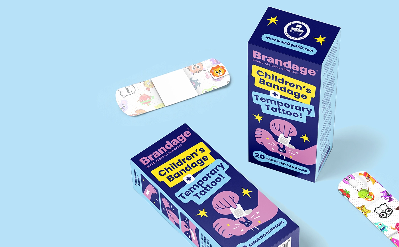
Children’s Bandage Packaging Design
concept
Brandage is a children’s first-aid product that combines colourful adhesive bandages with temporary tattoos. The packaging design uses bold typography, bright colours and playful illustrations to make the product appealing to children while remaining clear and trustworthy for parents.
challenge
The goal was to create children’s bandage packaging that would stand out from traditional medical products. Because the box is small, the product name, key feature and quantity had to remain highly visible and easy to understand. The design also needed to feel playful without losing its connection to the healthcare category.
solution
We moved away from the typical clinical look and created a bright, illustration-led packaging system. Contrasting yellow, pink and light blue elements add energy, while the deep blue background maintains a calm and reliable medical foundation. A clear typographic hierarchy makes the combination of children’s bandages and temporary tattoos immediately understandable.
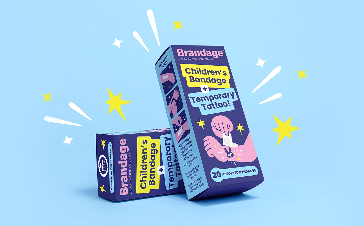
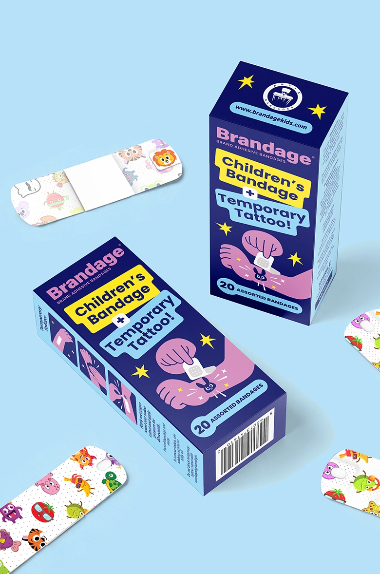
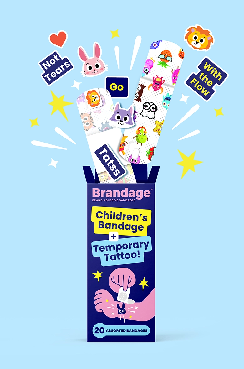
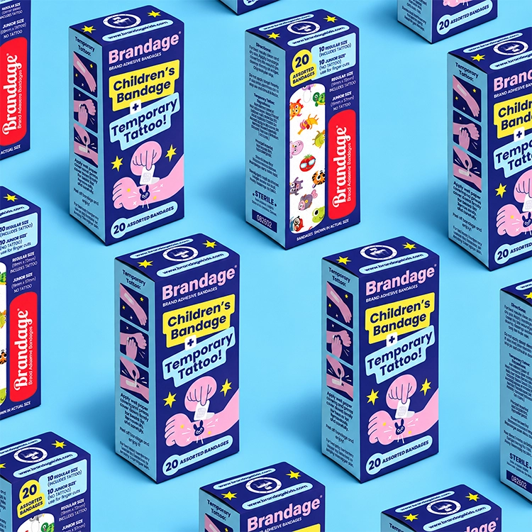
The compact box provided limited space for branding, product information, illustrations and instructions. We created a strong hierarchy that allows every element to be understood quickly. The Brandage name appears clearly at the top, followed by the two main product messages: “Children’s Bandage” and “Temporary Tattoo.” Each message is placed inside a high-contrast colour block, making the product concept easy to understand at first glance. The quantity—20 assorted bandages—is separated at the bottom of the front panel, where it remains clearly visible without competing with the main message.
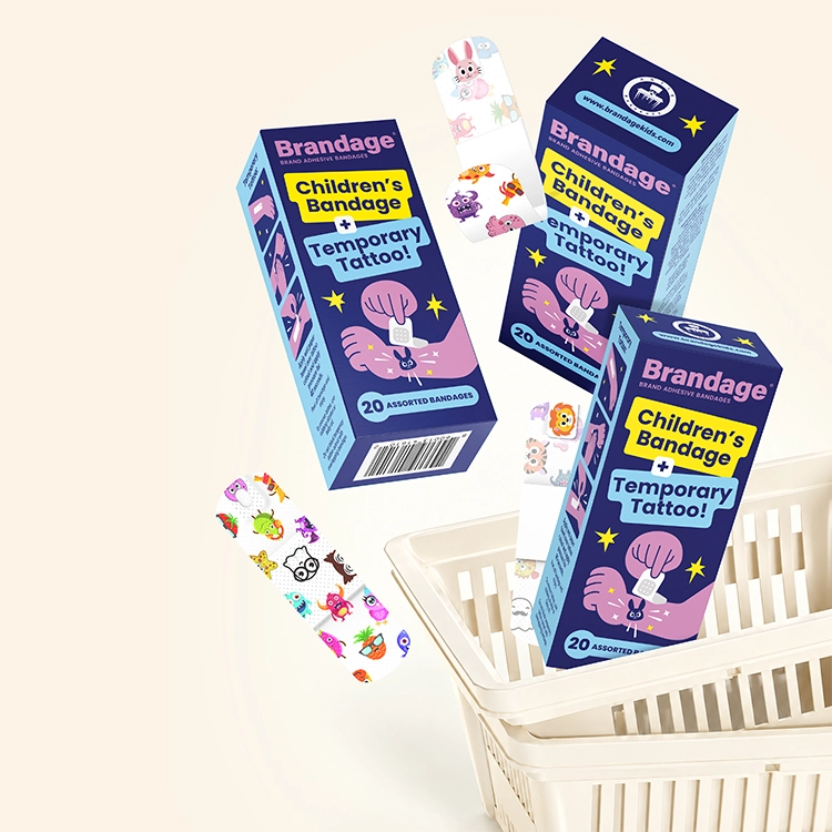
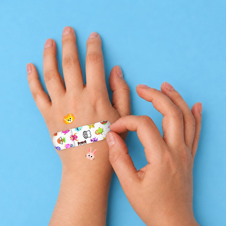
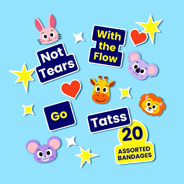
The colour palette was developed for both children and parents. Bright yellow, pink and light blue make the box feel fun and energetic, while the deep navy background creates stability, contrast and a visual connection to the medical category. This balance allows the packaging to feel playful without looking like a toy. Parents can recognise it as a first-aid product, while children see something colourful, friendly and less intimidating. The strong colour contrast also improves readability and helps the small package stand out among conventional healthcare packaging. Illustration is at the centre of the Brandage identity. Expressive hands, stars and sticker-like shapes explain the product idea in a simple and playful way. Colourful animal characters continue across the bandages and temporary tattoos, creating a clear visual connection between the box and the product inside. The side panels use illustrated steps to explain how to apply the temporary tattoos. Product information, instructions and required details are organised into clearly separated areas, keeping every side of the package consistent and easy to follow.
project overview
The final Brandage packaging turns a familiar medical product into a bright and memorable experience for children. Bold typography and contrasting colours give the small box strong shelf presence, while the illustration system makes the product feel friendly and engaging.
At the same time, the deep blue foundation and clear information hierarchy preserve the trust and clarity parents expect from a first-aid product.
relevant services
- packaging design
- label design
- beverage design
- food packaging design