What the Tropicana Redesign Teaches Brands Before a Packaging Refresh
In January 2009, Tropicana replaced the carton of its best-known juice, Pure Premium. The orange with a straw stuck in it, the picture shoppers had used to find the brand for years, gave way to a close-up of a glass of juice on a mostly white carton, a bold “100% Orange” graphic, and a new cap shaped like half an orange. Shoppers complained that the new carton looked like a store brand. Advertising Age reported that Pure Premium unit sales fell 20% between January 1 and February 22, and on February 23 the company said it would bring the old design back.
The redesign took away the cue loyal buyers used to spot the product, and nothing on the new carton replaced it. Those buyers didn’t stop drinking orange juice. Many of them just picked up a different carton instead, mostly one from a competing brand.
The same thing can happen to a brand with four SKUs in a few dozen stores. So it’s worth going through what changed, what the sales data shows, how the story repeated in 2024 with the bottle, and which checks we’d run before any packaging refresh.
What changed on the carton
The 2009 redesign was part of a broader campaign, “Squeeze, It’s a Natural,” that launched in early January with print, outdoor, and digital ads. The table below sticks to what was reported at the time.
| Element | Before 2009 | January 2009 |
|---|---|---|
| Main image | A whole orange with a straw in it | A tall glass of orange juice |
| Background | The established Pure Premium carton | A clean, mostly white carton |
| Product claim | No “100% Orange” graphic | A large “100% Orange” graphic, used for the first time |
| Cap | Standard cap | A new cap shaped like half an orange, meant to feel like squeezing the fruit |
| Campaign | Existing advertising | New print, outdoor, and digital campaign built around the squeeze idea, with TV spots scheduled |
Each of these choices makes sense on its own. A glass of juice shows the serving, “100% Orange” is a clear product claim, and the cap is a memorable touch. The problem was that the new carton dropped the single image that told a hurried shopper “this is the one you always buy.”
Under two months from launch to reversal
- In early January 2009, the new cartons started shipping, and the campaign launched in eight markets before rolling out regionally.
- Through January and February, customers wrote and called to complain. Most often they said the carton looked generic, like a private label product. Others just called it ugly.
- On February 22–23, The New York Times reported that Tropicana would return to the old carton. A company executive told the paper that Tropicana underestimated how attached some consumers were to the original packaging. The scheduled TV spots were reworked.
- The old carton was due back the following month: Tropicana said the orange with a straw would return within about a month, as NPR reported at the time.
Plenty of companies would have defended a new design for a year. Tropicana reversed course within weeks, and that probably limited the damage. But the sales drop came in the first few weeks, before anyone could react.
What the sales data shows
The headline number most articles quote is the 20% drop in unit sales reported by Advertising Age, which put the dollar decline at 19%, roughly $33 million over those seven weeks. The more useful data comes from a research paper by the Florida Department of Citrus, the state agency that markets and studies Florida citrus. It used Nielsen data from larger grocery stores across the US: 120 weeks of sales, from January 2007 to early May 2009.
If you’re planning a redesign, three of its findings are worth knowing.
- The losses were large. In January and February 2009, Tropicana’s gallon sales ran roughly 11% to 24% below the same weeks a year earlier, and the paper’s model attributes a large part of that to the change. In the West, two January weeks were down about 35% to 36%.
- Demand didn’t come back right away. The model showed Tropicana’s demand still below normal into early May, weeks after the old carton returned, so fixing the pack didn’t restore the habit overnight.
- The juice category as a whole didn’t shrink. Total orange juice sales held roughly steady. Demand for other brands rose, especially Florida’s Natural, with smaller and less consistent gains for private label.
So shoppers kept buying orange juice, just someone else’s. That’s what a premium brand risks when it starts to look generic. Once your carton stops standing out from the ones next to it, the habit that kept people reaching for yours is gone, and any other carton on the shelf will do.
The paper is careful to say that its weekly estimates capture everything that happened in those weeks, and the carton was only one of those things. Prices and promotions move too. Even so, the timing and the shift to competing brands are hard to explain any other way.
Why the redesign failed
Looking back, five things went wrong at once, and every one of them can happen to a much smaller brand.
1. It removed the main thing shoppers looked for. The orange with a straw was a distinctive asset, an image buyers had seen for years and could spot from the end of the aisle without reading a word. In a grocery store, shoppers tend to scan for familiar shapes and colors. Take that cue away and loyal buyers walk right past you, then grab whatever looks closest to what they expected.
2. It moved toward the generic look of the category. A glass of juice and a clean white carton are exactly what a store brand might use, because they say “orange juice” and nothing else. A premium brand earns its price partly by being recognizable. The new carton gave that up but kept the premium price.
3. It changed too much in one step. Image, layout, claim, cap, and advertising all changed together, so loyal buyers had nothing familiar left to hold on to. Many successful refreshes keep one strong cue in place and change the rest around it.
4. It treated a habit like a fresh decision. Orange juice is a weekly, almost automatic purchase. People don’t study the shelf; they reach for the usual carton. A design that might win a side-by-side preference test can still lose in the store. Nobody stands in the aisle comparing two cartons, and if shoppers don’t find you, they pick something else.
5. The risk was easy to underestimate inside the company. The team that approves a new design has looked at it for months and knows exactly where the product is. Shoppers see it for two seconds, once a week. Tropicana did research the design. Afterward, the head of Tropicana North America said the strong attachment of its most loyal buyers simply didn’t come out in that research. That’s the kind of thing a test with existing buyers trying to find the product on a real shelf is built to catch.
It happened again in 2024, with the bottle
Fifteen years later, the brand ran into a similar wall with a different part of the package. In summer 2024, Tropicana Brands Group, which has run the brand since PepsiCo sold a majority stake to PAI Partners in 2021, replaced the familiar round carafe bottle with a slimmer, more conventional one and cut the size from 52 to 46 ounces. The suggested price went down too, by about 70 cents.
Shoppers didn’t take it well. Many read the smaller bottle as shrinkflation, and some simply preferred the grip of the old carafe. According to Circana data reported by CNN, sales were down 10.9% in August and 19% by October compared with a year earlier, and the brand lost share to Simply Orange. The company said the change came from customer feedback about pouring, storage, and less plastic in the cap, that people need time to get used to a new package, and that third-party data showed sales returning to normal levels (Fortune, November 2024).
The 2024 bottle episode adds two things to what 2009 already showed.
- A pack’s structure can be a distinctive asset too. People recognize a bottle shape by touch and by silhouette, and it works the same way an image does. Change it and you’re asking shoppers to find you again.
- Shoppers read a smaller pack as a price move, even when the suggested price drops, and especially when some stores don’t pass the cut on. If the size changes, explain why on the pack and in your listings before shoppers come up with their own reasons.
What a smaller brand should take from this
A national juice brand can absorb a bad quarter. A brand with four SKUs in a few dozen stores often can’t. Fortunately, the checks that would have flagged the Tropicana problem cost very little.
Before the brief
- Write down your distinctive assets, meaning the colors, shapes, images, or words people actually use to find you. Ask a few loyal customers and a store manager how they spot your product. Founders are often surprised by what they hear.
- Decide which of those assets stay, which evolve, and which can go. Put that decision in the design brief so every concept respects it.
During design
- Keep your strongest cue in place. You can evolve it if you need to, just don’t erase it.
- Change one big thing at a time. Launching new graphics and a new pack structure together doubles the risk.
- Put every concept next to the store brand and the category leader. If yours could pass for the store brand, take that as a warning sign.
Before you print
- Test a printed mockup on a real shelf with people who already buy from you. All you’re asking is whether they can find you in a few seconds.
- Keep the old files, and find out how fast your printer could rerun the old version if you had to.
After launch
- Watch sales by SKU and by channel every week for the first two to three months. A small dip in some channels is common while buyers adjust. A sharp drop in the first weeks is the signal Tropicana got.
- Say “new look, same product” on the first runs, on Amazon images, and to your retail buyers before the new cases arrive.
Our rebranding checklist covers each of these stages in more detail, from the audit through rollout and measurement.
planning a packaging refresh?
send us your current packs and what has to change: we’ll tell you what to keep and send a fixed estimate in 1–2 business days
get quoteHow we approach a refresh
Most of our redesign projects fall somewhere between “keep everything” and “start over,” and the first job is figuring out where.
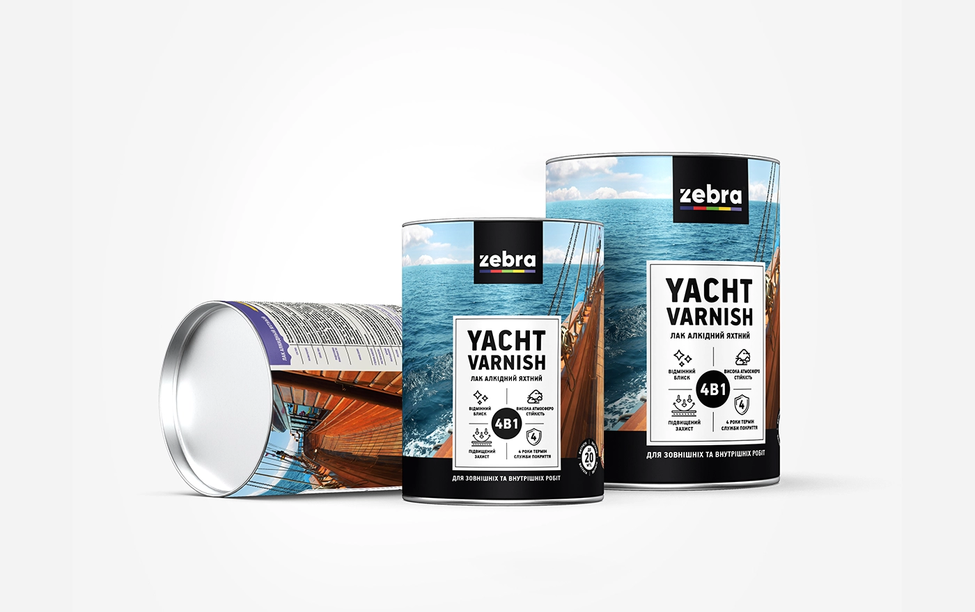
For the ZEBRA varnish line, the old packaging looked dated and the products were hard to tell apart, but buyers knew the ZEBRA name and logo. So we kept the logo, gave it higher contrast and better placement, and rebuilt everything around it with one system for the range, a different material image for each product, and a clear benefits block. The logo is still the first thing you see on every pack, and customers can now tell the varieties apart right away.
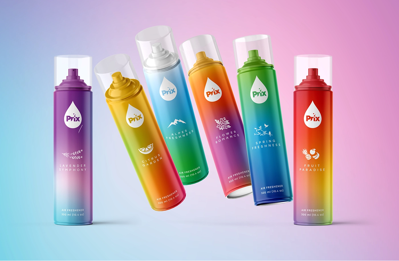
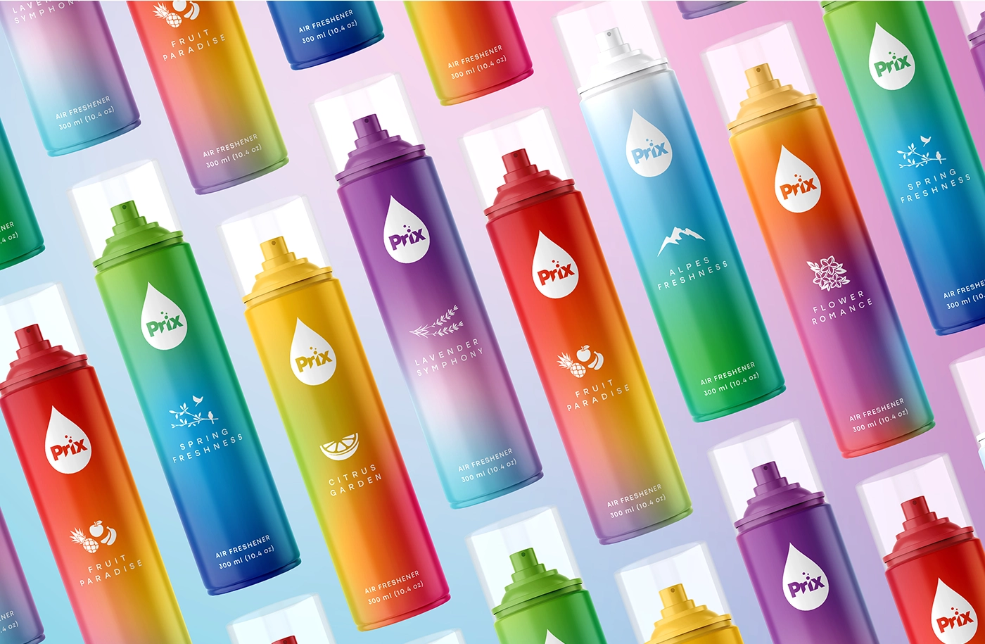
Prix air fresheners went the other way. The old packaging had no consistent brand identity, so there was little recognition to protect, and that gave us room for a full makeover. We designed a new droplet-shaped logo and gave each scent its own color gradient and emblem, so shoppers can tell Citrus Garden from Lavender Symphony at a glance. That made the bigger change far less risky.
The difference between those two projects comes down to one question Tropicana’s research missed: what does the current package do for the people who already buy it?
If you’re weighing a refresh of your own, our packaging design services start at $2,500, which covers the packaging system and the first SKU, and each additional SKU is about $800. You get three concepts and three rounds of revisions, and once we’ve reviewed your brief, we send a fixed estimate within 1–2 business days. SOTDESIGN is based in Albany, New York, and does design only. We’ve been doing branding and packaging for 10+ years and have completed 80+ packaging projects for consumer brands across the US.
refresh without losing your regulars
we start from what your buyers already recognize: design only, any printer
get quoteFAQ
01 Why did the Tropicana rebrand fail?
The 2009 carton removed the orange with a straw, the image loyal shoppers used to find Pure Premium, and replaced it with a glass of juice on a mostly white carton. Many shoppers said it looked like a store brand. Sales fell quickly, and the company reversed the change in under two months.
02 How much did Tropicana lose from the 2009 redesign?
Advertising Age reported that Pure Premium unit sales fell 20% between January 1 and February 22, 2009, and dollar sales fell 19%, roughly $33 million. A Florida Department of Citrus study found that demand moved to other brands, especially Florida’s Natural, while total orange juice sales held roughly steady.
03 Who designed the 2009 Tropicana packaging?
The redesign and the “Squeeze, It’s a Natural” campaign were created by the agency Arnell for PepsiCo, which owned Tropicana at the time.
04 Did Tropicana go back to its old packaging?
Yes. The company announced the reversal on February 23, 2009, and said the orange with a straw would be back within about a month.
05 What happened with the Tropicana bottle in 2024?
In summer 2024 the brand replaced its round carafe bottle with a slimmer bottle and reduced the size from 52 to 46 ounces at a lower suggested price. Sales fell sharply in the following months, according to Circana data reported by CNN, and many shoppers called the change shrinkflation.
06 How do I refresh my packaging without losing customers?
Find out which colors, shapes, or images your buyers use to recognize you, and hold on to the strongest one. Change one major thing at a time, test printed mockups with existing customers on a real shelf, tell retailers early, and watch sales by SKU every week after launch.
07 Is a full rebrand ever the right call?
Yes, when the current packaging isn’t earning recognition anyway. For example, the range has no consistent look, the brand is moving into a different price tier, or the old identity actively hurts sales. In those cases there’s less to protect, and a bigger change is less risky.