Packaging Design Trends 2027: What CPG Brands Should Plan For
Packaging trends for 2027 come from two directions. On the shelf, brands are moving toward bold type, loud color or deliberate restraint, real illustration in place of stock and AI imagery, honest product photography, and smaller packs. Behind the shelf, a set of rules is changing what a package has to carry: 2D barcodes that registers can read, packaging fees in states with producer responsibility laws, the end of Red No. 3 in food, and stricter attention to recyclability and ingredient claims.
The design trends are optional. The rule changes are not, and they affect artwork plans for any brand that will print packaging in 2027. The safest approach is to use trends to refresh a strong system. Brands that replace their packaging every time the look changes lose the colors and shapes shoppers use to find them.
Below are eight design trends with notes on who they suit, five rule-driven changes with dates, a short guide to using trends without dating your brand, and what a refresh costs. Our own packaging projects start at $2,500, which covers the system and the first product.
Packaging trends 2027 at a glance
| Trend | What it looks like | Fits best | Watch out for |
|---|---|---|---|
| Type as the hero | Oversized brand or product name filling the front | Brands with a short, strong name | Long names and small packs |
| Loud color and layered layouts | Saturated palettes, clashing colors, busy compositions | Snacks, drinks, brands aimed at younger buyers | Losing clarity on what the product is |
| Premium restraint | Fewer elements, tactile paper, foil, embossing | Chocolate, coffee, spirits, gifts | Looking empty next to louder competitors |
| Illustration and handmade marks | Drawn characters, hand lettering, visible craft | Craft drinks, bakery, kids, brands with a story | Style that ages with one illustrator’s fashion |
| Nostalgia | Retro type, old logos, archive colors | Brands with real history | Looking dated if there’s no story behind it |
| Real product, real ingredients | Honest photography, windows, sourcing details | Food brands with good-looking products | Photos that don’t match what’s inside |
| Smaller packs | Single-serve, snack size, minis | Snacks, cereal, treats, drinks | Too little space for required information |
| Systems built for screens | Packs that read at thumbnail size online | Any brand selling on Amazon or retailer sites | Fine detail that disappears in a 300-pixel image |
Design trends for 2027
Type takes over the front
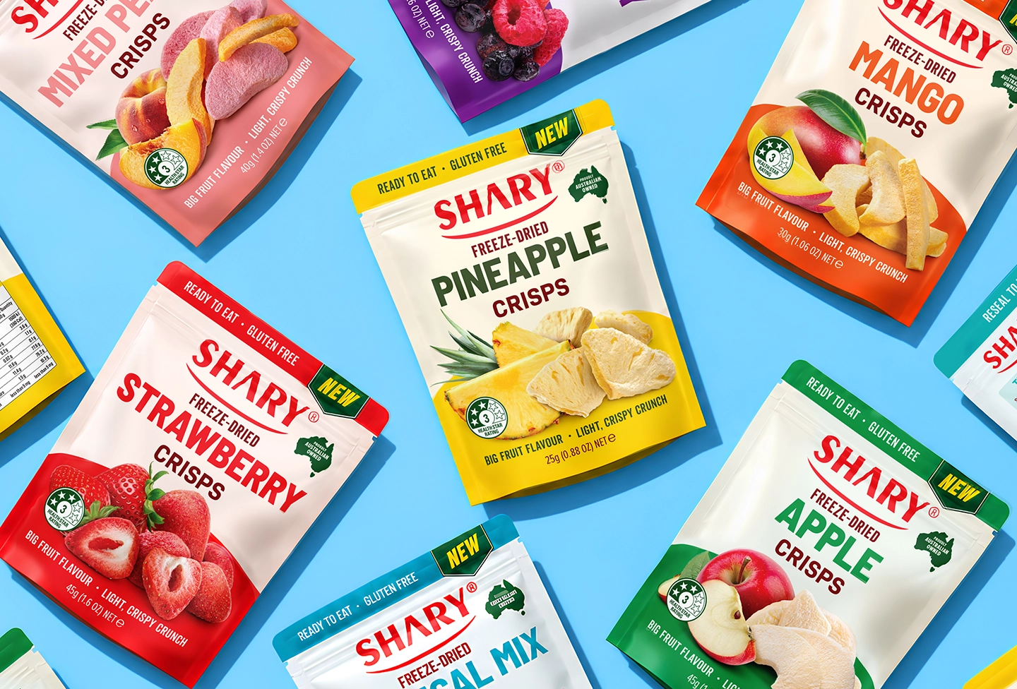
More packs use the brand or product name as the main image. The name runs large, sometimes cropped off the edge, sometimes stacked to fill the panel. It works because type reads fast and stays recognizable at any size, from ten feet down the aisle to a product tile on a phone.
This trend suits short names and simple products. A brand with a short name, like Oatly, can run it large across the carton. A brand with a twelve-letter name and a long descriptor needs another hero. If you try this, decide early how the type behaves across sizes. A word that fills a family pack may need to be cropped differently on a single-serve bag.
Loud color and layered layouts
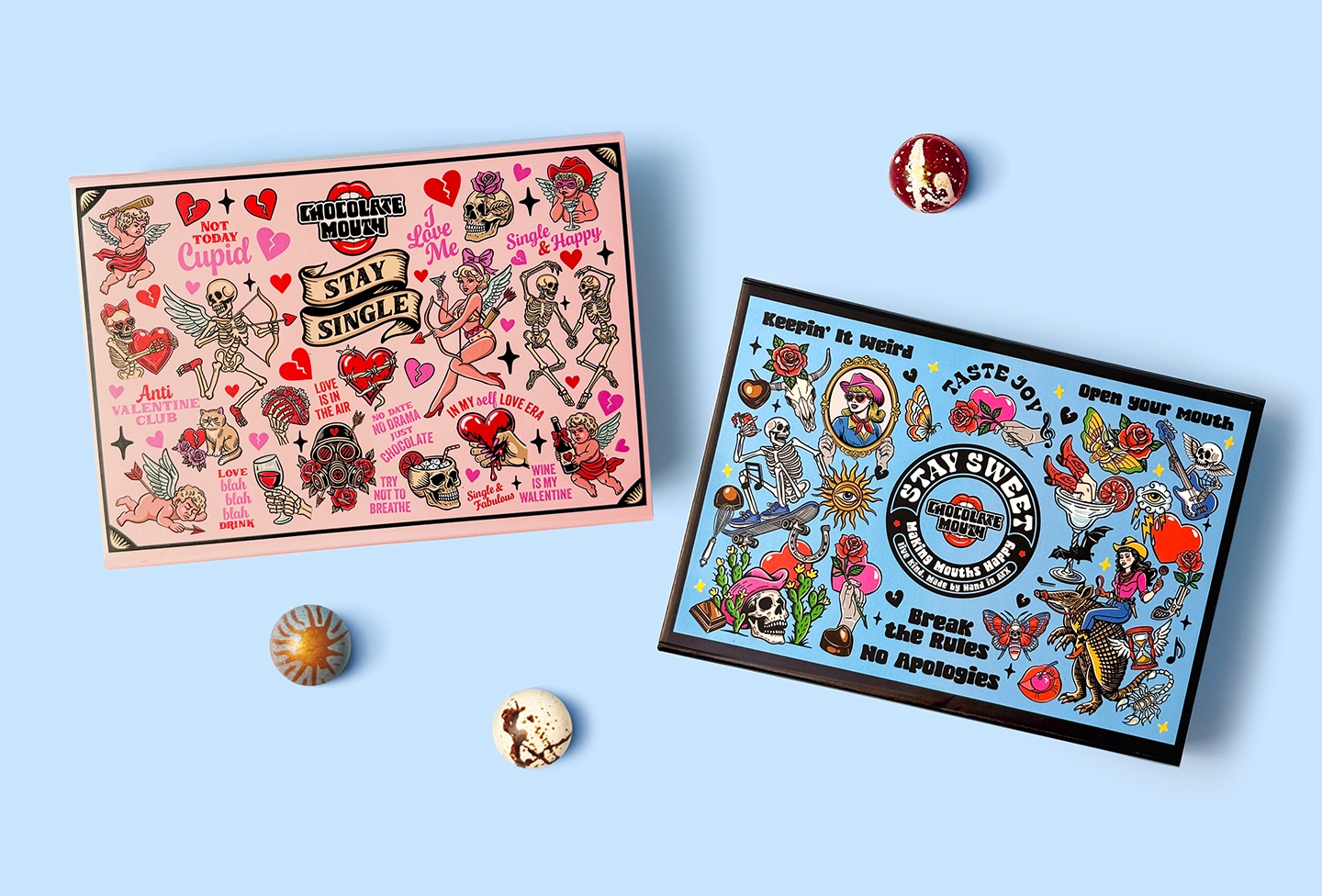
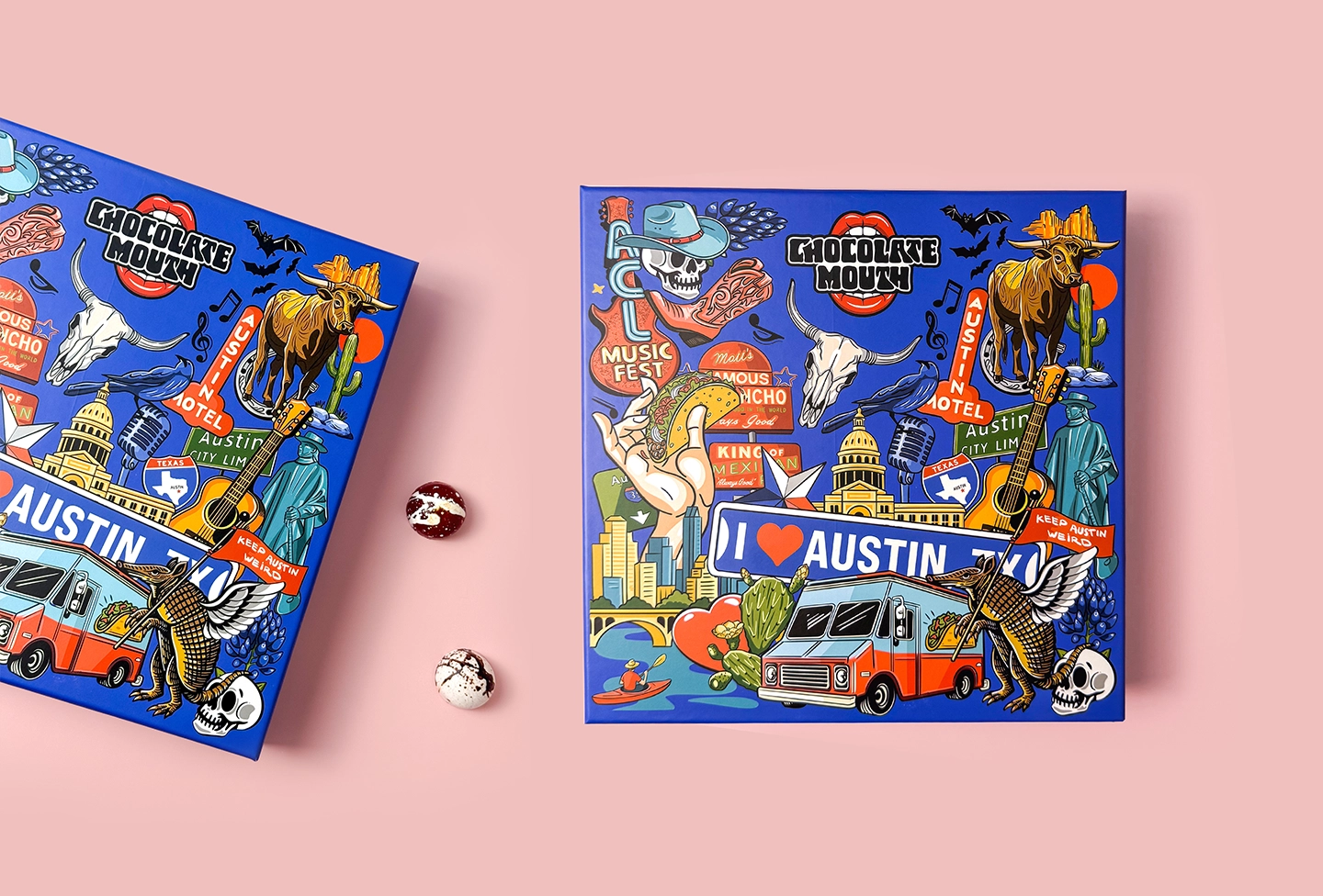
At one end of the shelf, brands are going louder: saturated colors, unexpected combinations, layered type, stickers, and collage. Designers call some of it “chaos packaging.” It grabs attention from younger shoppers who scroll past polished, quiet brands every day, and it photographs well for social media.
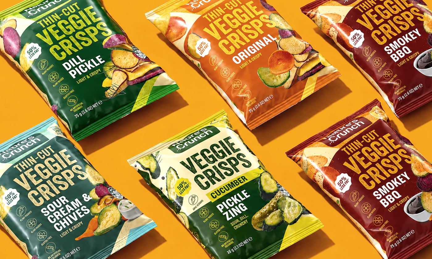
A busy front also makes it harder to see the product type, the flavor, and the size, and those are what shoppers need in the aisle. The brands that pull it off keep a strict order underneath the noise: the logo always in the same place, the product name always readable, one color per flavor. For the Nature’s Crunch veggie crisps line, five flavors share one bold layout and differ by a saturated color each, so the bags stand out as a group and still read flavor by flavor. Our snack packaging guide explains how a flavor system like that is built.
Premium restraint
At the other end, premium brands are cutting elements. One color, one typeface, a lot of empty space, and the quality carried by materials: uncoated or textured paper, soft-touch coatings, blind embossing, a small area of foil. It signals care and price without a single claim.
Restraint works when the materials can carry it, and that adds cost per unit. It also needs confidence on the shelf. Next to louder competitors, a quiet pack can look either expensive or empty, depending on how well the details are done. For the Una Luna Collection, a luxury Italian chocolate line, we used gold foil embossing and selective varnish on a dark ground, so the pack reads as premium from the first touch while the moon and birds carry the brand story.

Illustration and visible craft
As AI-generated images spread across ads and packaging, drawn characters and hand lettering have become a way to look human. A good illustration is hard to copy and easy to remember, and it can carry a brand across many SKUs without a photo shoot for each one.
Our Foxybeer seasonal ales are an example: each can has a fox musician character, and the series works as a set on the shelf. The risk with illustration is that a style tied to one moment, like a specific flat vector look, can date fast. Pick a style that fits the brand’s personality and will still look right in five years.
Nostalgia and archive looks
Old logos, retro type, and colors from a brand’s first packaging keep coming back, especially for brands with decades of history. It works when there’s a real story: shoppers who remember the original get a reason to pick it up, and younger shoppers read it as authentic.
For a brand launched three years ago, a fake vintage look usually reads as a costume. If your history is short, borrow the warmth of retro design (rounded type, warm colors) without pretending to be older than you are.
Real product, real ingredients
Shoppers have learned to distrust styled food photography that doesn’t match the product. More brands now show the actual product, sometimes through a window in the pack, and name where ingredients come from. This sits naturally with ingredient changes that are already happening: brands that removed artificial colors want shoppers to see the result.
If the photo shows strawberries, there should be strawberries inside, and the serving shown should match the product. A photo that oversells creates complaints, and misleading claims or images on food labels can lead to FDA action or consumer lawsuits.
Smaller packs
Pack sizes are shrinking in several categories, and one reason is GLP-1 weight-loss drugs. Big Chalk Analytics estimated that about 12% of US households had a GLP-1 user by November 2025, and GLP-1 users were more likely than the average shopper to buy smaller packs of cereal and granola. Add single-serve snacking, convenience stores, and lunchbox formats, and small packs are a growing share of many lines.
For design, a small pack means less space for the same required information. The brand, product name, and flavor need to work at a much smaller scale, and the back panel has to fit a full Nutrition Facts panel or a qualifying simplified format. Plan the small size together with the large one when you build the system.
Systems built for screens
A growing share of first impressions happen on a screen: a product tile on Amazon, a retailer’s app, a sponsored listing. At 300 pixels wide, fine detail disappears and the pack lives or dies on its color and two or three words. Many designers now check every pack at thumbnail size before approving it.
This changes what a strong system looks like. A clear color code per variant and a large product name help on the shelf and on the screen. Thin type and small claim badges help on neither.
planning a packaging refresh for 2027?
send us your current packs: we’ll tell you what to keep, what to update, and what it costs within 1–2 business days
get quoteFormat and structure trends
- Resealable everything. Zippers, press-to-close seals, and resealable lids are spreading from nuts and jerky to cheese, cookies, and frozen foods. Smaller households and smaller portions make a pack that closes again more useful.
- Paper replacing plastic where it can. Paper-based mailers, paper tubs, molded fiber trays, and paperboard sleeves are taking over parts of the aisle that used plastic, partly because of EPR fees. Paper changes the printing: colors look softer and fine detail spreads, so artwork made for film needs adjusting.
- Cans beyond beer and soda. Water, wine, cocktails, and coffee drinks keep moving into cans. A can has a small, curved print area, so the design must work as the can turns and from the top of a cooler.
- Refills and concentrates. In household and personal care especially, refill pouches and concentrates let a brand sell a durable bottle once and a lighter pack after that. The refill pack needs to look like part of the same family while costing less to produce.
Each of these is decided with your packaging supplier first. Bring the designer in at that stage, because a new structure changes where the logo, the product name, and the required information can sit.
What’s fading in 2027
A few looks that dominated the last several years now make a brand look older than it is.
- Generic flat minimalism. The sans-serif logo, the pastel background, and the single line of copy were everywhere in direct-to-consumer brands. When every pack looks like that, none of them is memorable. Minimal design still works, but it needs one distinctive element to hold on to.
- Fake handwriting fonts. Script typefaces that imitate handwriting read as decoration and rarely convince anyone. Real hand lettering or a confident typeface does the job better.
- Claim clutter. Six badges across the front (“keto,” “vegan,” “non-GMO,” “gluten-free,” “no added sugar,” “high protein”) turn into noise. Shoppers notice the one or two claims that matter to them; the rest belong on the side or back.
- Stock photography. Generic images of smiling families and perfect fruit are easy to spot and easy to forget. Shoppers respond better to the real product or a drawn world that belongs only to your brand.
If your current packs lean on any of these, they’re good candidates for a refresh, and they’re usually the cheapest elements to change.
Rule changes that affect packaging in 2027
Most of these changes affect artwork whether or not you refresh the design. Dates below are current as of October 2026; check the status before you finalize files, because several of them are still moving. This is general information, not legal advice; confirm details with your regulatory advisor.
2D barcodes at the register (Sunrise 2027)
GS1 US is leading an industry effort to get US retail registers able to scan 2D barcodes, such as QR codes with GS1 data, by the end of 2027. It doesn’t require brands to remove the UPC. The two will sit side by side for years, until nearly all retailers can read 2D codes.
For design, that means planning space for a second code. A 2D code can link to ingredient details, recipes, recycling information, or a product page, so it can also move optional content, like recipes or brand stories, off a crowded label (required FDA information stays on the pack). Reserve a place for it in the system template now, so every new SKU has it in the same spot.
Packaging fees under producer responsibility laws
Seven states have enacted extended producer responsibility (EPR) laws for packaging: California, Colorado, Maine, Maryland, Minnesota, Oregon, and Washington. Under these laws, the brand that sells the packaged product pays fees based on the packaging it puts on the market. Oregon’s fees started in July 2025 and Colorado’s in 2026. California’s program is set to start in 2027, with the first annual producer invoices expected early that year (a one-time early fee was already billed in 2026); see CalRecycle for the current schedule. The other states follow over the next few years.
Fees usually depend on the material and its weight, and some programs charge more for packaging that’s hard to recycle. That pushes brands toward lighter packs, a single material where possible, fewer mixed laminates, and less empty space. Material is mostly your supplier’s decision, but the design should be ready for it: a layout that works on a thinner film or a recyclable paper doesn’t need a redesign when the material changes.
Recyclability claims under scrutiny
California’s SB 343 limits the chasing-arrows symbol and other “recyclable” claims to packaging that meets state criteria for collection and sorting. Its compliance date was October 4, 2026, but in July 2026 a federal court in California preliminarily barred the state Attorney General from enforcing it while a lawsuit by industry groups continues. The rule could still come back, and the FTC’s Green Guides already say recycling claims must be backed up by evidence.
Until the case is settled, a practical approach is to keep recycling claims specific and supportable, and to keep the symbol and claim in an artwork zone that’s easy to change without reworking the whole label.
Food dyes and ingredient changes
FDA revoked the authorization of FD&C Red No. 3, and food manufacturers have until January 15, 2027 to reformulate. Many large food companies have also announced plans to drop petroleum-based dyes more broadly. A reformulated product needs an updated ingredient statement, and if its color changes, the product photography and the color on the pack may need to change too.
States are adding their own rules. Texas passed a law requiring a warning on food labels that contain any of 44 listed ingredients, for labels developed or copyrighted on or after January 1, 2027. In February 2026 a federal court blocked enforcement against the trade groups that sued and their members, and Texas’s appeal is pending at the Fifth Circuit. If you sell in Texas, follow the case before you design new labels next year.
Front-of-package nutrition and the “healthy” claim
FDA proposed a front-of-package “Nutrition Info” box in January 2025 that would rate saturated fat, sodium, and added sugars as Low, Med, or High. As of October 2026 the rule is not final, and FDA has said the proposal may be revised. Separately, FDA’s updated definition of “healthy” is in effect, with a compliance date of February 25, 2028 for products using the claim, and FDA is still working on a symbol.
Neither forces a change in 2027, but both affect the front panel. If you’re redesigning now, avoid filling every inch of the front so a future box or symbol can fit without moving the logo.
Sustainability you can see on the pack
Regulation pushes the material changes, but shoppers also look for signs that a brand is trying. Paper-based packs, fewer plastic windows, smaller labels on glass, and plain kraft or uncoated stocks all read as lower impact at a glance. Some brands print less ink coverage on purpose and let the material show.
A natural look is not proof, though. A kraft-colored pack with a plastic lining isn’t more recyclable because it looks like paper, and shoppers who find that out feel misled. The design should also still sell. A pack that looks responsible but hides the product name and flavor loses the sale to a louder competitor. The brands that do this well pick one visible material story and keep the rest of the front as clear as before.
Limited editions as a test lab
Many brands now use seasonal and limited packs to try new directions without touching the core line. A holiday flavor can test a louder palette, an illustration style, or a new finish. If shoppers respond, the idea can move into the main system; if not, the run simply ends.
This only works if the limited pack still carries the brand block in its usual place. Shoppers should recognize it as yours first and notice the new look second. Plan these editions inside the system, with a reserved area that changes each season, so every new edition doesn’t turn into a full design project.
Where AI fits in packaging design
AI tools are now part of how many studios and brand teams work. They help with quick mood boards, rough mockups on a shelf, and testing many color or copy variations before a designer refines the best ones. Used this way, they save time early in the process.
They are weaker at the parts packaging depends on most. Generated images can show products that don’t exist, wrong ingredients, or text that isn’t legible, and their ownership and licensing are still unsettled. Required information, dielines, color accuracy for print, and claim wording all need people who check them line by line. A sensible split is AI for early exploration and rough mockups, and designers for the final artwork, illustration, and product images.
A 2027 artwork checklist
If you plan to print new packaging in 2027, these checks cover the rule changes above. Do them before design starts, because each one can change the layout.
- List every SKU that uses FD&C Red No. 3 or other petroleum-based dyes, and confirm the new formula, ingredient statement, and product color with your team.
- Reserve a zone for a 2D code next to the UPC in the system template.
- Review every recycling symbol and “recyclable” claim with your packaging supplier and a regulatory reviewer, and keep them in an easy-to-change zone.
- Ask your supplier which materials will cost less under EPR fees in the states where you sell, and whether the design needs to adapt to a lighter or single-material pack.
- If you sell in Texas, check the status of the ingredient warning law before you approve new labels.
- Leave room on the front panel for a possible nutrition box or a “healthy” symbol, so they won’t push the logo or product name later.
- Decide whether you need smaller pack sizes, and design them together with the rest of the system.
Our guide to food label requirements covers the standing FDA rules that every label has to meet alongside these changes.
How to use trends without dating your brand
A trend should change how your brand is expressed, not what it is. Before you adopt one, sort your packaging into what shoppers use to find you and what can move.
- Keep the recognition assets: your logo shape, your signature color, the structure of the front panel, and any character or pattern people know. These are what let a returning buyer find you in two seconds.
- Update the expression. Typography details, photography style, finishes, secondary colors, and claim badges can follow the times without hurting recognition.
- Test with real packs. Print the new design at size and put it next to the old one and your top competitors. If someone who buys your product can’t find it, the change went too far.
- Change in steps. A refresh every few years ages better than a full redesign every decade. Tropicana’s 2009 carton is still the example of what happens when a brand drops its recognition assets at once; our article on the Tropicana redesign covers it.
If the brand needs more than an update, our rebranding checklist walks through deciding how far to go.
Trends by category
- Snacks and candy. Loud color, big type, and characters fit the impulse aisle. Smaller packs are growing. Keep the flavor code strict, because a busy front makes it harder to tell flavors apart.
- Coffee and chocolate. Premium restraint, tactile finishes, and origin stories lead here. Illustration works for specialty brands with a personality.
- Beer and drinks. Illustration and series design on cans are strong. Type-led designs suit brands with short names. The 2D code is useful for recipes, pairing ideas, or limited releases.
- Frozen and refrigerated. Real product photography and clear variant systems matter more than style, because shoppers read through glass doors.
- Better-for-you foods. Real ingredients and transparent sourcing. Be careful with claims: “healthy,” “natural,” and nutrient claims all have rules or are watched closely.
What a packaging refresh costs
Most brands don’t need a full redesign to stay current. A refresh keeps the recognition assets and updates the rest, so it is usually a smaller job than a full redesign. Our guide to packaging design costs explains the ranges.
If you work with our packaging design services, the price begins at $2,500 for the system and its first product, then roughly $800 per extra SKU. A line of four products in one system is about $4,900 ($2,500 + 3 × $800). From ten SKUs up there’s a volume discount, and a ten-SKU line usually lands around $8,000. You get three design concepts and three rounds of revisions, and a fixed quote arrives 1–2 business days after we read your brief.
SOTDESIGN is a branding and packaging design studio in Albany, New York, working with brands across the US for 10+ years, with 80+ packaging projects behind us. Printing isn’t something we do: we deliver print-ready files on your supplier’s dielines, and you choose the printer.
ready to refresh your packaging?
keep what shoppers recognize, update the rest: design only, any printer
get quoteFAQ
01 What are the latest packaging design trends?
For 2027: type-led fronts, loud color or premium restraint, illustration and handmade marks, nostalgia for brands with real history, honest product photography, smaller packs, and designs that work at thumbnail size online. Alongside them, brands are planning space for 2D barcodes and adjusting materials and claims to new state rules.
02 What are the packaging trends for 2026?
Most 2027 trends grew out of 2026: bolder type and color, illustration as an answer to AI imagery, smaller packs, and lighter, simpler materials. What changes in 2027 is the rules side, with Red No. 3 out of food in January, California’s first annual packaging fee invoices expected early in the year, and registers getting ready for 2D barcodes by the end of the year.
03 What are the packaging trends for Gen Z?
Younger shoppers respond to loud color, humor, characters, and packs that look good in photos and video. They also check claims and ingredients quickly, so a fun front still needs honest information behind it.
04 What is chaos packaging?
A design style with clashing colors, layered type, collage, and sticker-like elements that looks deliberately messy. It stands out on a calm shelf, but the product type, flavor, and brand still need to read in a few seconds.
05 Should I redesign my packaging to follow trends?
Only if your current design has a real problem: it doesn’t stand out, doesn’t explain the product, or no longer fits your price or buyer. Otherwise, refresh the expression and keep the logo, colors, and layout shoppers recognize.
06 Do I need a 2D barcode on my packaging in 2027?
No law requires one, and the UPC stays. But registers across the US are being prepared to scan 2D codes by the end of 2027, and some retailers may start asking suppliers for them, so it makes sense to reserve space for one in your packaging system now.
07 How often should packaging be refreshed?
There’s no fixed rule, but many CPG brands review their packaging every three to five years and make smaller updates in between. A refresh makes sense sooner if a reformulation, a new retailer, a new size, or a rule change forces artwork changes anyway, since you’re paying for new files either way.
08 Is minimalist packaging still in style?
Yes, when it has a distinctive element. Clean layouts with one strong color, a recognizable shape, or a premium material still work well, especially in coffee, chocolate, and personal care. What has faded is the generic version with a plain sans-serif logo on a pastel background that looks like every other brand.
09 What should change on food packaging in 2027 because of new rules?
Check products that use Red No. 3 or other synthetic dyes before the January 15, 2027 deadline for Red No. 3, reserve space for a 2D barcode, review recycling claims, and ask your supplier about material changes in states with packaging fees. If you sell in Texas, follow the court case on ingredient warnings.
10 How much does a packaging refresh cost?
SOTDESIGN charges from $2,500 for a system and its first product, and around $800 for every SKU after that. A four-product line is about $4,900, and a ten-SKU line usually comes to about $8,000.