Cereal Packaging Design: Boxes, Granola Pouches, and Protein Bars
Good cereal packaging tells a shopper three things from about two meters away: what brand it is, which flavor or variety, and the one reason to pick it over the box next to it, such as protein grams, whole grains, or less sugar. Everything else, from the story to the full ingredient list, can wait for the side and back panels. The format sets how much room you get for those three things. A cereal box gives you a big front and a busy back, a granola pouch gives you a front and a window, and a protein bar wrapper gives you a strip the size of a phone screen.
The rest is the same for all three: one layout used across every flavor, a color or a clear marker for each variant, appetizing product imagery, and labeling that follows FDA rules for nutrition facts, allergens, and claims. Get the system right on the first SKU and every new flavor after it is quicker and cheaper.
For scale: our cereal and snack projects start at $2,500 for the system and the first flavor, and each flavor added later runs about $800. We design packaging only and hand off print-ready files for your printer.
Formats in the cereal and bar aisle
| Format | Typical products | What it means for design |
|---|---|---|
| Folding carton with a bag liner | Ready-to-eat cereal, muesli | Large front and back; the liner keeps it fresh, the carton does the selling |
| Stand-up pouch | Granola, clusters, muesli | Front plus gussets; often resealable; a window is common |
| Bag-in-box or kraft box | Premium granola, small batch | Fewer colors, more texture; works with a label or sleeve |
| Canister or tub | Oats, overnight oats, toppings | Wraparound label; the front is a narrow strip of the curve |
| Single-serve cup or packet | Hotel, office, travel | Tiny front; brand and flavor only |
| Flow-wrapped bar | Protein, granola, fruit bars | A small strip; flavor and one number, usually protein |
| Caddy or multipack carton | Bars sold by the box | The shelf face of the brand; often more seen than the single wrapper |
Choose the structure and material with your packaging supplier, based on shelf life, how fragile the product is, and where you sell it. Bring the dimensions and the dieline to the design stage, so the layout is built for the real panel sizes.
What goes on the front of a cereal box
Shoppers scan the cereal aisle fast, and most of them already know what they want. The front panel works best when it answers a fixed set of questions in a fixed order:
- Brand. Same place and size on every flavor, so the line reads as one family on the shelf.
- Product name and flavor. Large and plain. Flavor is the most common reason a regular buyer picks one box over another from the same brand.
- One benefit. “12 g protein,” “whole grain,” “no added sugar,” or “gluten-free.” Pick one or two. A front with six badges has none.
- Product image. A bowl, a handful of clusters, or the ingredients. It has to match what’s in the box in color and size.
- Net weight. Required on the front panel, in the bottom 30% of the panel (21 CFR 101.7).
The top of the box and the side panels matter more than people expect. On a high shelf, the shopper may see the top and a side before the front, and in a store stocked spine-out the side is all they see. Repeat the brand and flavor there.
Kids’ cereal and adult cereal follow different rules. Kids’ boxes use characters, bright saturated color, and activities on the back. Adult and better-for-you cereal leans on ingredients, nutrition, and calmer color. A brand that wants both usually ends up with two lines under one master brand, each in its own system.
The back and side panels
The back of a cereal box is the only big panel in the category that people read at home, at breakfast, for several minutes. That makes it useful real estate. Typical uses:
- the brand story and where the ingredients come from;
- a serving suggestion or recipe, such as granola with yogurt or cereal as a baking ingredient;
- a QR code to recipes or the product page;
- for kids, a puzzle or a game.
The Nutrition Facts panel, ingredient list, allergen statement, and the manufacturer or distributor name and address usually sit on a side panel. Leave real space for them. If the nutrition panel gets squeezed into whatever is left after the artwork, the type ends up below legal size and the panel has to be redone.
Cereal boxes are filled by weight, and the product settles during shipping. FDA’s slack-fill rule allows empty space for reasons like that (21 CFR 100.100), and many brands add a line such as “sold by weight, not volume; contents may settle.” It costs nothing and answers the most common complaint.
Granola packaging
Granola usually sells in a stand-up pouch or a box, and the choice changes the design.
Pouch. A pouch gives you a tall front and gussets on the sides. A window works well for granola, because clusters, nuts, and dried fruit look good and build trust. Plan where the window sits early, since it takes space from the artwork and has to land on the most attractive part of the product, not on dust at the bottom. Remember that the gussets fold: keep text off the fold lines.
Box. A box gives you flat, printable panels, a back for the story, and a clean shelf presence. It also costs more per unit and needs a liner or bag inside.
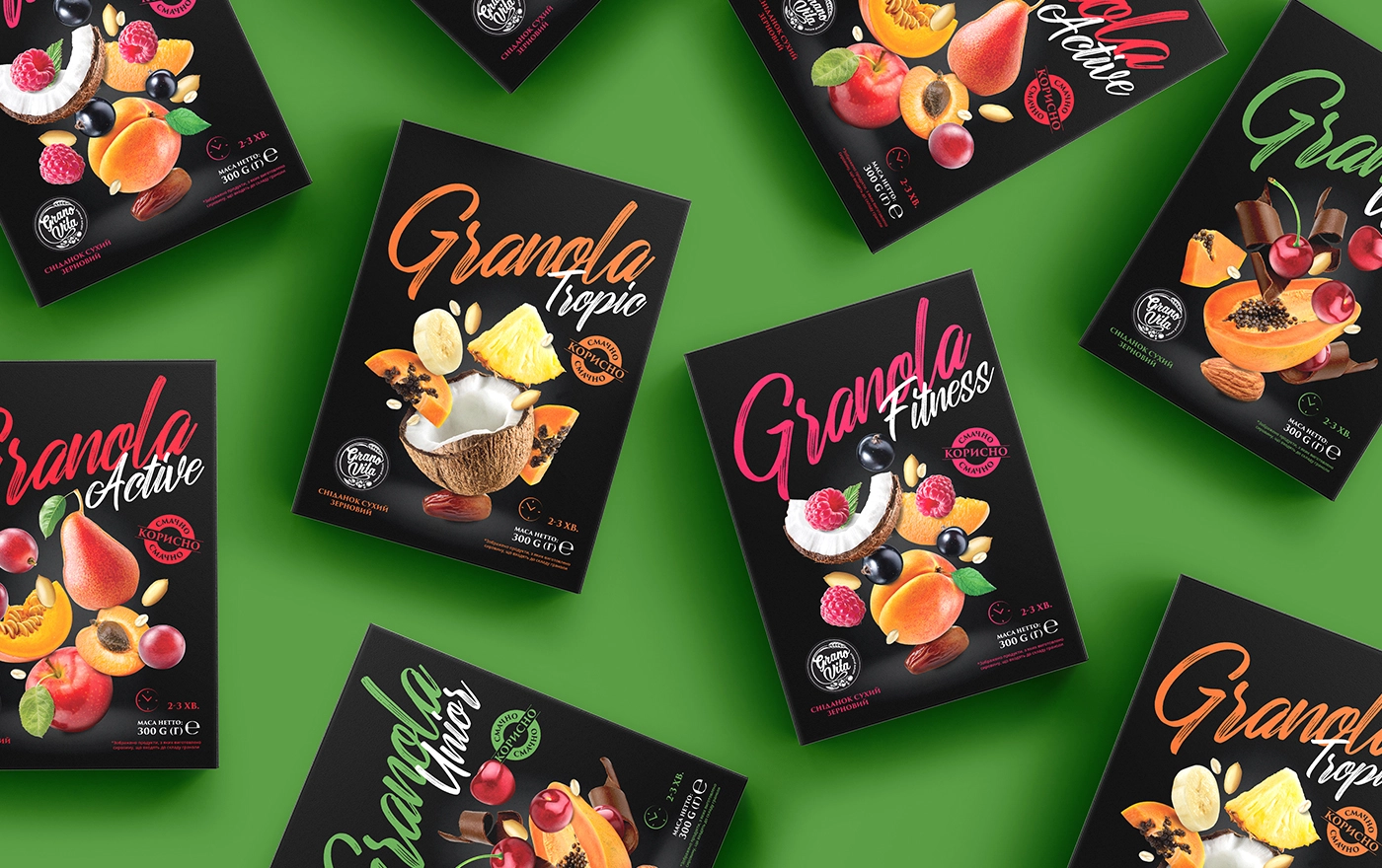
Our example: Granola for Granovita. Four varieties named Tropic, Fitness, Active, and Unior, each with its own color: orange, pink, red, and green. All four boxes share a black background, the same logo position, and the same layout, so the line reads as one set on the shelf while each flavor is easy to find. The main image on every box is a photograph of the ingredients flying outward from the center, which gives the pack energy without a single extra word. A matte coating cuts glare under store lights and makes the colors look richer.
Granovita also asked us for a second granola line, Crunch, aimed at younger, health-focused buyers. There the approach was different: bright flat colors per flavor (mint, magenta, coral, cyan), a large handwritten-style logotype, and detailed 3D renders of clusters, fruit, and seeds placed around a clear window. Small icons on the front carry “Vegan” and “Ready to Eat,” and the back holds the full nutrition panel and serving ideas. Two lines from the same producer, two different answers, because the buyers were different.

launching a cereal, granola, or bar line?
send us your flavors and formats: one system for the whole line, fixed estimate in 1-2 business days
get quoteProtein bar and granola bar packaging
A bar wrapper is one of the hardest pieces of packaging to design, because there is almost no room. On a flow wrap you have a strip roughly the size of a phone, and the shopper often sees it at an angle, in a box on the shelf or at the checkout.
What works on a single wrapper:
- brand mark, flavor, and one number. For protein bars that number is protein grams. For granola and fruit bars it is often the main ingredient or a claim like “no added sugar”;
- one color per flavor, consistent across the whole line;
- simple shapes over detailed photos, because fine detail disappears at this size and on metallized film.
The rest goes to the back of the wrapper or to the caddy. The caddy, the open-top box that holds 12 or so bars on the shelf, is often the most visible piece of the brand in a store. Design it at the same time as the wrapper, as part of the same system. A multipack carton for grocery stores and club stores is a third piece with its own front.
If you sell online, test the wrapper as a small thumbnail next to competitors. Many bars are chosen from a screen at that size.
Our example: Fruit Bar for Prime Bio. Five flavors, each coded by color: orange for apricot, purple for fig, blue for plum, green for date, and red for the mixed fruit bar. Each box has a cheerful fruit character for its main ingredient, which works for children, while the clean layout and natural ingredients keep it believable for parents. We designed the logo and the packaging together. The project won an A’ Design Award in the packaging category.

Claims and labeling to plan before design
Health claims sell cereal and bars, and they are also where most labeling problems start. A short list to check with your regulatory reviewer before the artwork is final. For the full picture of FDA label rules, see our food label requirements guide.
- Protein. “High protein” or “excellent source of protein” means at least 20% of the Daily Value per reference amount customarily consumed (RACC), and “good source” means 10 to 19% (21 CFR 101.54). Even a plain number like “12 g protein” on the front counts as a protein claim, so the Nutrition Facts panel must then show protein as a percent Daily Value, corrected for protein quality.
- Gluten-free. Allowed only when the food has under 20 parts per million of gluten (FDA). Oats are a common issue because of cross-contact with wheat.
- Allergens. Nine major food allergens must be declared, including sesame since 2023 (FDA). Nuts, peanuts, milk, soy, and wheat show up in a lot of granola and bars.
- “Healthy.” FDA updated the definition of “healthy,” and products using the claim must meet it by February 25, 2028 (FDA). The new rule requires a meaningful amount from a food group, such as whole grains, and sets limits on added sugars, sodium, and saturated fat. Many sweetened cereals won’t qualify.
- Whole grain. FDA has no final definition for “whole grain” statements, only older draft guidance. Some brands use the Whole Grain Stamp, which is a private program with its own criteria.
- Front-of-package nutrition box. FDA proposed a “Nutrition Info” box for the front of most packaged foods in January 2025, placed in the upper third of the front panel. It isn’t final, but it’s worth keeping the top of the front panel flexible.
None of this is legal advice. The point for design is to know which claims you are making before the layout is drawn, so the front doesn’t have to be rearranged after a review.
Images: photography, renders, or illustration
Cereal and granola are sold on appetite and texture. There are three ways to show the product, and each suits a different brand.
Photography of the product in a bowl or as loose clusters is the most honest and the most common. It needs real styling, a food photographer, and a decision about how the image looks on every flavor.
3D renders let you control every flake and nut and keep every flavor consistent, which is why we used them for Crunch. They work best when they look like the real product. Overly glossy renders read as fake.
Illustration separates a brand from the photo-heavy aisle and suits kids’ products and premium small-batch brands. It also handles new flavors easily: draw one more fruit.
Whatever you choose, the image on the pack should match what’s inside in color, size, and amount of add-ins. If the picture shows more berries than the box contains, add a “serving suggestion” line, and expect reviews to point it out anyway.
Sustainability and materials
Most cereal boxes are paperboard, often with recycled content, and most liners are plastic film, which few curbside programs accept. Granola pouches are usually multi-layer films, which are hard to recycle. Several states now have packaging fees that depend on the material, which we covered in our packaging trends guide. For design, two practical points:
- recycling claims and symbols should match what the material really is, and sit in a zone that’s easy to change if the material changes;
- paper-based and mono-material films print differently from standard laminates, with softer colors and less fine detail, so ask for a print test before a full run.
What a cereal or bar line costs to design
We price cereal and bar projects the same way as the rest of our packaging work. The first flavor carries the cost of building the system ($2,500), every flavor or size after it is about $800, and a new logo, if the brand needs one, is about $1,500. Three typical cases:
| Project | Calculation | Approximate design cost |
|---|---|---|
| Granola line, 4 flavors in pouches | $2,500 + 3 × $800 | $4,900 |
| New bar brand, logo plus 5 flavors | $1,500 + $2,500 + 4 × $800 | $7,200 |
| Cereal, 2 flavors in boxes | $2,500 + $800 | $3,300 |
A caddy or a multipack carton is a separate piece of packaging, so list it in the brief to get it into the estimate. Our packaging design cost guide explains what pushes a project above or below these numbers.
How a cereal or bar project runs
- Brief. Flavors, formats, sizes, where you sell, who buys it, and which claims go on the front. The questions are listed in our packaging design brief.
- Dielines and specs from your packaging supplier.
- Concepts. We show three directions on one lead flavor.
- Revisions on the chosen direction.
- System rollout to every flavor, the caddy, and any multipack.
- Print-ready files for each piece, prepared for your printer’s specs.
The full process, with timelines, is in our guide to the packaging design process. If you’re building out a whole food range, our food packaging design page shows more of our work in the category.
ready to design your cereal or bar packaging?
design only, files ready for any printer · fixed estimate in 1-2 business days
get quoteFAQ
01 What should be on a cereal box?
The front needs the brand, product name and flavor, a main benefit, an image of the product, and the net weight in the bottom 30% of the panel. The Nutrition Facts panel, ingredient list, allergen statement, and the manufacturer or distributor name and address go on the side or back. Many brands also add a serving suggestion, a story, and a QR code on the back.
02 What material are cereal boxes made of?
Most cereal boxes are folding cartons made of paperboard, often with recycled fiber, with a plastic or paper liner inside that keeps the cereal fresh. Granola more often sells in stand-up pouches made of multi-layer film. Your packaging supplier chooses the structure based on shelf life and cost.
03 Why is cereal sold in a bag inside a box?
The liner keeps out moisture and air so the cereal stays crisp, and the carton protects it in shipping and gives the brand a large printable surface. Some brands have tested bagless boxes or resealable bags, but the carton-and-liner format is still the most common.
04 How do you design packaging for a protein bar?
Start with the wrapper: brand mark, flavor, and the protein number, with one color per flavor. Keep the shapes simple, because detail is lost at this size. Then design the caddy and any multipack carton in the same system, since shoppers often see those first.
05 Can I put “high protein” on my packaging?
Only if the food provides at least 20% of the Daily Value for protein per reference amount customarily consumed, and then the Nutrition Facts panel must also list protein as a percent Daily Value adjusted for protein quality. Note that even “12 g protein” on the front counts as a protein claim. A product with 10 to 19% can use “good source of protein.” Check claims with a regulatory reviewer.
06 How much does cereal packaging design cost?
Our projects start at $2,500 for the system and the first flavor, plus about $800 per additional flavor. A four-flavor granola line comes to about $4,900; a new bar brand with a logo and five flavors to about $7,200.