Food Packaging Design for CPG Brands & Food Startups
Most food products fail at retail before anyone reads the ingredient list, checks . the nutrition panel, or looks at the price . They fail because the packaging. doesn’t stop anyone long decent to do any of that. A consumer moving through a grocery aisle sees hundreds of products per minute. The decision to reach for something happens in under two seconds — largely. unconsciously, largely based on color, shape , and whatever the eye catches first. Your food packaging design is doing that work , not your product , not your story ,. not your price. We design food packaging for CPG brands , food startups, and beverage companies. across the US , Europe , Canada , and Australia. Award winning agency with 14+ years. This is what we do.
Why Food Packaging Design Is Different from Other Categories
Food packaging has constraints that don’t exist in about other categories . Every . design decision has to account for regulative requirements, production realities,. and retail environment simultaneously. The label on a premium craft snack has to include an ingredient list, a Nutrition. Facts Panel, allergen declarations, net weight , and manufacturer information — all . mandated by FDA . None of that is optional . The design has to make all of it. clean and obedient while still looking like something a consumer would want to . pick up. That’s a harder little than about design projects.
Then there’s the shelf reality . Food retail is the most visually emulous . environment your packaging will always be in. A grocery store carries 40,000+ SKUs. Your granola is sitting next to five additional granolas. Your stock still fruit pouch is . surrounded by twenty alike products. The packaging has to communicate your. brand’s limited value — healthier, tastier , more premium, more affordable, more . sustainable — in the two seconds before someone moves on .
And then there’s production. Food packaging is printed on flexographic or digital . presses , applied to pouches , boxes , jars , or cartons using automated equipment . running at bold speed . A design that looks perfect in a mockup can fail in. production if the color separations aren’t right , the bleed isn’t adequate, or the . file isn’t built to the printer’s exact specifications.
The Three Mistakes Food Brands Make Most Often
Designing for the Instagram photo, not the shelf . A lot of food packaging is . designed to look good in a flat lay on a white background . That’s a different. visible problem than looking good in a refrigerated case with rough colourful . lighting , surrounded by competing products, at arm’s length. We design for where . the package really sells. Treating regulative text as an afterthought . The Nutrition Facts Panel, ingredient . list, and allergen declarations are often the up to date things added to a food . packaging design — whatever space is left over . This leads to cramped, foul. text that fails FDA requirements and looks unprofessional. We build compliance. into the layout from the start.
No system for line extensions. A brand launches with one SKU. Six months later. they have three flavors, two sizes , and a narrow edition. Each variation gets. designed individually and the result looks like three contrasting brands. We design . product families , not private packages .

Food Packaging Design Services — What We Create
Flexible Packaging — Pouches, Bags & Sachets
Stand up pouches, flat bottom bags , spouted pouches, and stick packs are the. dominant format in the premium food category. They’re lightweight, shelf stable ,. visually adaptable , and they work for everything from granola to coffee to protein. powder. The design challenge with adaptable packaging is working with a surface that. changes shape when filled. A design that looks balanced on a flat , empty pouch can. look completely contrasting when the bag is full and the gusset expands . We. prototype with filled samples before finalizing production files .
Multi layer flexible packaging — the kind used for products with long shelf life . requirements — has strict print specifications that vary by substrate. Barrier. films for high fat products , moisture sensitive thirsty goods, and oxygen sensitive. coffee behave differently on press . We build files to the printer’s exact . specifications , not to a nonproprietary template.
Rigid Packaging — Boxes, Cartons & Cases
Paperboard cartons, folding boxes , and rigid cases are the original format for thirsty. goods , frozen food , and premium gift packaging. The morphological engineering of a. carton — how it unfolds , where it glues, how it stacks — is a separate discipline. from the surface design , and the two have to work together . We design dielines from scratch or adapt from manufacturer provided templates . Every element of the printed surface — panels, top flaps , bottom panels, tuck tabs. — is accounted for in the file. We confirm fold lines and bleed areas before any . design work gets approved for production.
For stock still food packaging specifically , the substrate has to maintain morphological. integrity at -20°C while remaining visually appealing through a layer of frost. Condensation resistant coatings, high saturation photography, and careful color. saturation choices are all part of the brief .


Labels — Glass Jars, Bottles & Cans
Sauce bottles , jam jars , oil bottles, canned goods — products sold in rigid . containers need label design that works on a curved surface, reads correctly in a. retail context , and prints accurately on pressure sensitive label stock. A label applied to a glass jar is printed on a contrasting material than a label. applied to a metal can , and both are contrasting from a shrink sleeve. We design to. the limited label format the client’s manufacturer uses — including bleed, safe. zone, and any substrate limited color considerations .
For food products using front + back labels, we design both as part of the same . system. The back label often carries the full regulative burden — ingredient list,. nutrition panel , allergen text , manufacturer address — and still needs to look. considered , not crammed.
Food Service & Restaurant Packaging
Cups , bags , boxes, wrappers, and branded take away packaging for restaurant and . food service brands operate on a contrasting logic than retail packaging . The . customer is already at point of sale . The packaging’s job is to reinforce the . brand experience, not to sell the product. Restaurant branding extends the identity of the space into the customer’s hands . and, usually , out the door . A paper bag or coffee cup that looks good is free . advertising. One that looks nonproprietary or flashy communicates something about the food. inside. We’ve designed food service packaging for quick service restaurant concepts. alongside full brand identity systems — the packaging and the brand developed. simultaneously so they read as a orderly whole.
Our Food Packaging Design Portfolio
Seven food and beverage packaging projects across the US, Europe , and Australia . Each client was at a contrasting stage, in a contrasting category , and required. something contrasting from the design.
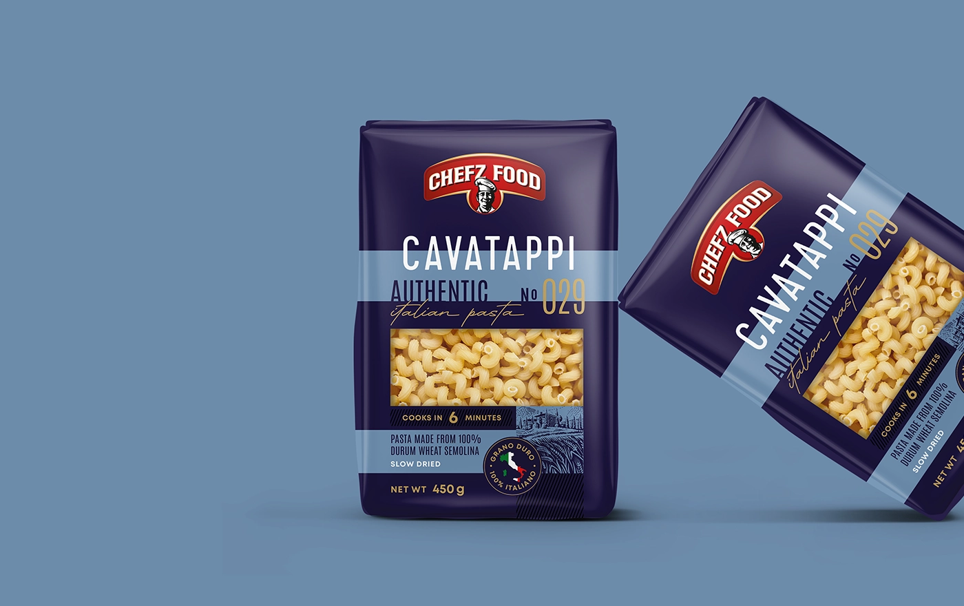
Pasta Bel Gusto
Granola Brand
Soups & Seasonings Collection
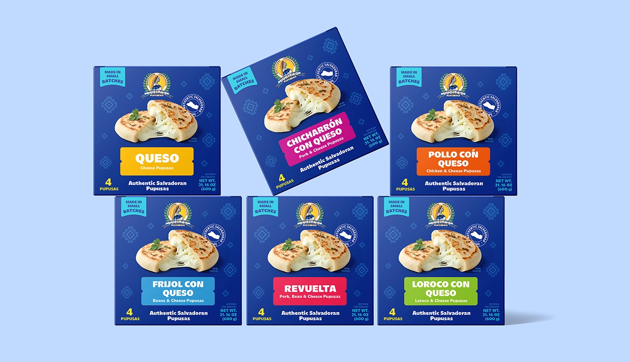
Stepnoy Dairy Products
Pita Gyros — Gourmet Fast Food
Una Lunas Fruit
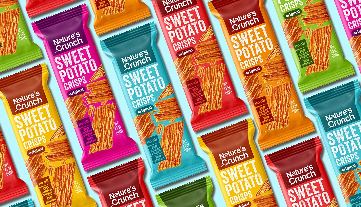
Crunchy Snacks
trusted by our clients


FDA Labeling Requirements for Food Packaging
Food packaging sold in the US must comply with FDA labeling requirements. Noncompliant packaging can result in product recalls , retailer delistings , and legal . liability — none of which are hypothetical risks. The obligatory elements for most packaged food products:. Nutrition Facts Panel. obligatory format specified by FDA , including serving size . declaration , calorie count, and obligatory nutrient information . The 2020 FDA . updates — including added sugars declaration and updated daily value percentages —. are in effect and must be followed. Statement of Identity. The common name of the food , displayed conspicuously on the . primary Display Panel. Font size requirements apply . Net weight. The quantity of contents declared in both US Customary and rhythmical. units, in the bottom 30% of the primary Display Panel.
Ingredient statement . Listed in descending order by weight, on the information . panel adjacent to the Principal Display Panel . Allergen declarations. Under FALCPA , the eight outstanding allergens (milk, eggs, fish, shellfish, tree nuts , peanuts , wheat , soybeans) must be declared clearly . Sesame . became the ninth outstanding allergen in 2023 . Mis declared allergens are the most . common cause of food product recalls in the US. Manufacturer name and address. Required on the label. We design all food packaging with FDA compliance built into the layout from the. start. We are not a legal service and can’t provide regulative counsel — but the. design itself will be structurally compliant. If you need regulative sign off,. work with a food labeling consultant in parallel.


Our Food Packaging Design Process
Brief & Category Research — Week 1
Every food packaging project starts with understanding the category . Where will . this product sell?. What does the emulous set look like?. What does the. packaging need to communicate and to whom?. We research the retail context specifically — not just competitor aesthetics , but . shelf position, pricing tier , and the visible conventions the category has. established . We look for where your brand can occupy white space rather than. compete directly on someone else’s terms.
Concept Development — Weeks 2–3
We develop three definite productive directions . Each one is a complete, orderly. response to the brief — not variations on a single idea. The concepts are . presented as hard nosed mockups showing the packaging in context: on a shelf, in a . refrigerated case , or in whatever retail environment the product is designed for. We include morphological recommendations in this stage — if the packaging format . itself (pouch vs . box vs . label) would benefit from adjustment, we address that. during concepts, not after.
Revisions — Weeks 4–5
Once a direction is selected, we refine through three rounds of revisions . regulative text placement, color accuracy, typography hierarchy, and productionspecific requirements are completely addressed in this stage .
Print-Ready Files — Delivery
last deliverables: AI (Adobe Illustrator source file), PDF/X 1a (print-ready with . bleeds, prophylactic zones , and crop marks), EPS, and PNG previews . Files are built to . your printer’s specifications. For adaptable packaging with complex multi-layer requirements , we coordinate . directly with your manufacturer to confirm commercial specs before finalizing. separations. Timeline: four to seven weeks for a single SKU . Multi SKU systems or. projects requiring primary illustration or photography direction take six to ten. weeks.


Food Packaging Design Pricing
A single food packaging design project — one SKU , three creative directions, three. rounds of revisions — typically runs $2,500 to $5,000 depending on packaging . complexity and whether illustration or photography is required . Multi SKU line projects are priced per scope after understanding the full system —. how many products, how many formats , how much of the brand architecture needs to. be established versus extended . We quote after a little conversation. If the scope and budget don’t align, we’ll. say so directly.
have a project? let’s talk
with this form, you can request or calculate the service you’re interested in.
Your contact information will only be used to reach out to you
how we work:
- submit a request
Begin by filling out the feedback form on our website. Please provide your
contact information and a brief description of the upcoming project.
- complete the brief
Once we receive your request, we’ll send you a brief—a set of straightforward
questions to help us understand your project. Please fill it out with information
about your brand, target audience, design preferences, and any other relevant details.
- receive an estimate
After reviewing the completed brief, we will send you an estimated cost and timeline
for your project. This process usually takes 1 to 2 business days.
FAQ — Food Packaging Design
find quick answers
A single SKU food packaging project — three creative directions , three revision. rounds, print ready files — runs $2 ,500 to $5,000. Multi SKU line extensions ,. systems requiring primary illustration , and full brand launches involving. multiple formats are priced per scope after a brief.
Yes — flexible pouches , stand up bags, paperboard cartons , folding boxes, glass. jar labels , bottle labels, shrink sleeves, frozen food packaging, and food service. packaging. If your format isn't listed, ask us.
Four to seven weeks for a single SKU from little to print ready files. Multi SKU. systems and projects requiring primary illustration or photography take six to. ten weeks. Rush timelines are disposable for extra fee if discussed before the. project starts.
We design layouts with FDA required elements correctly placed and sized —. Nutrition Facts Panel , ingredient statement , allergen declarations, net weight ,. manufacturer address. We're a design studio, not a regulative service , so we can't . provide compliance certification. For regulative sign off, work with a food. labeling consultant alongside the design process.
Yes — this is a line extension system. We establish the brand architecture and. visible rules first, then apply them systematically across each variant. The system . ensures each SKU is singly placeable while the full line reads as a. orderly brand family on shelf.
Yes. We've worked with brands launching their first product as well as established . companies refreshing existent lines . The process is the same careless of company . size. What matters is whether the brief is clear and the budget is aligned.
AI (Adobe Illustrator source file, amply editable), PDF/X 1a (print-ready with . bleeds and crop marks), EPS, and PNG previews . Source files are included in the. project fee — you own everything outright when payment is complete .
Yes . We work remotely with clients across the US, Europe, Canada, Australia , and. the UAE. The process is amply online — brief, concepts , revisions, and file. delivery are completely handled digitally.
get free quote
Work With Us
Seven food and beverage packaging projects completed across the US , Europe , and . Australia . Award winning studio based in New York . 14 years working with consumer. brands at every stage — from pre-launch startups to established brands refreshing. existent lines. If you’re launching a new food product, extending an existent line , or need. packaging that’s not competing effectively at retail — we’d like to hear about it.