brand identity, packaging design
Branding & Packaging Design for Soups & Seasonings
concept
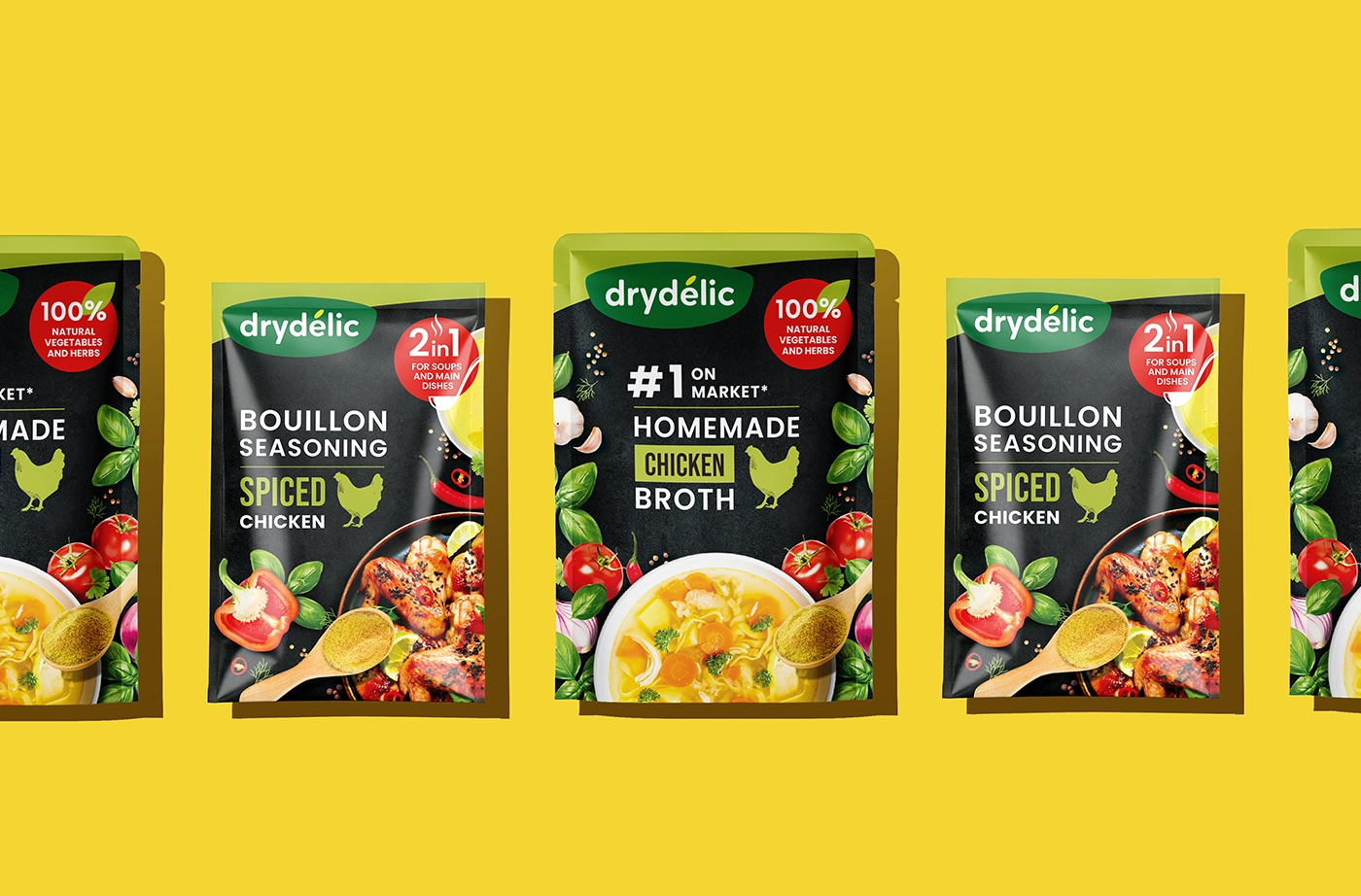
The idea behind the new line was to mix natural freshness with a strong shelf presence. This would show off the items' handcrafted quality and modern convenience. The package makes an emotional connection with people who want quick, substantial, and healthy meals right away by using rich food images, bright colour contrast, and straightforward icon-based language.
challenge
The new line of ready-to-eat soups, broths, and bouillon spices needed a creative way to get into the market. The goal was to create a lively, unique brand that would appeal to busy people who want quick, nutritious, and tasty eating options. The problem was how to get across the idea of convenience without losing the idea of naturalness and home-cooked quality.
solution
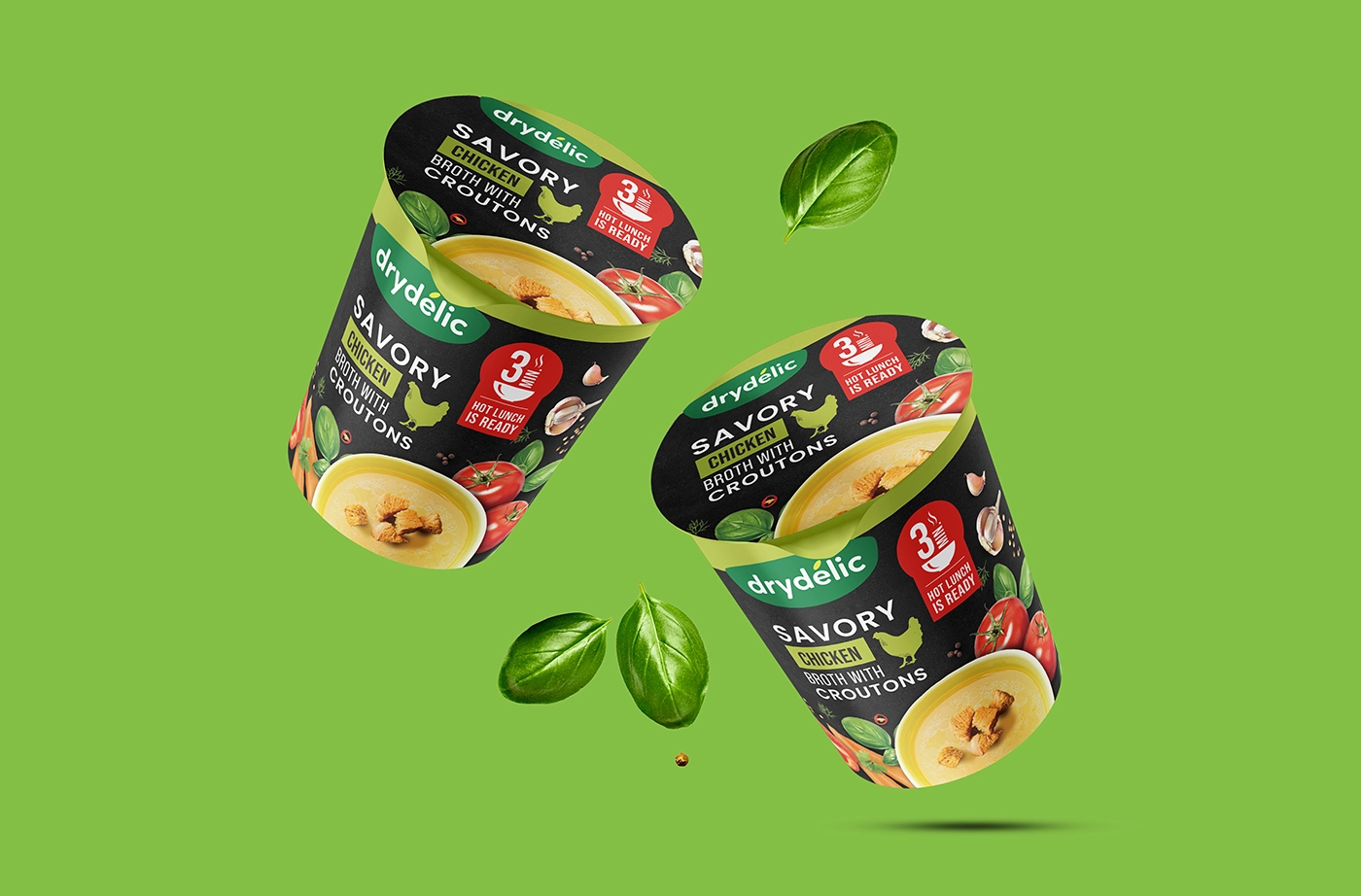
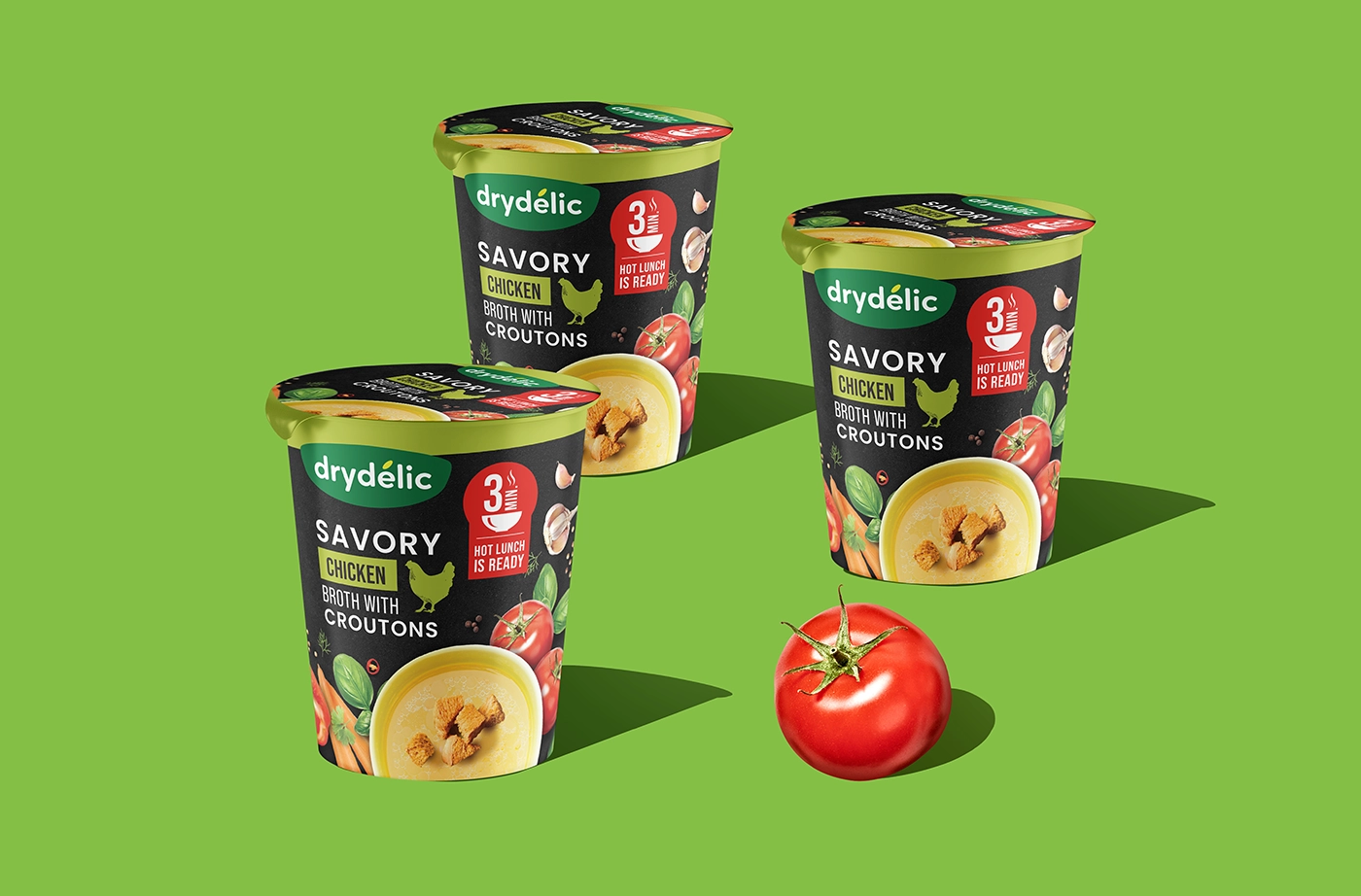
We built a whole branding and packaging strategy that focuses on making things look good, being clear, and standing out on the shelf. The design system combines a modern look with a strong natural message. It uses rich photos of herbs and vegetables, simple flat symbols, and bold statements like "100% Natural Vegetables and Herbs" and "Hot Lunch in 3 Minutes."

industry
food
project type
logo design, packaging design
client
DelicFood
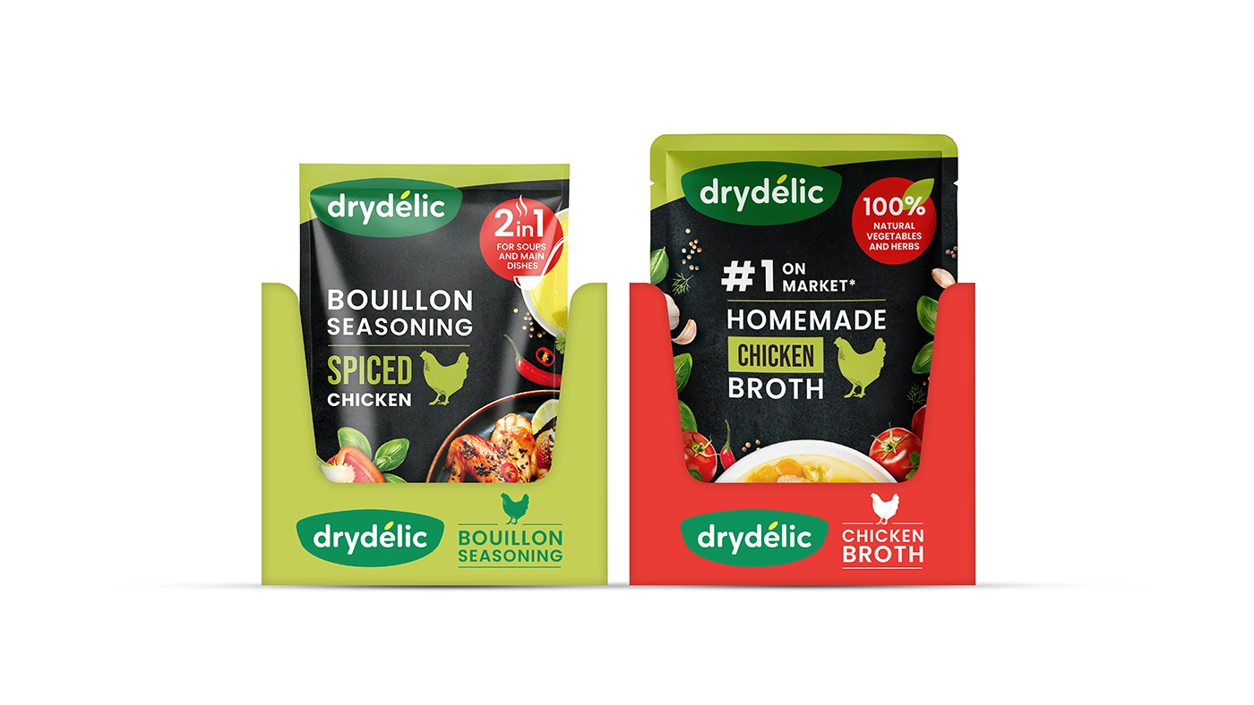
We made sure that the colours were strong and that the soups, crouton broths, and bouillon blends were easy to tell apart by breaking up the line into these groups.
The package tells you not just what it tastes like, but also what it does. Labels make it apparent how to use the product, whether as a soup on its own or as a flavouring for meat, pasta, or grains.
Features of the Design
Appetizing Pictures: Pictures of soup bowls and ingredients show how fresh and tasty they are. Clear Structure: The hierarchy of the typeface makes it easy to tell what kind of product it is, what flavour it has, and how long it takes to prepare. Bold Colour Coding: Bright red and green accents show what flavour the product is and what category it belongs to. Strong Callouts: Pictograms like "2 in 1 for Soups & Main Dishes" and "#1 on Market" make the benefits of the product clearer.
Modern Shelf Presence: The matte black background makes the goods look more premium and pleasant by adding contrast.


The new brand shows that healthy taste and convenience can go hand in hand. The brand's visual style emphasizes freshness, quickness, and variety, which appeals to both people who care about time and people who enjoy food. The packaging makes you want to try it and establishes trust right away, whether you want to use it as a comfortable meal or to add flavour.