packaging design
Una Luna Alcoholic chocolates Packaging Design
concept
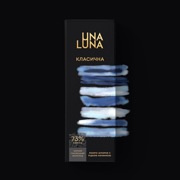
We developed packaging for Una Luna's new line of alcoholic chocolates, emphasizing the distinctiveness of every taste with strong, abstract brushstrokes on a sophisticated black background with gold accents. Every package transforms the chocolates into a real piece of art by artistically catching the vitality and character of the flavor.
challenge
Una Luna turned to us to design packaging for their next line of alcoholic chocolates. Unlike classic liqueur-based sweets, Una Luna's products include a range of fascinating tastes. Our goal was to design packaging that will not only guard these premium chocolates but also graphically convey the spirit and vitality of every unique taste.
solution
The vivid tastes and artistic quality of the chocolates motivated us to create a design idea emphasizing abstract representation. Bold, surprising brush strokes that capture the dynamic energy and spirit of the ingredients help to portray every flavor. This method lets customers see the richness and thrill of the flavors before even tasting the chocolates.

Awards
Silver A'Design Award
project type
packaging design, illustration
client
Una Luna
Una Luna Luna's chocolates' packaging combines contemporary artistic flair with sophisticated elegance.
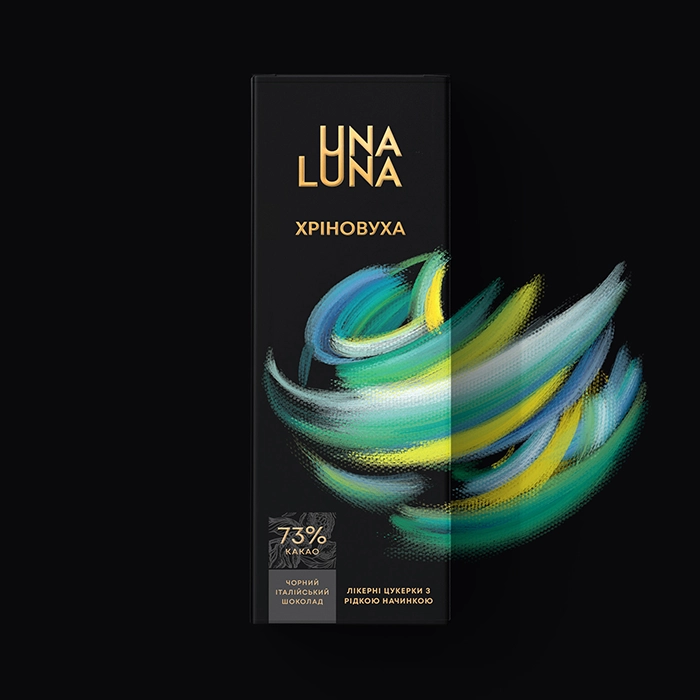
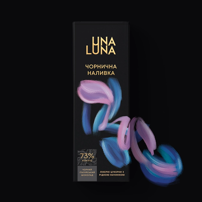
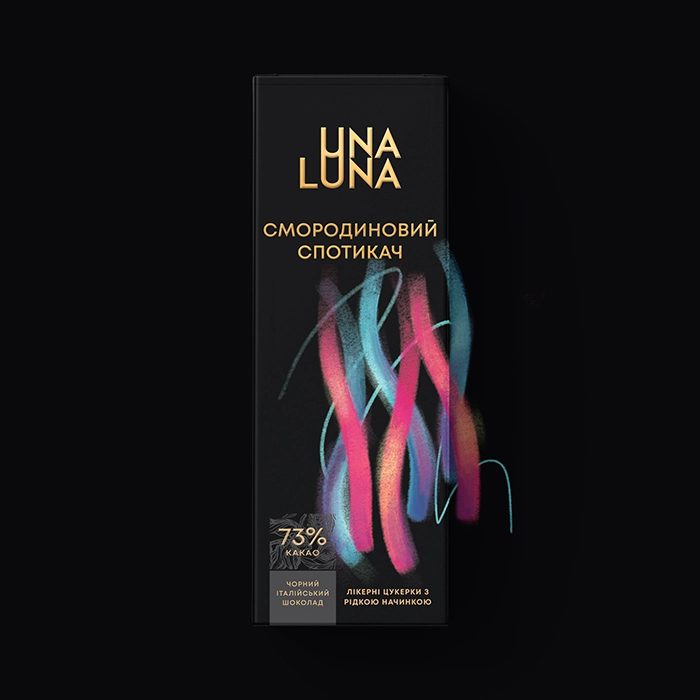
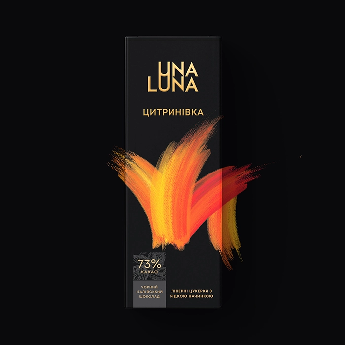
The black background offers a refined canvas that accentuates the vivid brushstroke hues. Gold typeface brings a bit of elegance in line with the chocolates' high quality. Reflecting its strong and complicated taste, the flavor of horseradish tincture with honey and lemon is caught in a swirl of green, blue, and yellow strokes. Malynivka: Emulating the sweet and sour taste of real raspberries, a raspberry tincture blossoms with brilliant pink strokes. Tsytrynivka, an orange tincture, symbolizes the citric, zesty taste by exploding brilliant, scorching orange strokes. Jyravlynivka: The vivid and tart character of cranberries is captured in the cranberry tincture with a firework of blue and scarlet splashes. Klasichna: Harmonious blue and white strokes suggest a balanced and conventional taste, therefore reflecting the traditional flavor. Dynamic, interwoven strokes of vivid colors express the rich and fruish taste of the blackcurrant flavor. Chornychna Nalivka: Flowing blue and purple strokes capture the taste sensation of great depth and richness from the blueberry liqueur.


Every box is meant to be aesthetically beautiful as well as useful. Although the beautiful design distinguishes the boxes on shelves, their construction guarantees the chocolates are well-protected. Apart from their striking appearance, the abstract drawings help to visually narrate the distinctive qualities of every taste.