Judinström Beer – Hej! Je m'appelle Olsen

Gaining Norway's Soul
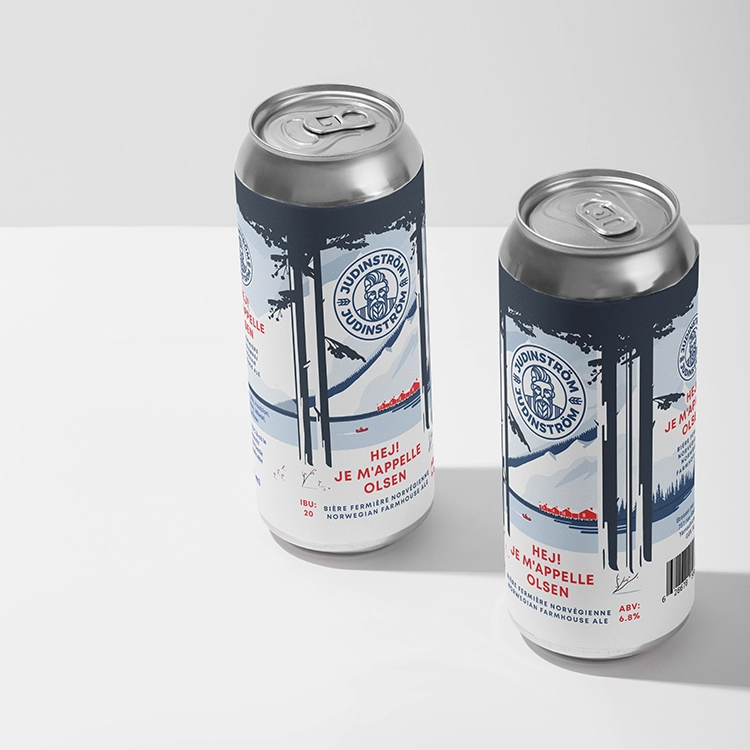
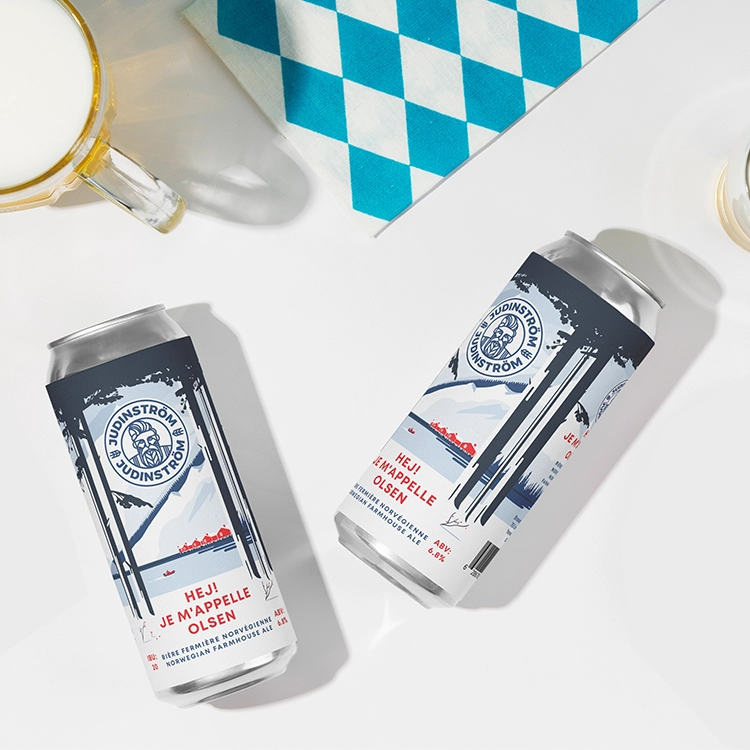
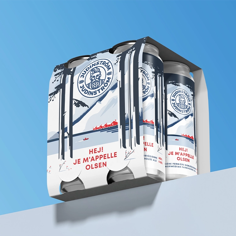
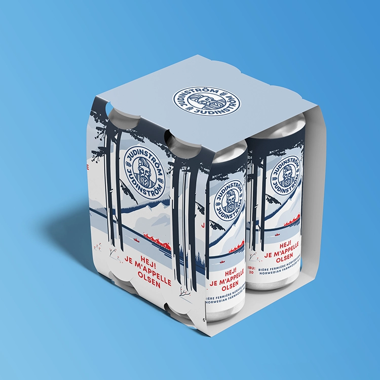
The label boasts a gorgeous fjord surrounded by snow-capped mountains and deep pine trees. The calm view, broken sometimes by a small red cottage, captures the harmony of nature and history that defines Norway.
The product name, “Hej! Je m’appelle Olsen,” is clearly shown in a neat, strong typeface, therefore fostering an approachable and inviting tone. Combining Norwegian and French gives a distinctive touch that suggests a worldwide appeal while keeping anchored in its Nordic roots.
With its strong Viking-inspired symbolism, the Judinström logo ties the modern design to its legacy and accentuates the great regard for history and tradition of the business.
Blues, whites, and reds taken together reflect the Norwegian flag and the calm tones of the local landscape. White space’s subdued utilization improves the product’s clean, reviving appeal.
The design gently encircles the can to inspire the customer to investigate the whole label. From the great settings to the finer product details, every position presents a fresh perspective of the story.