Event agency. Logo & Corporate Identity
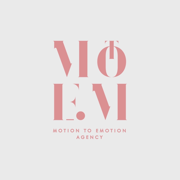
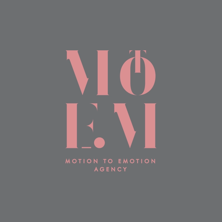
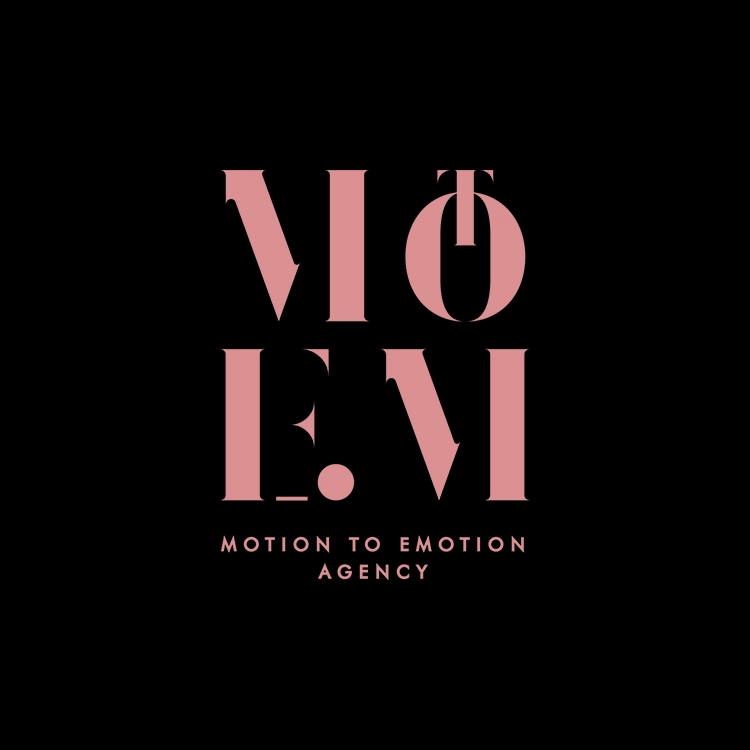
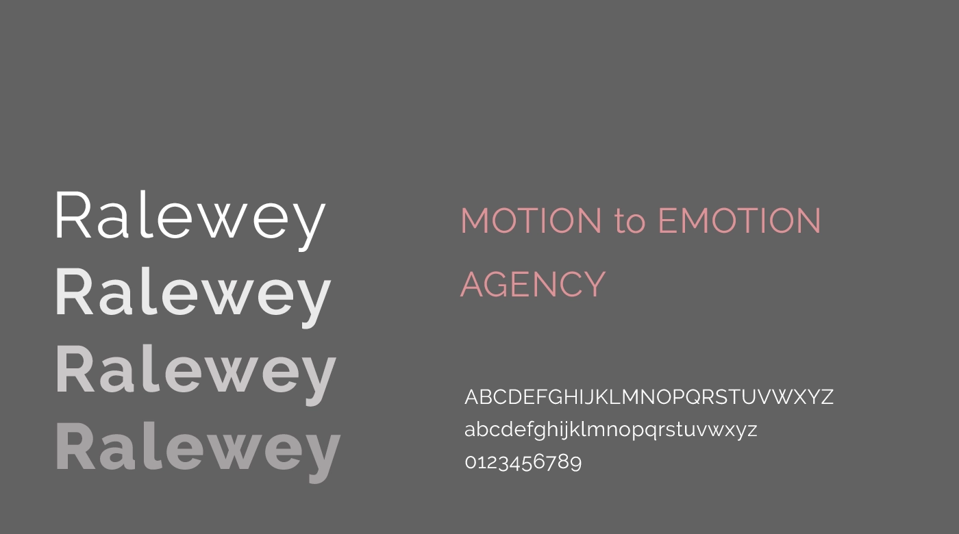
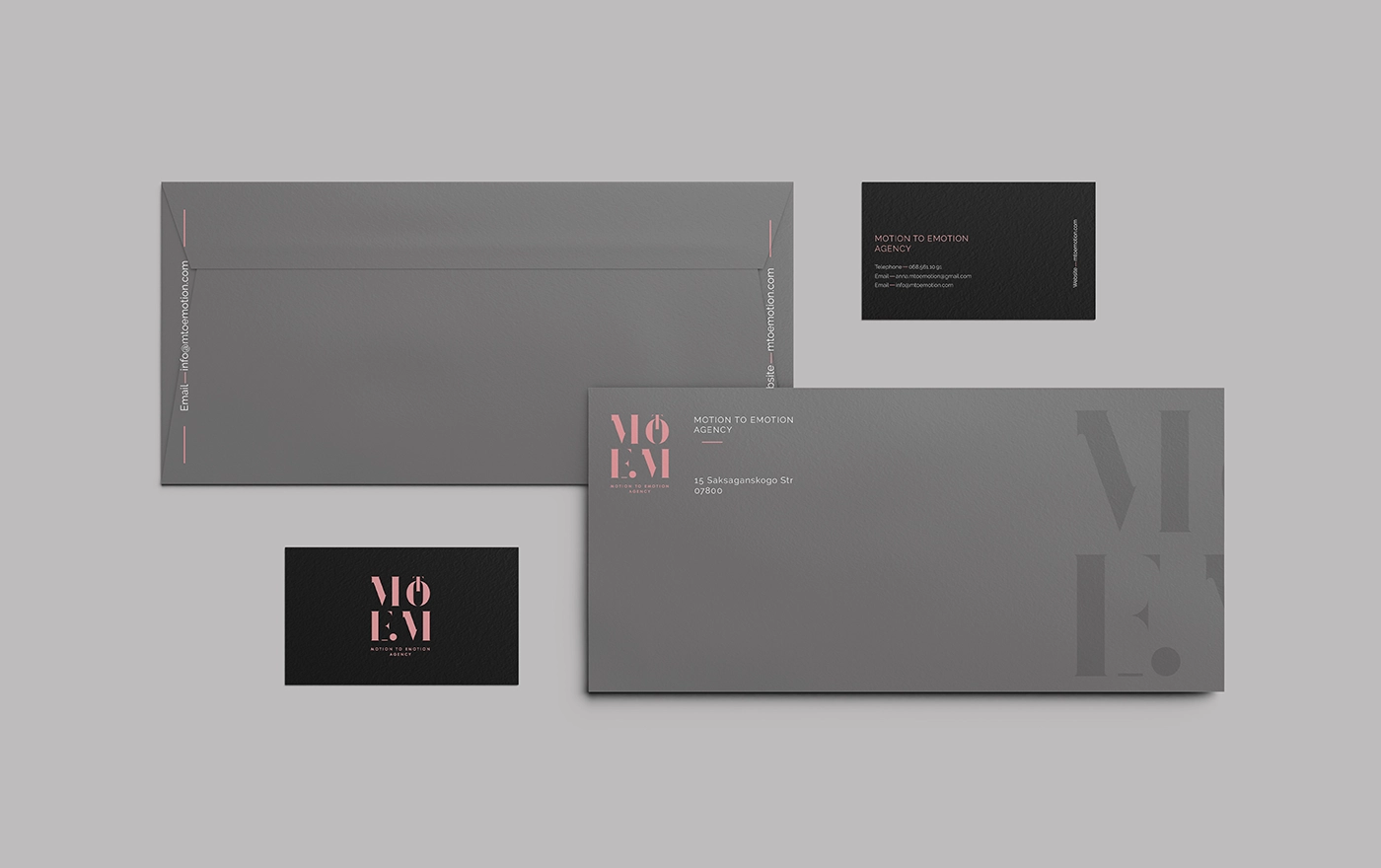
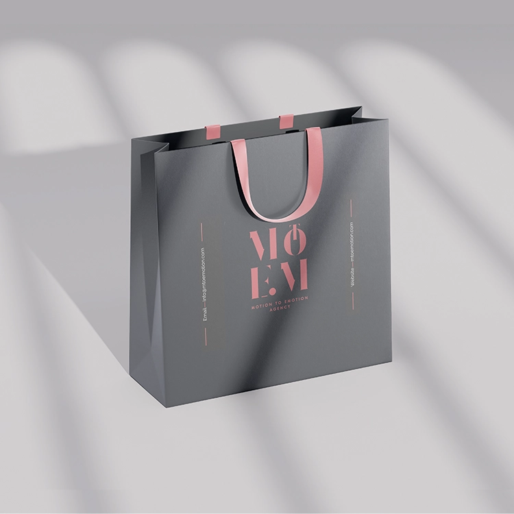
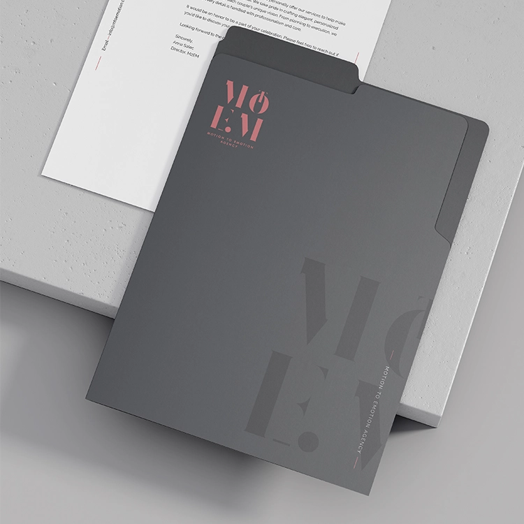
The MtoEM logo employs a strong, contemporary typeface in an exquisite serif style.
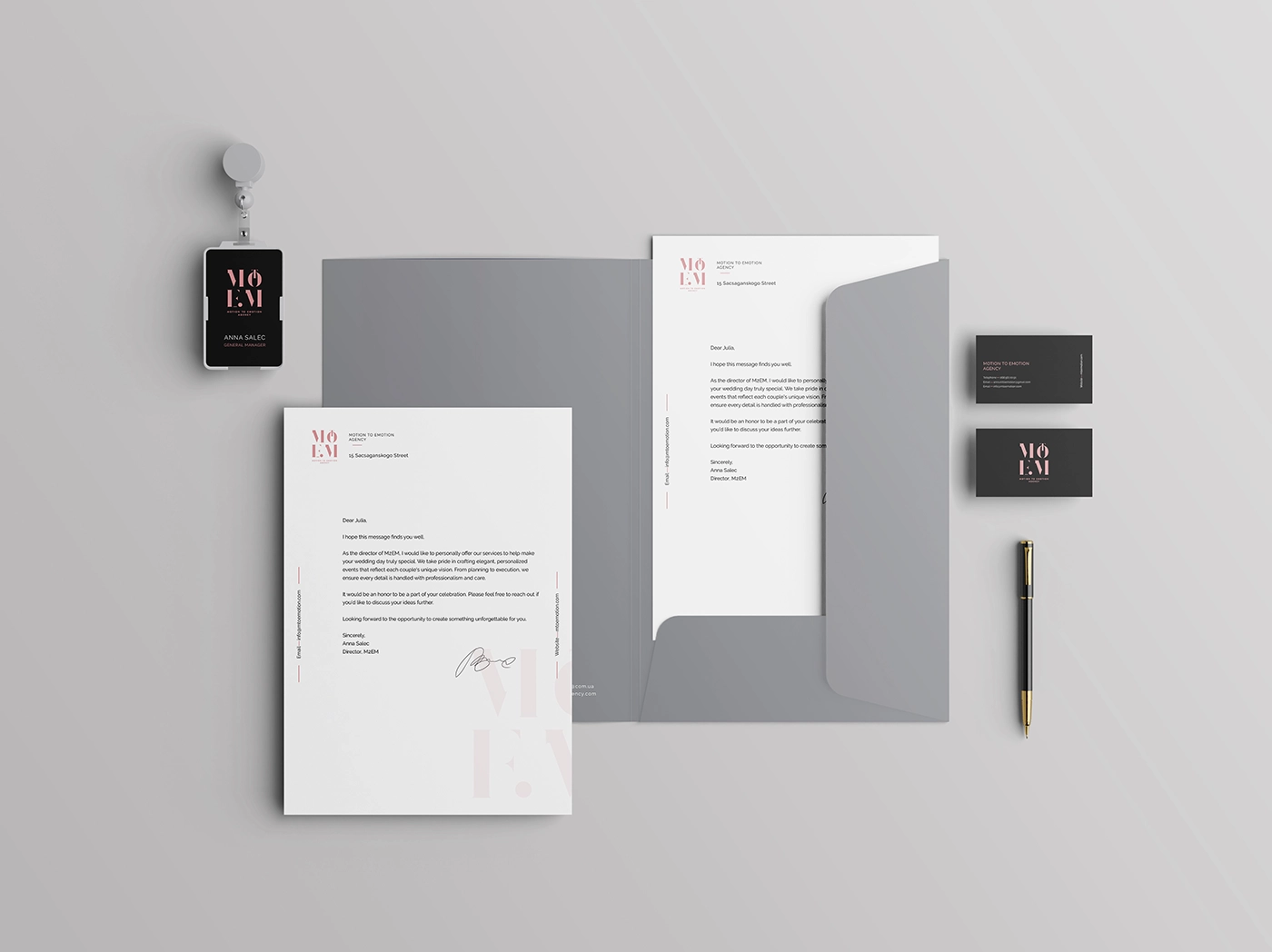
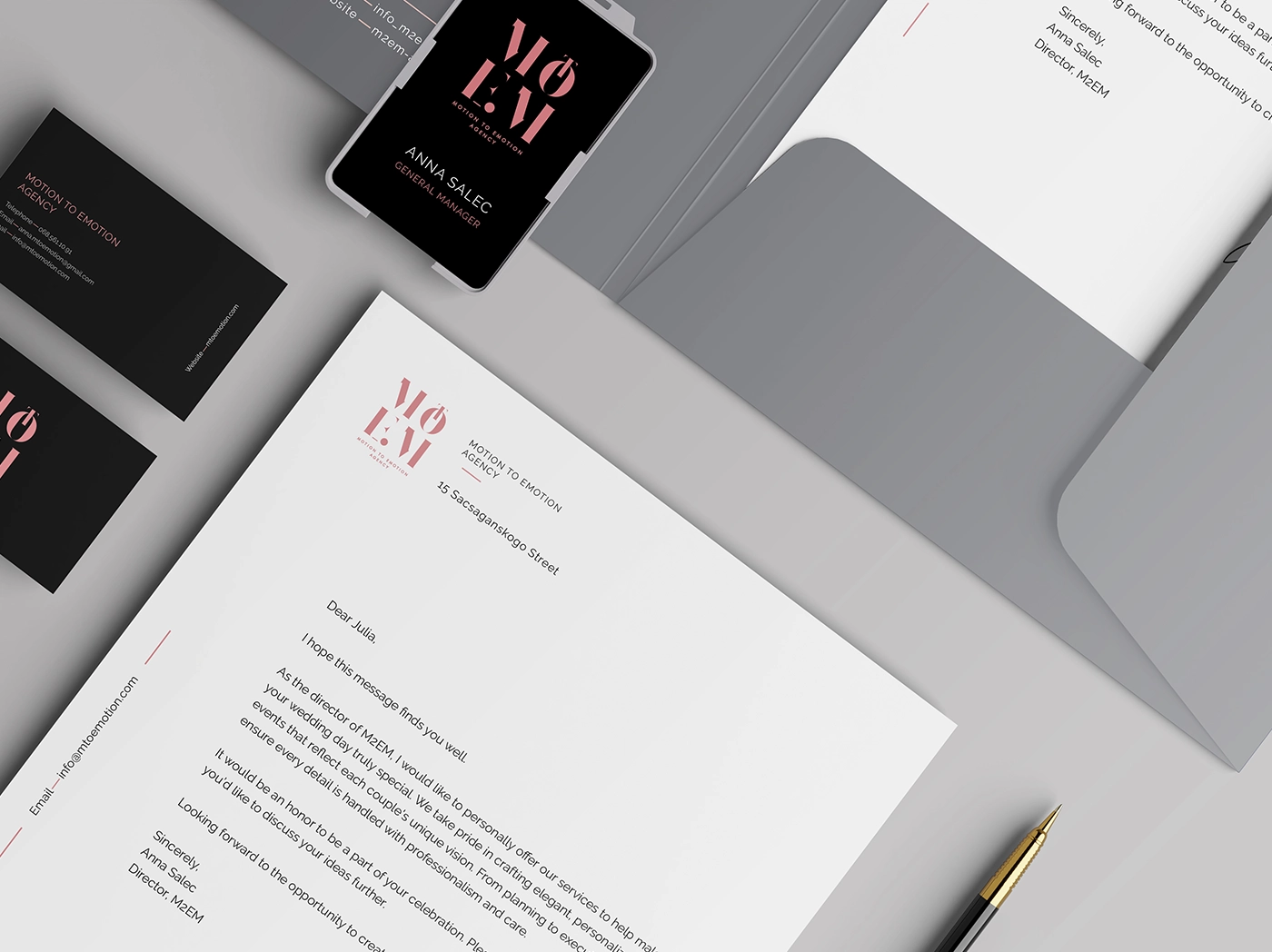
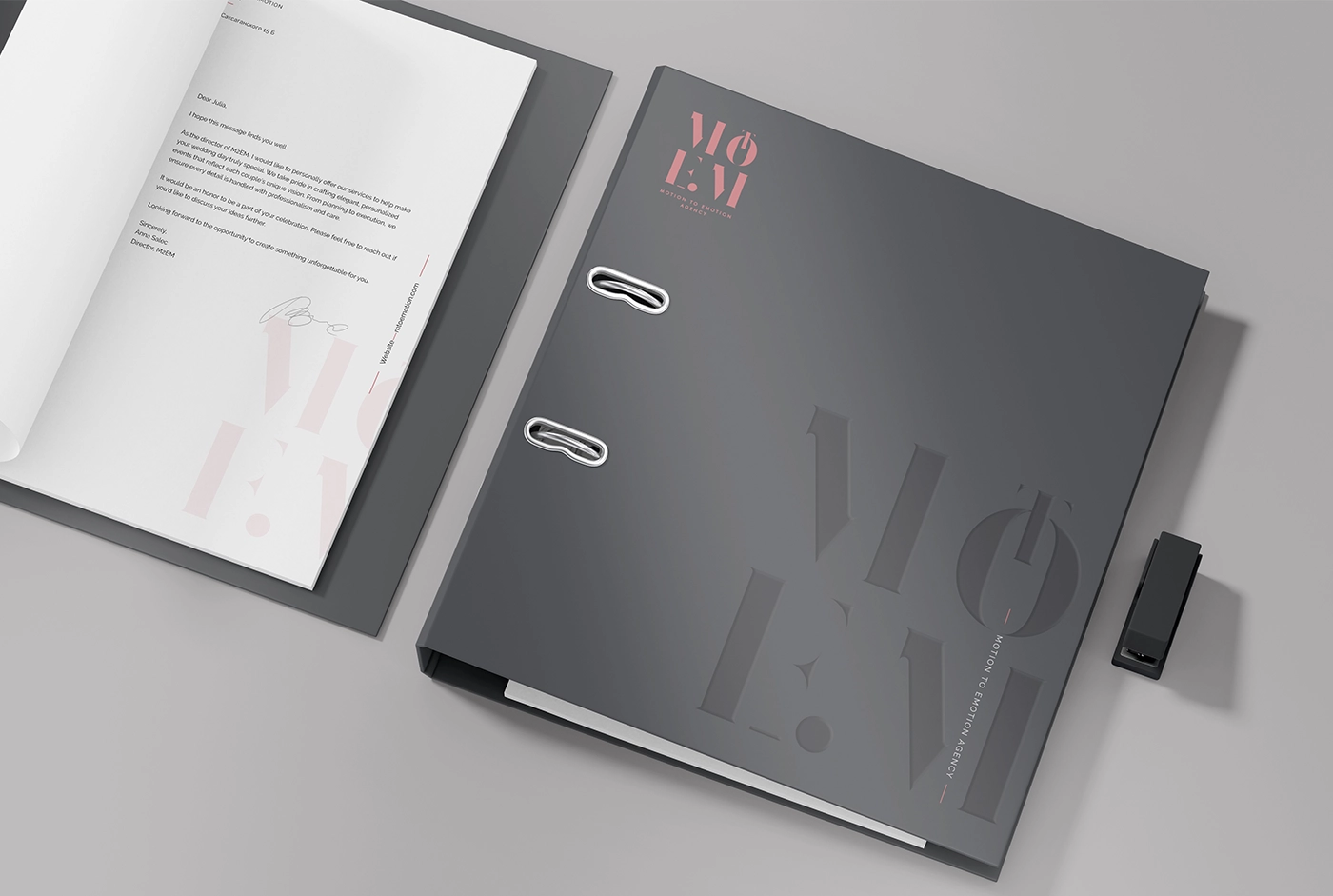
The corporate identity is developed on a flawless integration of branded elements reflecting the agency’s sophisticated and modern look. Business cards radiating expertise and exclusivity show a startling contrast between matte black and soft coral pink. With understated branding elements, letterheads keep a simple and elegant approach that highlights communication’s clarity and grace. Designed with elegant finishes and embossed typeography, envelopes and folders improve tactile experience and guarantee a quality feel. Using premium fabrics and well placed accents to improve brand impression, branded shopping bags have the same elegant look. From all physical and digital touchpoints, office supplies—binders, badges, digital apps—keep uniformity and a flawless brand experience.