
Frozen Pupusas Packaging Design
concept
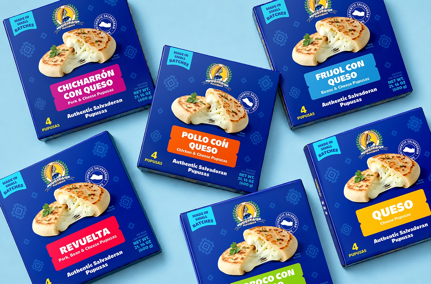
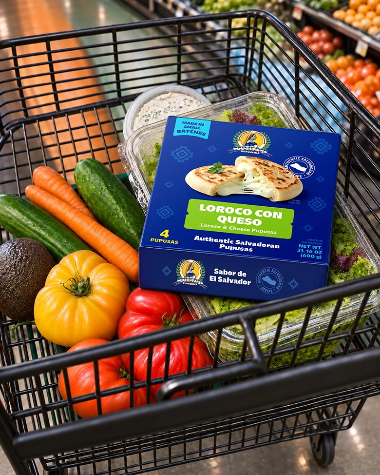
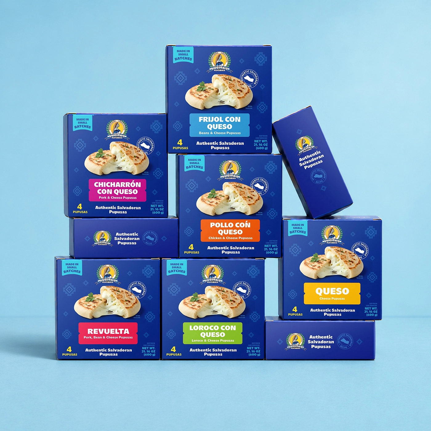
Traditional Salvadoran motifs inspired the packaging for Lucita’s Pupuseria’s six pupusa varieties. The deep blue background draws on El Salvador’s flag, and the geometric pattern reinterprets traditional Salvadoran designs. Bright flavor labels draw from the country’s traditional color palette and make each variety easy to spot. A seal featuring the outline of El Salvador highlights the dish’s origins.
challenge
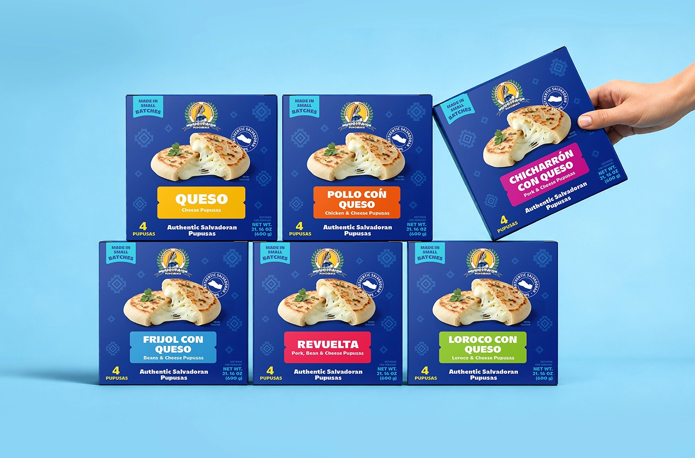
The packaging needed to work for shoppers who grew up eating pupusas and for those discovering them for the first time. Each carton had to make the filling easy to identify, keep the Spanish flavor name prominent, and explain it in English. Displayed together, the six varieties needed to read as one brand while remaining easy to tell apart.
solution
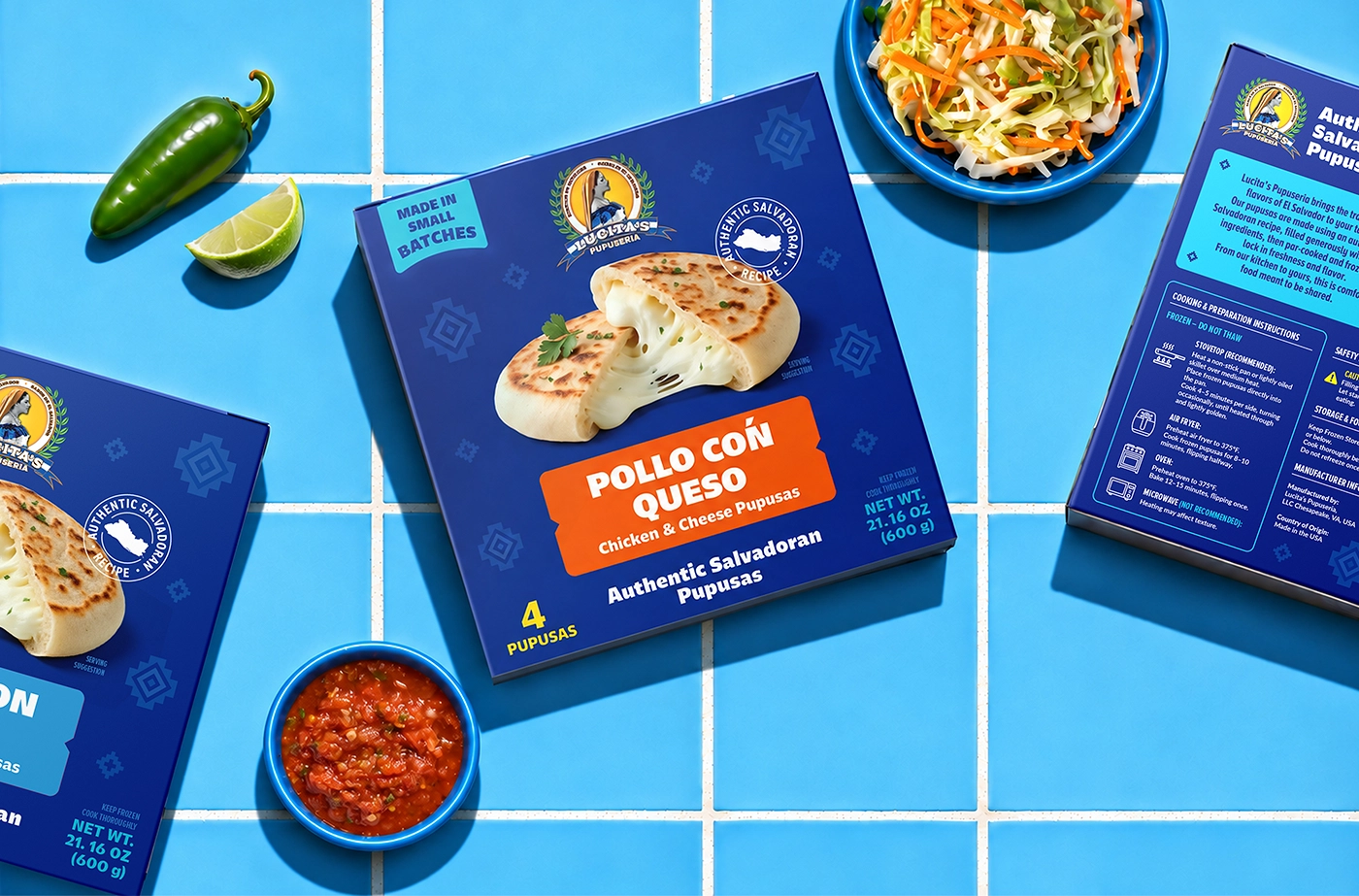
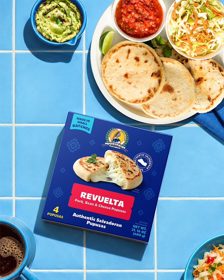
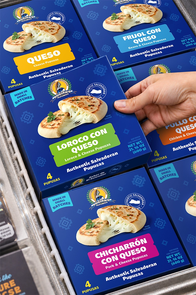
We built a consistent layout for all six square cartons. Each variety has its own color block, with the Spanish name in bold type and a short English description beneath it. The shared blue background, brand crest, and close-up product image make each carton recognizable on its own.
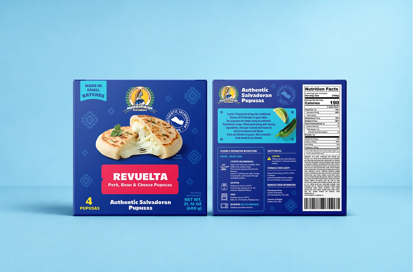
Project overview
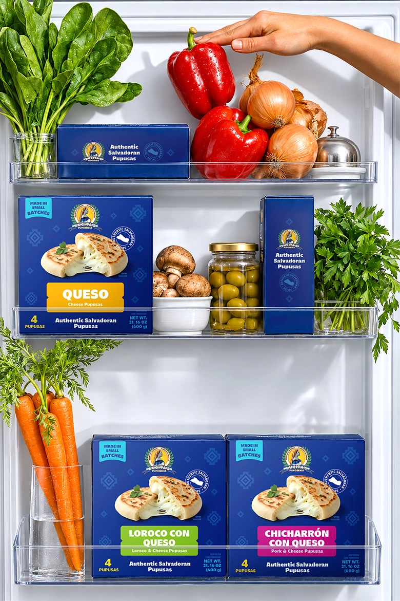
The finished packaging gives Lucita’s Pupuseria a recognizable presence in the frozen food aisle. It introduces the dish through a close-up of the pupusa, keeps the Spanish flavor names central to the design, and gives shoppers a clear way to choose among six fillings.
relevant services
- packaging design
- label design
- beverage design
- food packaging design