
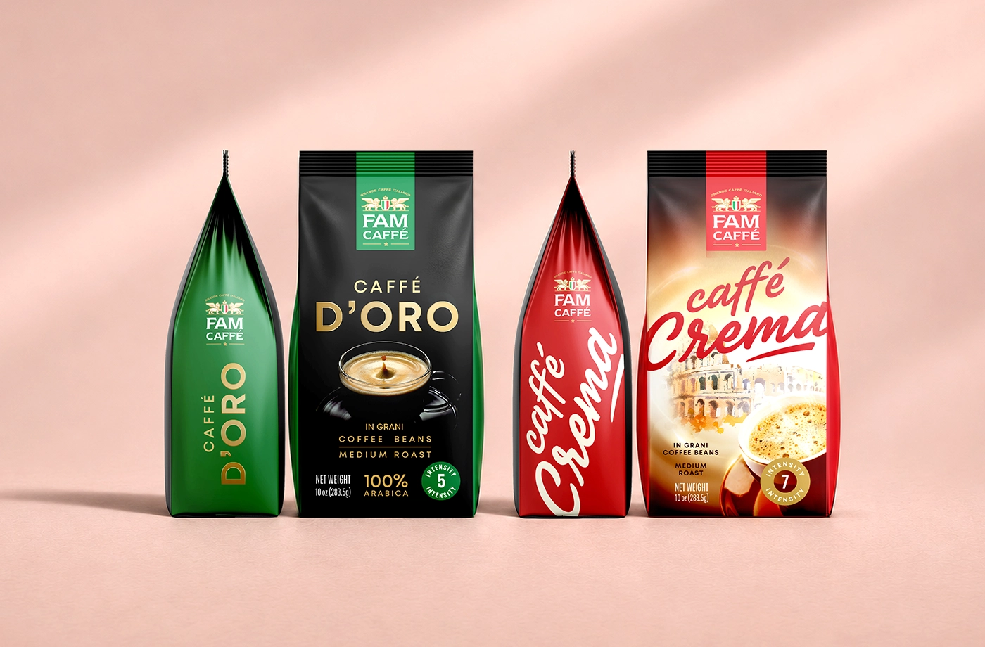
FAM CAFFEE Logo & Coffee Packaging Design
concept
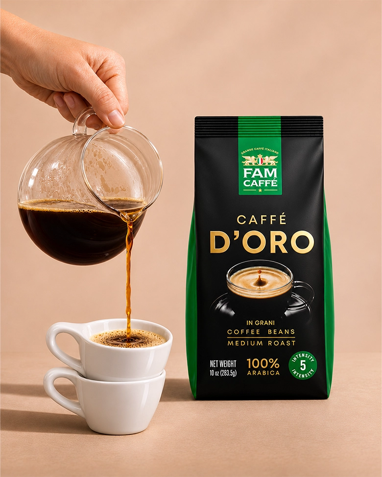
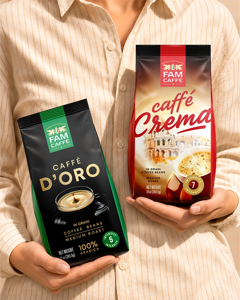
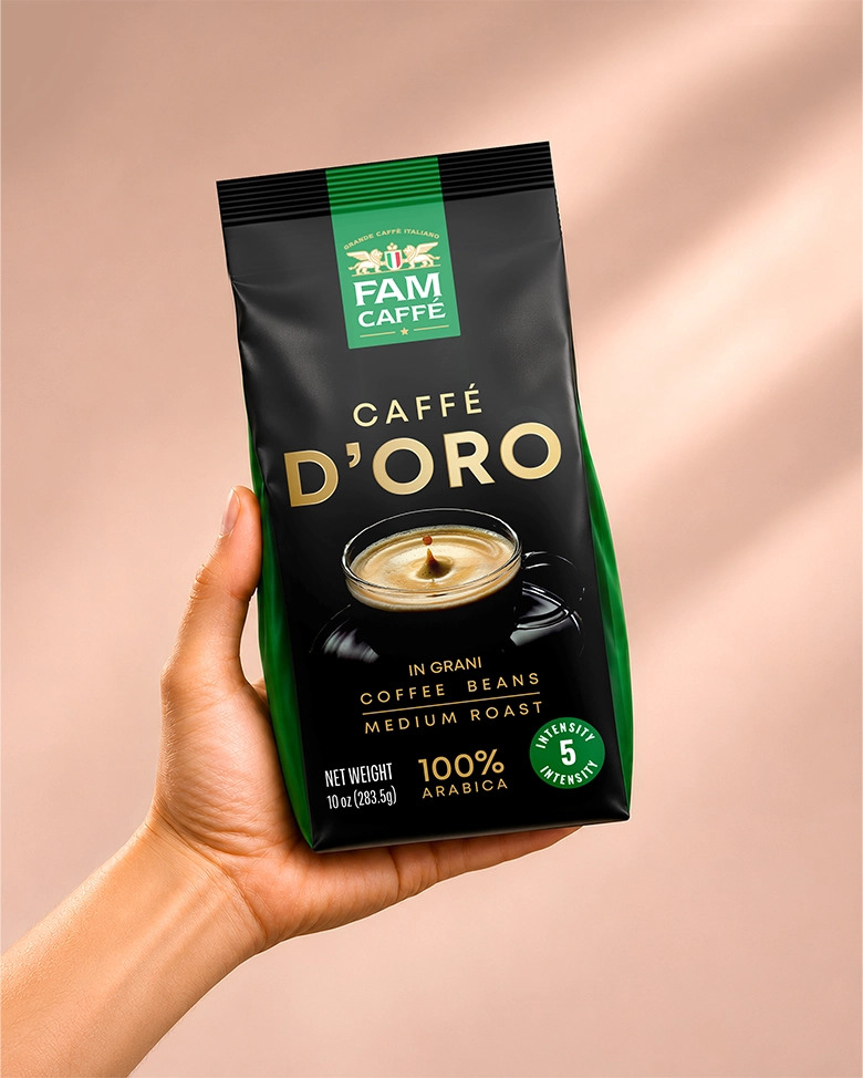
We designed the FAM CAFFÉ logo and packaging for two whole-bean coffees, Caffé D’Oro and Caffé Crema. The visual direction draws on Italian espresso culture, using a crest and serif wordmark to give the brand a classic character. Each coffee has its own colour palette, typography and imagery.
challenge
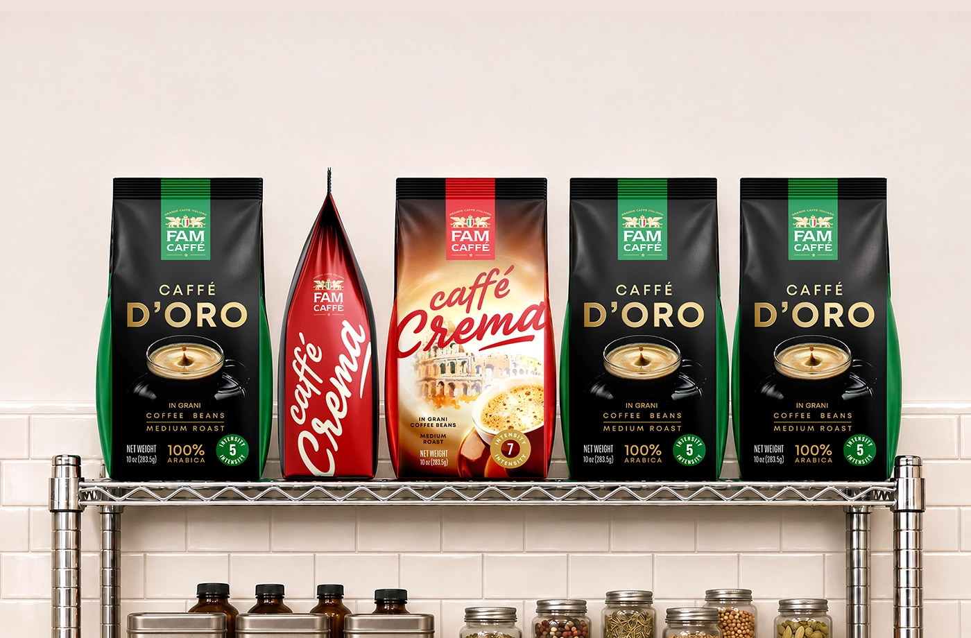
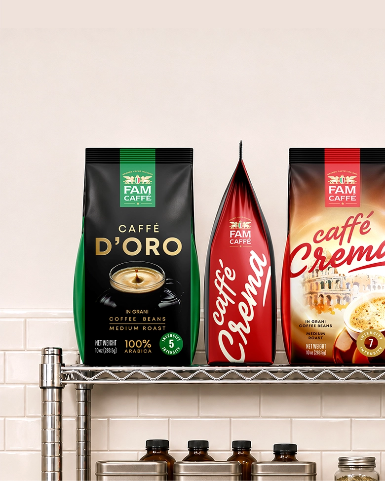
The two bags needed to look like part of the same range while remaining easy to tell apart on the shelf. Each front panel had to make the brand and product name immediately recognisable, with the roast level, intensity and net weight easy to find.
solution
We placed the FAM CAFFÉ logo in a colour panel that runs down from the top seal of each bag. The crest pairs two winged lions with a shield in the colours of the Italian flag. A shared layout connects the two designs, while the green and red panels give shoppers a quick way to distinguish them.
Project overview
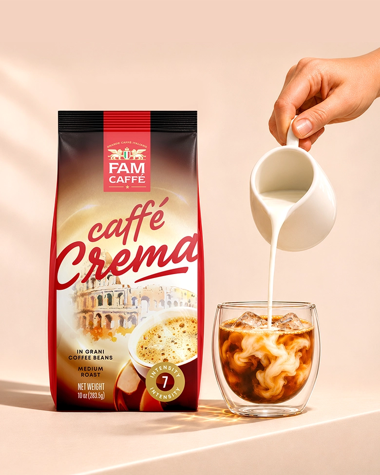
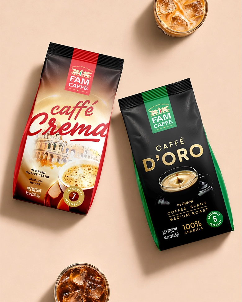
The finished range brings together a single FAM CAFFÉ logo and two distinct packaging designs. The shared logo placement and information hierarchy hold the range together on the shelf, while colour and lettering give each coffee its own identity.
relevant services
- packaging design
- label design
- beverage design
- food packaging design