rebranding, logo design, packaging design
Prix Air Freshener Rebrand. Logo & Packaging Design
concept
Our partnership with Prix sought to remake the packaging for their aerosol air fresheners, therefore producing a contemporary, visually appealing product line. The major goal was to create packaging that preserves a consistent brand identity while clearly distinguishing each scent.
challenge
Prix required a whole brand makeover for their range of aerosol air fresheners. The current packaging had no consistent brand identification, which would confuse customers and help them to identify and distinguish among the many scents. The difficulty was to produce a modern, eye-catching look that not only preserved brand consistency but also made every scent immediately identifiable and attractive on the shelf.
solution
Featuring a clean, sans-serif typeface inside a droplet shape—representing freshness and the liquid core of the product—the new Prix logo became the visual anchor of the design. This simple and flexible design guaranteed uniformity across several packing sizes.
industry
home & lifestyle
project type
logo design, packaging design
client
Prix
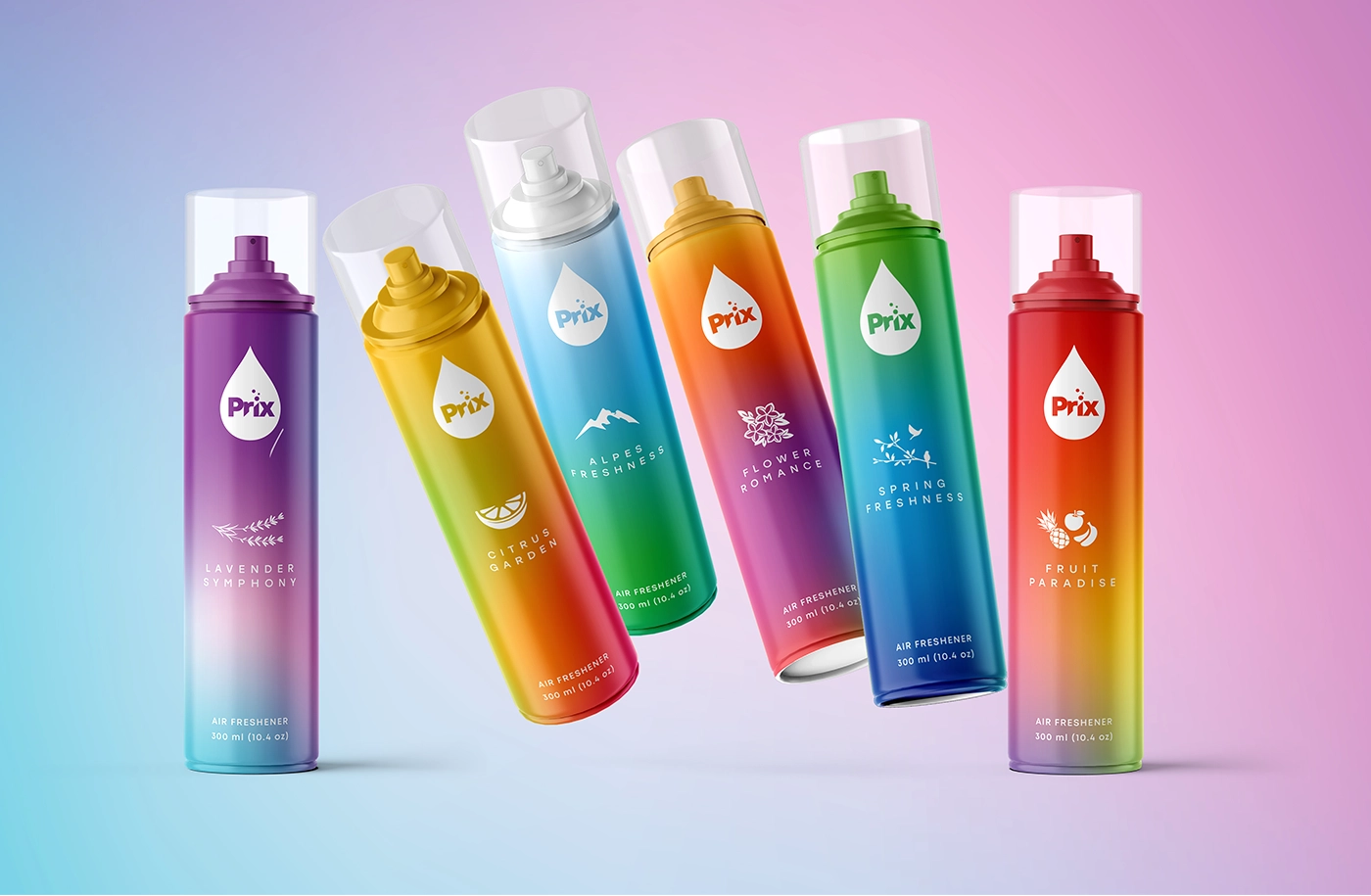
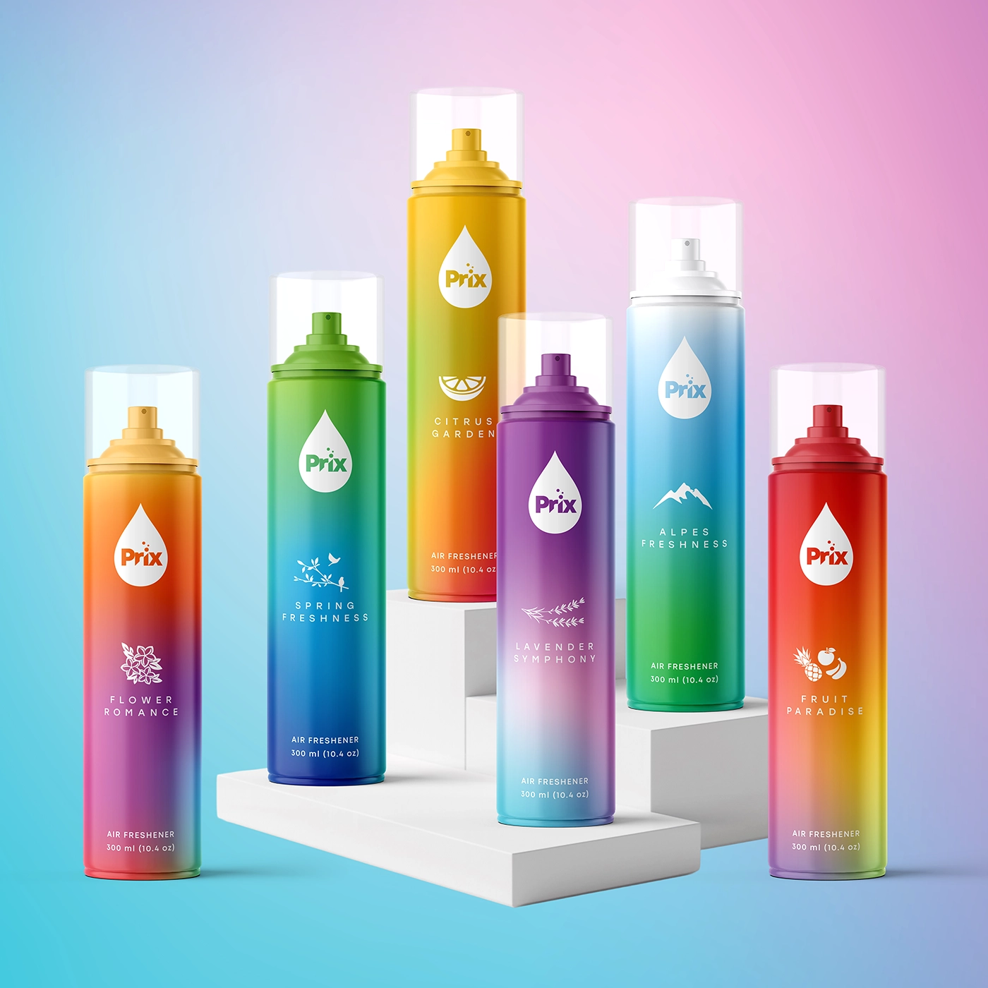
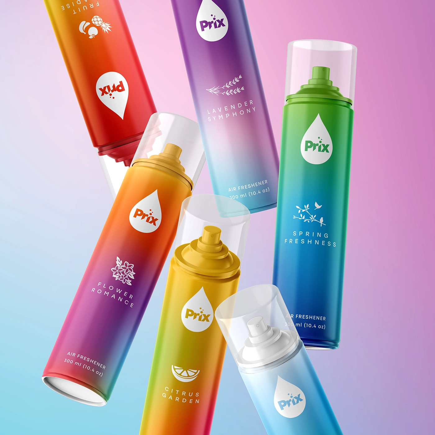
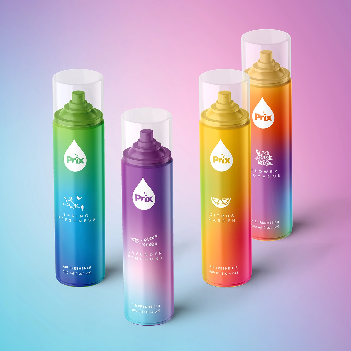
Vibrant Color Gradients for Clear Differentiation
Every scent in the Prix air freshener line has a different gradient color pattern:
Citrus Garden: For a zesty, refreshing sensation, bright yellow-orange gradient with a citrus slice symbol. Soft purple-blue hue combined with a lavender sprig motif, Lavender Symphony captures calming tones. A floral icon on a soft pink-orange gradient represents Flower Romance, which suggests subtle floral scents. Spring Freshness: Vibrant green-blue gradient with bird emblems suggesting a cool spring wind. Fruit Paradise: Warm red-orange gradient with a fruit basket emblem, suggesting rich, fruity aromas. Alpes Freshness: Mountain emblem on a cool blue-green gradient, signifying clean, fresh alpine air. These gradients provide quick visual identification and assist customers in readily differentiating between aromas.
Citrus Garden: For a zesty, refreshing sensation, bright yellow-orange gradient with a citrus slice symbol. Soft purple-blue hue combined with a lavender sprig motif, Lavender Symphony captures calming tones. A floral icon on a soft pink-orange gradient represents Flower Romance, which suggests subtle floral scents. Spring Freshness: Vibrant green-blue gradient with bird emblems suggesting a cool spring wind. Fruit Paradise: Warm red-orange gradient with a fruit basket emblem, suggesting rich, fruity aromas. Alpes Freshness: Mountain emblem on a cool blue-green gradient, signifying clean, fresh alpine air. These gradients provide quick visual identification and assist customers in readily differentiating between aromas.
Clean Typography and Minimalistic Iconography
A straightforward, graphic emblem just below the logo supports each version, so strengthening the individuality of the smell. Modern, clear typeface guarantees that product information stays readily readable without stressing the design.
Shelf Presence and Visual Impact
Bold gradients and consistent brand positioning improve shelf impact by making the items readily visible. This design strategy guarantees brand awareness as well as clear communication of the freshness and quality of every perfume.
Rebranding Prix air fresheners has turned the product line into a visually consistent and identifiable brand. Vibrant hues, obvious aroma separation, and simple design have helped Prix to stand out on shelves, hence attracting customers.