packaging design
Cotton Category Packaging Design
concept
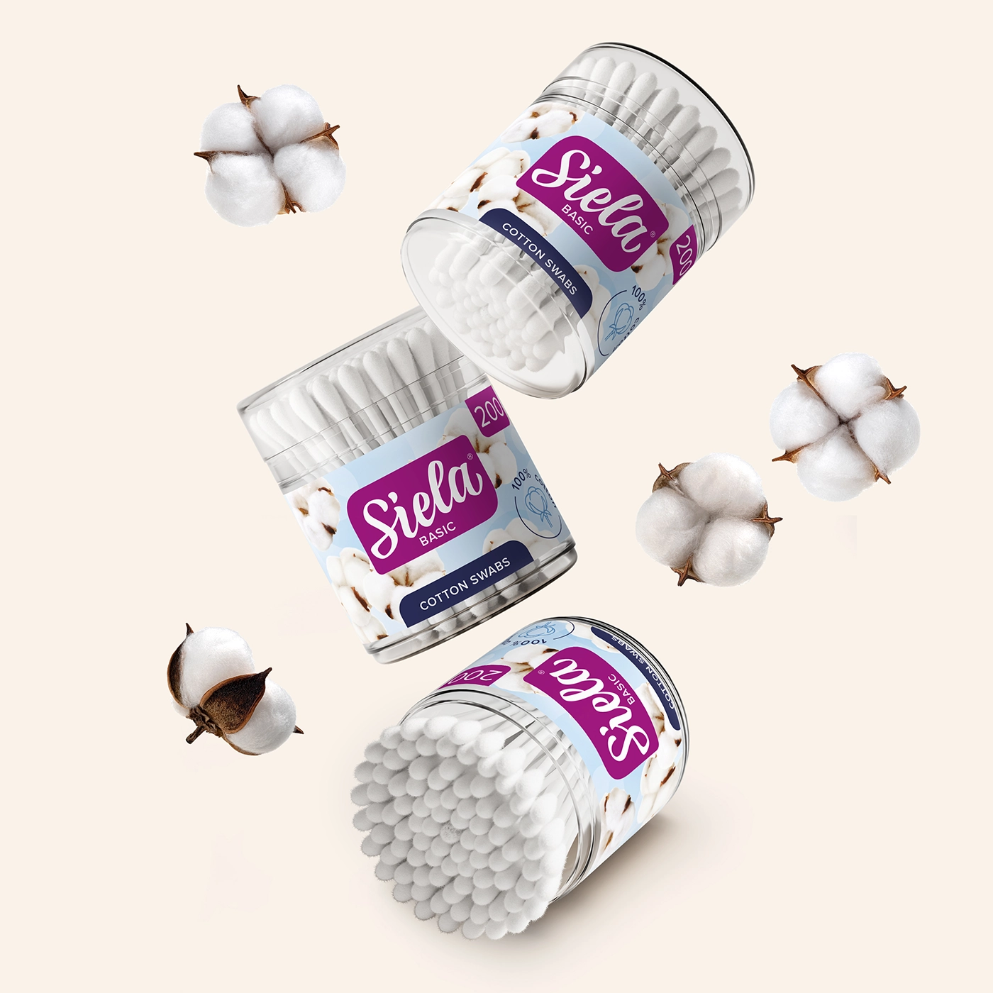
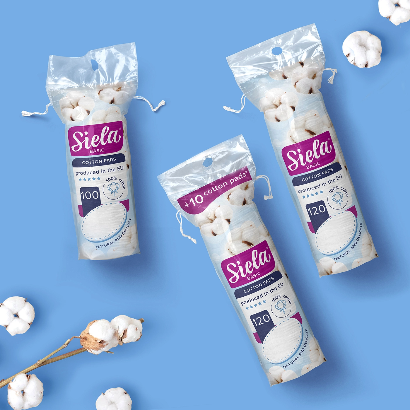
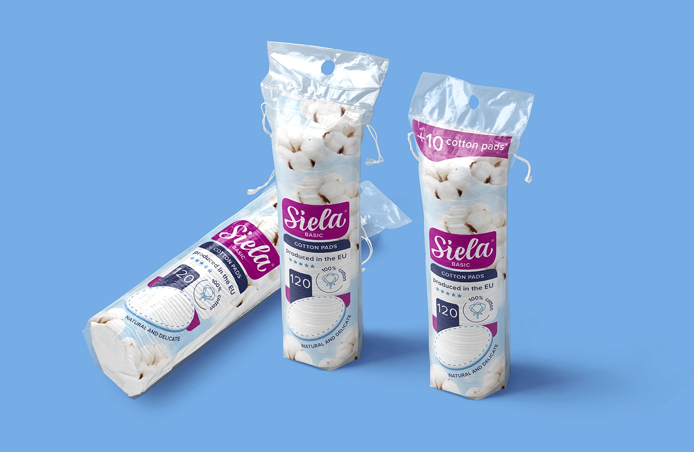
In the oversaturated market of personal hygiene goods today, it's not enough to just say softness and purity; businesses have to visually convey trust, quality, and emotional connection at first look. The Siela BASIC line—a selection of cotton pads and swabs manufactured in the EU from 100% cotton—was precisely the difficulty we were given.
challenge
The client came to us with a specific aim: update the packaging and identity for their vital product line to better compete in European retail chains and attract modern, health-conscious consumers. Finding a visual language that would convey softness, cleanliness, and dependability while preserving a sense of affordability and approachability was the difficulty.
solution
Our creative approach focused on developing a bright, pleasant, and reliable appearance. To highlight product purity and softness, we mixed natural photographic textures of cotton with a cool pastel blue backdrop linked with hygiene and peace. While guaranteeing good visual consistency across the whole product line, the vivid purple hue of the logo panel offered a striking contrast and made the brand stand out on the shelf.

industry
health & beauty
project type
packaging design
client
SIELA
Design Features & Impact
Simple segmentation using unified design with accent colours.
A consistent design structure was applied across all SKUs, with slight accent color differences to differentiate each product while boosting brand identification on the shelf.
Soft cotton pictures for emotive and natural appeal Images of actual cotton underline the purity and tenderness of the product, hence appealing to emotions and stressing its natural source.
Spacious, tidy layout for a quality appearance Generous white space and minimalist style produce a contemporary, high-quality impression that distinguishes from visual clutter.
Transparent product information with EU origin as a trust point While the "Produced in the EU" statement increases confidence and guarantees customer excellence, the essential product information is simple to understand.
Shelf and digital optimized photography Bright, uncomplicated images ensure the product pops out both online and in-store, fulfilling the needs of e-commerce and retail contexts.

The new packaging gave the product a clean and inviting design that fits with what customers expect from hygiene and skincare goods. The system is easy to grow across SKUs, and the visual aspects help build trust in the brand and make it clear what category it belongs to.
Siela BASIC now clearly communicates with customers, from the first time they see it on the store to the faith they have in using it every day. It does this by combining modern design with classic purity signals.