logo design, packaging design
WineTime Seafood. Logo & Packaging Design
concept
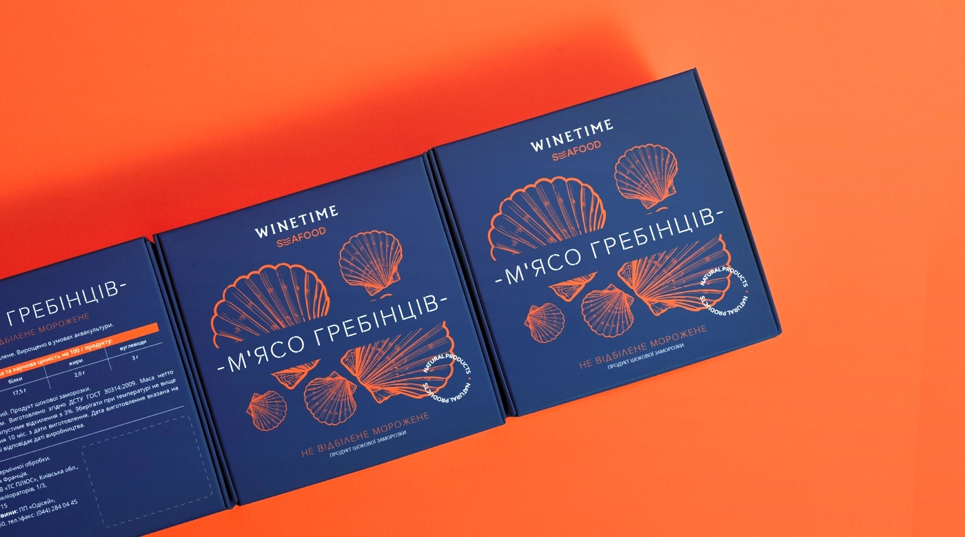
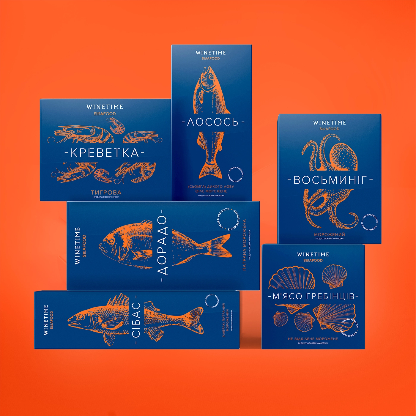
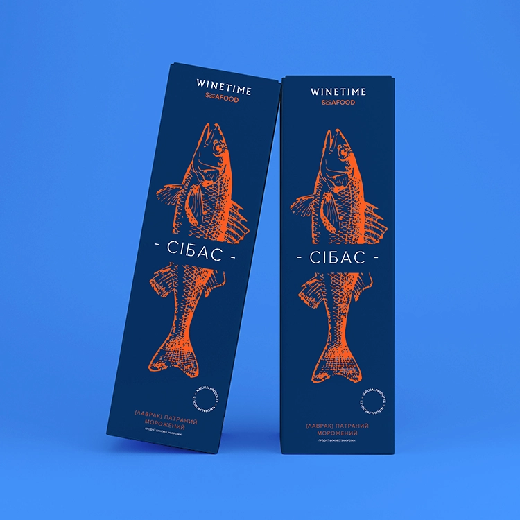
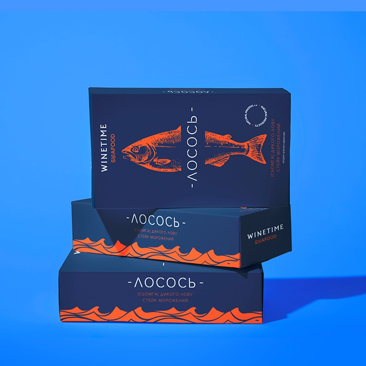
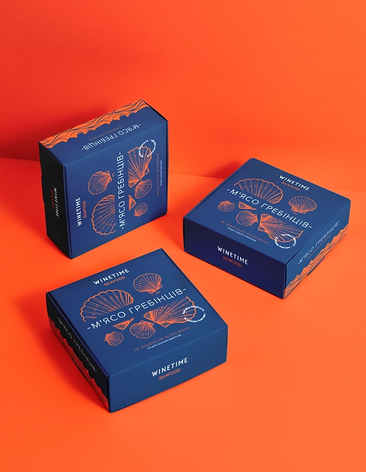
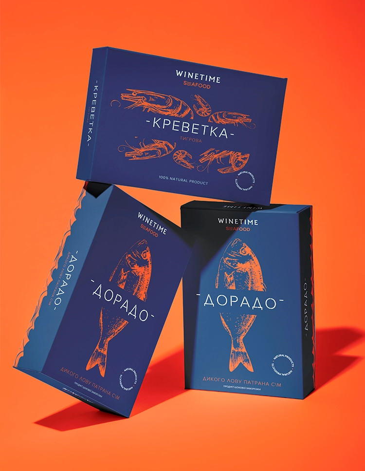
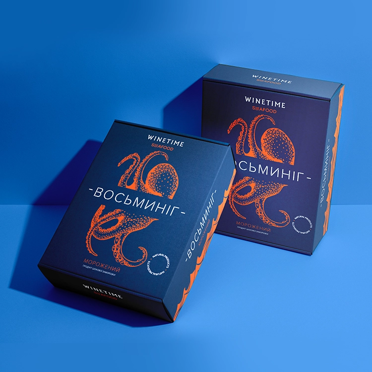
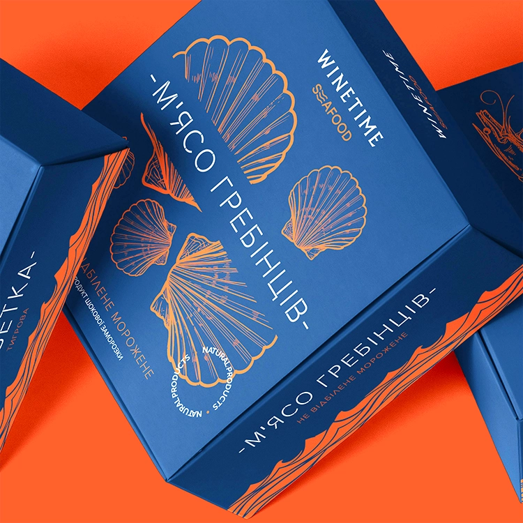
Created using shock freezing technique, which protects the original structure, flavor, and nutritional content of each item, WINETIME SEAFOOD is a premium line of frozen fish and seafood products. Among the more than ten gourmet choices in the collection are wild dorado, salmon, European bass, scallops, octopus, and tiger shrimp.
challenge
The customer wanted a consistent packaging system that would combine the whole product line under one strong visual identity while letting each SKU stay recognizable and appealing on retail shelves. At first look, the packaging had to reflect the premium quality of the components and convey freshness, culinary value, and brand knowledge.
solution
Driven by clarity, consistency, and polished simplicity, we created a thorough packaging idea and visual strategy. The design approach uses a deep blue foundation—evoking the hue of the sea—as the canvas for all goods. Each package features detailed, hand-drawn line illustrations of the seafood items in a vibrant orange, reflecting the company’s signature color and drawing attention without disrupting the brand unity.
Award
Platinum A'Design Award
project type
logo design, packaging design
client
Pita Gyros
This approach guarantees that the whole product line is instantly identifiable as part of the WINETIME SEAFOOD brand.
While the thorough orange line drawings—unique to each kind of seafood—emphasize the uniqueness of every SKU, the regular application of deep blue packaging produces significant shelf impact and brand coherence. These hand-drawn features support the gourmet positioning of the brand by adding a feeling of craftsmanship and genuineness. The crisp white sans-serif typeface improves readability and offers a new visual contrast, hence modernizing and refining the impression that communicates confidence, clarity, and faith in product quality.
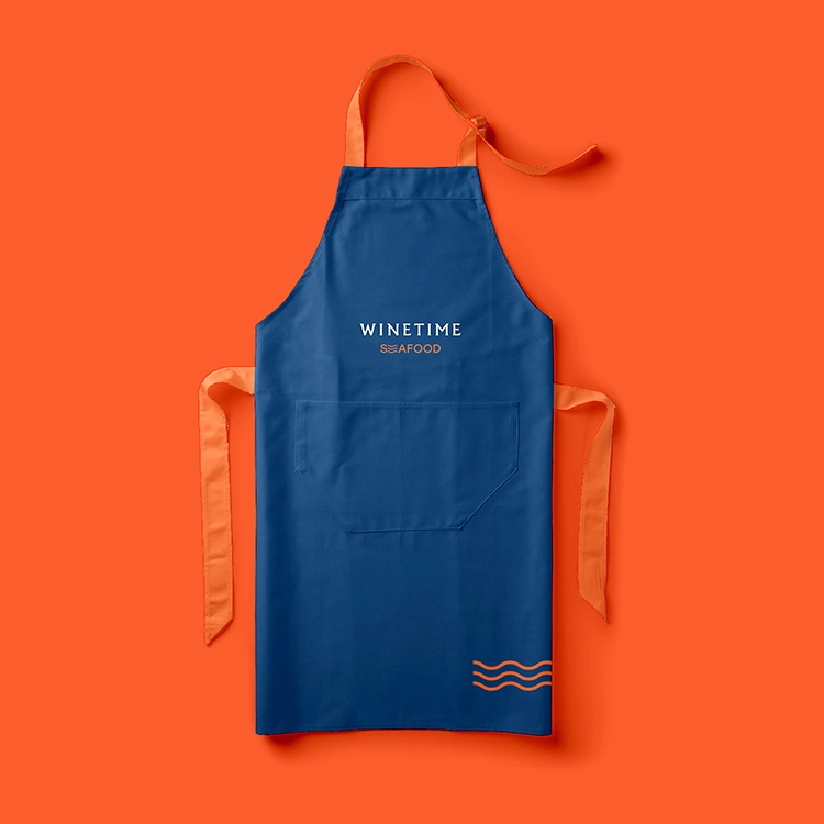
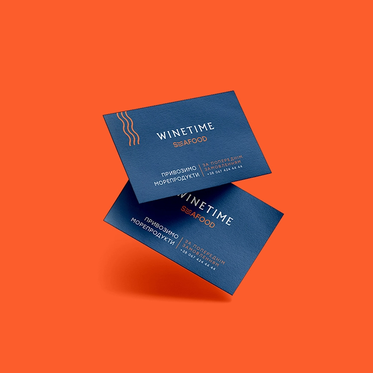
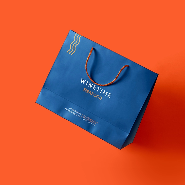
The outcome is a strong, contemporary package solution that improves brand perception and raises the culinary attractiveness of the food line. By clearly expressing product quality and category, the strong visual uniformity improves shelf presence and quickens consumer decision-making. Supporting brand assets like aprons, gift bags, and printed materials follows the same graphic logic, hence strengthening brand consistency across all consumer touchpoints.